filmov
tv
How To Start Your Digital Art - in 5 Easy Steps
Показать описание
Are you interested in illustration, but don’t know where to start? Are you looking for some beginner tips to get started with digital art? Or maybe you’re looking to break into digital art. Look no further.
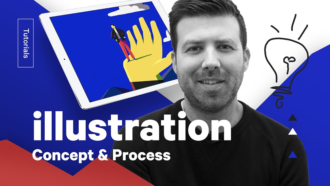
The Futur’s local illustrator, Greg Gunn, shares his 5 step process to go from idea to finished illustration. He will cover the basics of how to find an idea, sketch a thumbnail and color it using Procreate, Photoshop or Illustrator. And he makes look easy.
0:28 Step 1 - Prompts
The first thing we need to do is come up with prompts to work from. These are words or phrases that will help guide what we make. It helps if they're visual words, but they don't always have to be.
0:55 Step 2 - Thumbnails
Okay, so this is drawing 101 right here. You always start with a thumbnail sketch. I know, you want to get to the fun part right away and just render the *#$% out everything. But don't. Because it will suck. You'll want to change it. And you will have wasted your time.
1:32 Step 3 - Clean up
At this stage, we have a visual concept, but it needs refinement. I might adjust the composition a bit, change scale, add or even remove some things. The objective here is to take this collection of chicken scratches and turn it into this—a better collection of chicken scratches.
2:28 Step 4 - Color
Without getting too into the weeds about color theory, our primary goal here is to block out the color for each shape in the drawing. I'm doing this in Procreate, cuz that's my jam, but do this in whatever program tickles your fancy. While I do this, I'm thinking about where I want to place visual focus and make those shapes the brightest or give them the most contrast.
3:07 Step 5 - Detail
So we have our color blocked in and you'll see that I moved some things around. We're going to place some type in here later and I want to make sure there's ample room for it.
Overall, I like where we're at, but it's kinda boring. So let's make it unboring.
We can do that by adding some light and shadow. Keep in mind, this is intended to be a thumbnail, so it's gotta read when it's very small. That's the reason I decided to leave out the trees from the sketch.
For a prominent illustration, I'd probably add more detail, maybe some line work. But for this, a little bit goes a long way.
===
===
#TheFutur
Want a deeper dive? Typography, Lettering, Sales & Marketing, Social Media and The Business of Design courses available here:
—
Love the content? Become a sustaining member for $5/mo today.
Our recommended products and Booklist:
Kits & Proposals:
Visit our website:
FREE resources:
Mandarin (Chinese) Subtitles on UiiUii
—
AFFILIATE LINKS*
🙏 Support The Futur but purchasing through our affiliate links:
✍️ Sharpen your skills by taking a course, using our affiliate links:
🎧 Do you like the music? Check out the music libraries we use in our affiliate links below:
*By making a purchase through any of our affiliate links, we receive a very small commission at no extra cost to you. This helps us on our mission to provide quality education to you. Thank you.
—
Futur Podcast on iTunes: 🎙
Spotify: 🎙
—
We love getting your letters. Send it here:
The Futur
c/o Chris Do
1702 Olympic Blvd.
Santa Monica, CA 90404
USA
—
Host– Chris Do
Content Director– Matthew Encina
Cinematographers– Mark Contreras, Stewart Schuster, Aaron Szekely, Ricky Lucas, Jona Garcia
Editors– Mark Contreras, Stewart Schuster, Aaron Szekely, Ricky Lucas, Jona Garcia
Live Editor– Jona Garcia
Social Team– Elle Money, Alex Burlui
Typefaces: Futura, DIN, Helvetica Neue, Calibre
Futur theme song— Adam Sanborne
Комментарии
 0:00:57
 0:36:55
 0:12:55
 0:28:32
 0:25:44
 0:40:13
 0:05:25
 0:28:15
 2:55:05
 0:21:23
 0:05:37
 0:24:37
 0:13:42
 0:09:37
 0:11:16
 0:24:01
 0:13:38
 0:00:54
 0:08:28
 0:13:43
 0:14:02
 0:03:45
 0:34:23
 1:07:54