filmov
tv
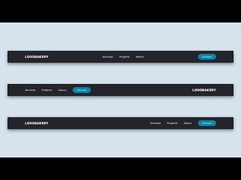
Responsive Navbar | CSS Flexbox tutorial

Показать описание
In this lecture, you'll learn how to create a fully responsive navbar which adapts to three different screen sizes.
Once you've learned CSS Flexbox, you'll wonder how you ever managed to build websites without it. It gives you all the tools you needed in order to properly arrange content inside flexible containers.
Given that all websites need to be flexible and responsive these days, Flexbox is a must-have skill for web developers.
💻 Check out Scrimba’s interactive learning platform:
🌲 Linktree:
 0:15:08
Navbar CSS Tutorial: 3 Ways to Create a Navigation Bar with Flexbox
 0:33:46
Simple Responsive Navbar with HTML & CSS (Flexbox Layout)
 0:00:24
Learn CSS Flexbox Flex-wrap in 24 Seconds
 0:05:15
Flexbox Tutorial - 19 - Responsive Navbar
 0:15:21
How to create a Responsive Navigation Bar (for beginners)
 0:17:54
FLEXBOX Responsive Navbar (with Logo) | Navigation Menu Bar with HTML, CSS & JavaScript
 0:35:50
Responsive Nav Bar Tutorial | HTML CSS JS Flexbox Navigation Menu
 0:21:51
CREATE a Responsive Navigation Bar with FlexBox CSS!
 0:08:17
How To Make Navbar with HTML & CSS | Flexbox Tutorial for Beginners
 0:08:16
Learn Flexbox CSS in 8 minutes
 0:20:37
Learn CSS Flexbox in 20 Minutes (Course)
 0:00:16
Responsive Side Navigation Bar in HTML and CSS | Dashboard Side Nav Bar
 0:11:40
Animated Responsive Navbar with CSS - Plus Other Useful Tricks
 0:08:35
Responsive Flexbox Navigation Bar with Logo | Navbar CSS Tutorial
 0:08:57
Flexbox Navbar Tutorial | Only HTML & CSS
 0:15:13
How To Create a Responsive Navbar Using HTML & CSS | Step By Step Tutorial
 0:09:39
5 CSS Tips & Tricks for better Responsive Web Design
 0:08:00
How to Create Responsive Navigation Bar using HTML and CSS
 0:00:22
CSS Flexbox flex wrap property | CSS Flexbox Tutorial
 0:14:56
Create a RESPONSIVE NAVBAR with sidebar animation (CSS ONLY)
 0:00:08
Navigation menu |css html | easy | code #viral #html #css #navbar #menu #uidesign #web
 0:06:24
Responsive Navigationsleisten | HTML, Flexbox, JavaScript, CSS Tutorial Deutsch
 0:00:25
You won’t believe this navigation menu in CSS!
 0:02:03
Simple Navbar using CSS Grid | CSS Flexbox Layout
Комментарии