filmov
tv
Professional Logo Design - Adobe Illustrator CC (Reach)
Показать описание
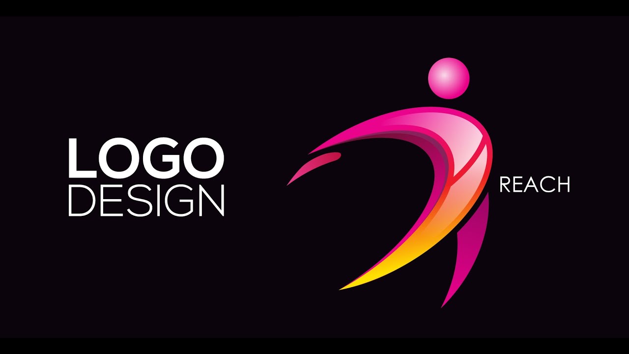
Here is another new Logo Design Tutorial. this logo has got a human figure made of basic shapes. the message convey by this full of energy. the formation of the this logo include to parts of semicircle, one placed on the top of other. the top one has few layers of detail which include some shadow, reflection glossiness and lower one has got small portion where, rest of the part are covered by the shadow of the upper one. on the top there is a small sphere which represents head. We designed this logo in few steps, 1st we created the basic shape with the ellipse tool, 2nd with the help of transform option we edited the ellipse formed . 3rd with the shape builder tool we sorted out each unique pieces. Finally we applied the gradient tool from the color pallet and the proper font for text.
If you want to Know more about Designing,
▲Gumroad Store!
▲Official website!
▲Creatnprocess Channel!
Professional Logo Design Pack!:
▲Design Tutorial Packages!
Useful Design Kits!:
Want to see my latest work? (Logo designs, Illustrations, etc.) follow me on!:
Check out our Website and work for more information!
© Creatnprocess 2016
 0:18:49
Professional Logo Design - Adobe Illustrator cc (Scanner)
 0:17:31
Professional Logo Design - Adobe Illustrator cc (DUAL)
 0:00:20
Beginner vs Professional Graphic Designer | Adobe Illustrator cc Tutorial
 0:00:55
Modern Logo Design Process | Adobe Illustrator Tutorial#logo #adobeillustrator
 0:07:00
Professional Logo Design - Adobe Illustrator CC (MOTION)
 0:15:06
Professional Logo Design - Adobe Illustrator - world wide
 0:00:47
Best Adobe Illustrator Tutorial #adobeillustrator #shortvideo #logodesign
 0:12:37
Professional Logo Design - Adobe Illustrator cc (Pool)
 0:00:58
how to create a company logo using illustrator #illustrator
 0:22:47
Professional Logo Design - Adobe Illustrator cc (SURFACE)
 0:00:22
How to italicise any font in Adobe illustrator!
 0:01:01
3 Principles of Logo Design #graphicdesign #logodesign #graphicdesigner
 0:10:02
Master Adobe Illustrator - Logo Design Tips (You Might Have Missed)
 0:01:00
Unique Logo Design in Adobe Illustrator!
 0:00:59
Unique Logo Design in Adobe Illustrator!
 0:15:35
Professional Logo Design - Adobe Illustrator cc (Split)
 0:16:58
Professional Logo Design - Adobe Illustrator cc (Rio2016)
 0:05:32
Professional Logo Design || Laurel Wreath Letter A Logo Design || Adobe illustrator Tutorial
 0:14:18
Professional Logo Design - Adobe Illustrator CC (Reach)
 0:00:24
Make Free Logo With AI in Seconds
 0:09:31
Professional Logo Design - Adobe Illustrator cs6 (COLOR)
 0:07:58
Logo Design In Illustrator : How to Make Professional Logo Design in Adobe Illustrator cc
 0:00:57
Simple Logo Design in Adobe Illustrator #shorts #illustrator
 0:00:51
Adobe Illustrator - Letter H Logo Design with Rectangle
Комментарии