filmov
tv
SUNBURST CHART TABLEAU TUTORIAL PART 1
Показать описание
Become a cutting-edge TABLEAU expert in as little as 8 HOURS with our newest data science online course — now 95% off.
Dive into all that Tableau 2018 has to offer and take your data science career to whole new heights with “Tableau 2018: Hands-On Tableau Training For Data Science” — currently rated 4.6/5 on Udemy.
Learn by doing with step-by-step lectures, real-life data analytics exercises and quizzes.
=================================================
95% OFF — A limited time, YouTube ONLY offer!
=================================================
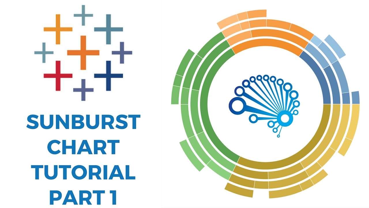
Learn how to make Sunburst Chart in Tableau through this amazing tutorial!
This type of visualisation shows hierarchy through a series of rings, that are sliced for each category node. Each ring corresponds to a level in the hierarchy, with the central circle representing the root node and the hierarchy moving outwards from it.
Rings are sliced up and divided based on their hierarchical relationship to the parent slice. The angle of each slice is either divided equally under its parent node or can be made proportional to a value.
Colour can be used to highlight hierarchal groupings or specific categories.
Like, Comment and Share this video!
To stay up to date with our latest videos make sure to subscribe to SuperDataScience YouTube channel!
0:07 - A Sunburst chart is an outgrowth of a tree map.
0:27 - A Sunburst takes that chart and makes it into a radial or a circular view. That's why this Sunburst Chart is actually also called a Radial Tree Map
1:03 - So if we come in and we look at our data right here we've kept it a nice small easy data set to work with.
1:33 - Now the trick with the Sunburst data is you actually need to have your data look like so.
2:17 - There are many ways that you can automate this data, automate this preparation step.
2:22 - The best way would be some sort of method using script. Using R, using Python you can even do it using custom SQL.
2:28 - But in this case we're going to show a quick example that actually uses pivot tables.
2:37 - So if you come here and you say: "insert pivot table"
3:27 - So once you've hidden all the blanks you come down here avoiding the grand total row
3:48 - Now we just need to come in and create this level field.
5:06 - Now going into Tableau we're going to connect the data and we're going to connect to our excel file and when we connect we're going to go in and we're going to use the legacy connection.
5:15 - This is needed because we're going to use some custom SQL techniques
5:19 - This option is not available for Mac users it's also only available for PC users
5:51 - So if you connect with a legacy connection and have the proper drivers you can come here you have your data brought in and what we're going to need to do is we're going to need to prepare it for some data densification.
5:59 - Data densification takes your data, we have 50 rows right now, it makes a copy of it and then basically doubles it
6:11 - So to do that using custom SQL we'll copy this say Union
6:33 - So we'll come here to our custom SQL query edit it for
6:40 - And then we'll call this one, name it ToPad, another name for data densification is data padding and so you'll see why
7:02 - What data densification does is it goes into your data and it in effect creates rows that weren't there before. We'll walk through this technique more in the second video.
8:00 - If you wanted to skip the custom SQL step if you don't have a legacy
Dive into all that Tableau 2018 has to offer and take your data science career to whole new heights with “Tableau 2018: Hands-On Tableau Training For Data Science” — currently rated 4.6/5 on Udemy.
Learn by doing with step-by-step lectures, real-life data analytics exercises and quizzes.
=================================================
95% OFF — A limited time, YouTube ONLY offer!
=================================================
Learn how to make Sunburst Chart in Tableau through this amazing tutorial!
This type of visualisation shows hierarchy through a series of rings, that are sliced for each category node. Each ring corresponds to a level in the hierarchy, with the central circle representing the root node and the hierarchy moving outwards from it.
Rings are sliced up and divided based on their hierarchical relationship to the parent slice. The angle of each slice is either divided equally under its parent node or can be made proportional to a value.
Colour can be used to highlight hierarchal groupings or specific categories.
Like, Comment and Share this video!
To stay up to date with our latest videos make sure to subscribe to SuperDataScience YouTube channel!
0:07 - A Sunburst chart is an outgrowth of a tree map.
0:27 - A Sunburst takes that chart and makes it into a radial or a circular view. That's why this Sunburst Chart is actually also called a Radial Tree Map
1:03 - So if we come in and we look at our data right here we've kept it a nice small easy data set to work with.
1:33 - Now the trick with the Sunburst data is you actually need to have your data look like so.
2:17 - There are many ways that you can automate this data, automate this preparation step.
2:22 - The best way would be some sort of method using script. Using R, using Python you can even do it using custom SQL.
2:28 - But in this case we're going to show a quick example that actually uses pivot tables.
2:37 - So if you come here and you say: "insert pivot table"
3:27 - So once you've hidden all the blanks you come down here avoiding the grand total row
3:48 - Now we just need to come in and create this level field.
5:06 - Now going into Tableau we're going to connect the data and we're going to connect to our excel file and when we connect we're going to go in and we're going to use the legacy connection.
5:15 - This is needed because we're going to use some custom SQL techniques
5:19 - This option is not available for Mac users it's also only available for PC users
5:51 - So if you connect with a legacy connection and have the proper drivers you can come here you have your data brought in and what we're going to need to do is we're going to need to prepare it for some data densification.
5:59 - Data densification takes your data, we have 50 rows right now, it makes a copy of it and then basically doubles it
6:11 - So to do that using custom SQL we'll copy this say Union
6:33 - So we'll come here to our custom SQL query edit it for
6:40 - And then we'll call this one, name it ToPad, another name for data densification is data padding and so you'll see why
7:02 - What data densification does is it goes into your data and it in effect creates rows that weren't there before. We'll walk through this technique more in the second video.
8:00 - If you wanted to skip the custom SQL step if you don't have a legacy
 0:08:50
SUNBURST CHART TABLEAU TUTORIAL PART 1
 0:17:27
SUNBURST CHART TABLEAU TUTORIAL PART 2
 0:04:48
Creating Sunburst Chart in Tableau
 0:05:29
Sunburst Chart in Tableau | Tableau Visualization
 0:12:39
How to Create a Sunburst Chart in Tableau? | Step By Step
 0:07:25
Sunburst Chart Tableau Tutorial
 0:13:47
How to create Sunburst Chart with multiple layers in Tableau | Tableau Tutorial: Sunburst Chart
 0:25:08
Sunburst chart in Tableau using TWO different methods
 0:05:43
Tableau Tutorial: Sunburst Chart
 0:10:45
Multi Layer Sunburst chart in Tableau
 0:09:27
Tableau Tutorial BI- Sunburst Pie Charts
 0:37:12
Sunburst Chart Tableau Prep Template: Put Some Prep In Your Step
 0:00:08
How to Create a Sunburst Chart in Tableau? | Step By Step #shorts
 0:06:50
Create a Sunburst Chart with Map Layers in Tableau
 0:04:57
39. Sunburst Chart in Tableau || Dr. Dhaval Maheta
 0:08:39
How do you make a sunburst chart in tableau?
 0:01:10
How to create a Sunburst chart in TABLEAU using Dynamic Sunburst Extension Tutorial.
 0:03:53
Tableau Video Lesson 20 Do you know #howto #develop #Sunburst #chart using #Extension in #Tableau ?
 0:09:24
#Tableau - Starburst Chart
 0:10:25
Tableau Sunburst /Pie / Donut Chart Drill down | Two Dimensional Pie Chart
 0:14:25
Tableau Video Lesson 17 #doyouknow #how #tableau #Map #Layer #used to #built #sunburst #Chart?
 0:14:06
sunburst chart
 0:03:43
#Sunburst Chart in Tableau| Chinmay Jain | Hindi
 0:05:47
Sunburst in Tableau ( No LOD , No Table Calculation)
Комментарии