filmov
tv
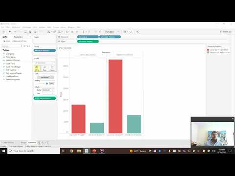
#Tableau - Show Variance with Bar Charts

Показать описание
Using variance as a measure in bar charts helps you:
1. Add context - You can answer the question “compared to what?”
2. Make decisions - You can answer the question "what should we do next?"
3. Alert you to areas that need focus
In this video, I show you 10 ways to add variance to bar charts.
0:48 Variance to Prior Year Sales
2:14 Side by Side bar chart
3:15 Bar in Bar chart
4:32 Indicator for decrease in variance
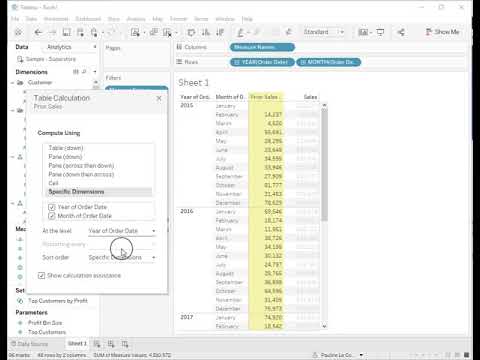
6:07 Deviation/variance/difference between two measures
6:59 Year over year variance by month bar chart
7:36 Floating bar chart (Gantt bar chart)
8:17 Bullet graph
8:56 Sparkbars / spark bars / sparklines as bars
10:02 Population pyramid
Resources:
#Tableau - Show Variance with Bar Charts
Tableau variance analysis
Display the variances between dates in Tableau Software (EN)
Variance Bar Chart with Arrow in Tableau | Analytics Planets
How to Show Month Over Month Difference As a Percentage in Tableau
Measures of Variation – Range, Variance, and Standard Deviation on Tableau
The VAR Function in Tableau: Your Ultimate Guide
Tableau | #WOW2021 | Week 01 | Can you find the variance along the line?
How does the VARP function work in tableau?
Tableau Charts & Graphs For Beginners | Tableau Advanced Charts | Data Visualization | Edureka L...
Show Difference Between 2 Fields in Tableau
#Tableau - Create Bump Charts to Show Change in Rank Over Time
How to Compute The Difference Between Two Years Sales in Tableau Using Table Calculations & Aggr...
How to compare prior year data by month in Tableau
9.8 Using Variances To Create Actionable Insight In Excel and Tableau
Confidence Interval with a Known Standard Deviation using Tableau
How to create a Year Over Year (Week Comparison) comparison in Tableau
Perfect way to show Gain/loss in Tableau @AllAboutDATA100 #tableaututorial #businessintelligence
Actual Sales vs Target Sales in Tableau
How to Display Subtotals for Only Some Dimensions in Tableau
#Tableau - Area Chart
Table Calculations in Tableau Tutorial | ArtofVisualization
Tableau calculated fields: understanding row-level and aggregate calculations
How to Create Dynamic Variance Charts with Arrows | Show Change to Previous Year / Budget
Комментарии
 0:11:47
 0:07:19
 0:13:07
 0:09:47
 0:00:39
 0:15:07
 0:02:34
 0:20:18
 0:02:46
 0:43:39
 0:01:39
 0:05:33
 0:03:53
 0:01:05
 0:10:50
 0:22:07
 0:02:56
 0:00:06
 0:08:10
 0:01:17
 0:00:37
 0:17:51
 0:14:57
 0:10:20