filmov
tv
GEE Tutorial #9 - Interactive plotting of Earth Engine data with minimal coding

Показать описание
This video shows you how to do interactive plotting of Earth Engine data with only a few lines of code.
Earth Engine Videos Playlist:
geemap GitHub repository:
Jupyter notebook for this video:
Earth Engine Videos Playlist:
geemap GitHub repository:
Jupyter notebook for this video:
 0:11:42
GEE Tutorial #9 - Interactive plotting of Earth Engine data with minimal coding
 0:00:47
GEE Clip #9 - Interactive plotting of Earth Engine data with minimal coding
 0:27:21
GEE Lesson 9 - Getting Started with Earth Engine Image Collection
 0:15:38
GEE Tutorial 99 - Visualizing Landsat 9 Data with Earth Engine and Geemap
 0:07:19
GEE Tutorial #5 - Using drawing tools to interact with Earth Engine data
 0:19:52
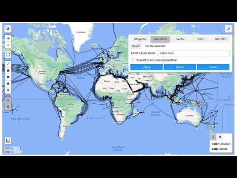
GEE Tutorial #54 - Visualizing Earth Engine vector data interactively with a GUI
 0:09:49
GEE Tutorial #10 - Using shapefiles with Earth Engine without having to upload data to GEE
 0:07:44
GEE Tutorial 119 - Plotting raster data in 3D with only one line of code
 0:13:41
GEE Tutorial #21 - Exporting Earth Engine maps as HTML and PNG images
 0:28:20
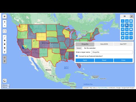
GEE Tutorial #58 - Loading local vector data via an interactive GUI
 0:12:30
GEE Tutorial #47 - How to download image thumbnails from Earth Engine
 0:13:51
GEE Tutorial #24 - How to publish interactive Earth Engine maps?
 0:17:45
GEE Tutorial #42 - How to upload data to Earth Engine Apps using ipywidgets
 0:23:14
GEE Tutorial #28 - How to use your local computer as a web server for hosting Earth Engine Apps?
 0:06:23
GEE Tutorial #3 - Introducing the Inspector tool for Earth Engine Python API
 0:07:41
GEE Tutorial 130 - Printing Earth Engine objects without the getInfo() function
 0:23:25
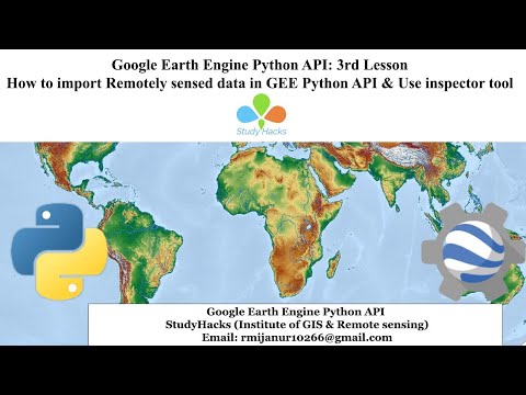
🛑GEE Tutorial #3: How to import Remotely sensed data in GEE Python API & Use the inspector tool...
 0:12:10
GEE Tutorial #56 - Loading local vector and raster data into geemap without coding
 0:25:23
GEE Tutorial 121 - How to style Earth Engine vector data based on attribute
 0:15:09
GEE Tutorial #55 - Visualizing Earth Engine raster data interactively with a GUI
 0:14:47
GEE Tutorial 111 - Mapping the number of available satellite images at each pixel location
 0:15:01
GEE Tutorial #19 - How to search and import datasets from Earth Engine Data Catalog
 0:07:16
GEE Tutorial #6 - Creating an interactive map with a marker cluster
 0:00:30
Creating Interactive Choropleth Maps with 15 Classification Schemes Using Geemap
Комментарии