filmov
tv
𝐂𝐥𝐚𝐬𝐬 𝟓:𝐃𝐚𝐭𝐚 𝐕𝐢𝐬𝐮𝐚𝐥𝐢𝐳𝐚𝐭𝐢𝐨𝐧 𝐰𝐢𝐭𝐡 𝐒𝐞𝐚𝐛𝐨𝐫𝐧 | 𝐏𝐲𝐭𝐡𝐨𝐧 𝐋𝐢𝐛𝐫𝐚𝐫𝐢𝐞𝐬 |𝐏𝐲𝐭𝐡𝐨𝐧 𝐄𝐃𝐀 𝐅𝐮𝐥𝐥 𝐂𝐨𝐮𝐫𝐬𝐞 | 𝐃𝐚𝐭𝐚 𝐀𝐧𝐚𝐥𝐲𝐬𝐢𝐬

Показать описание
𝐖𝐞𝐥𝐜𝐨𝐦𝐞 𝐭𝐨 𝐂𝐥𝐚𝐬𝐬 𝟓 𝐨𝐟 𝐨𝐮𝐫 𝐜𝐨𝐦𝐩𝐫𝐞𝐡𝐞𝐧𝐬𝐢𝐯𝐞 𝐏𝐲𝐭𝐡𝐨𝐧 𝐄𝐃𝐀 𝐜𝐨𝐮𝐫𝐬𝐞!
In this video, we explore Seaborn, a powerful Python library built on top of Matplotlib for enhancing your data visualizations. Seaborn allows you to create more attractive and informative statistical graphics with ease.
🔍 𝐖𝐡𝐚𝐭 𝐘𝐨𝐮'𝐥𝐥 𝐋𝐞𝐚𝐫𝐧:
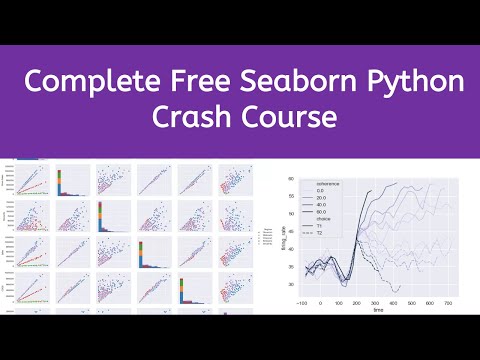
Introduction to Seaborn: Why Seaborn is preferred for statistical data visualization
Visualizing Data: Creating advanced plots like pair plots, heatmaps, and violin plots
Styling and Themes: Customize your visualizations with Seaborn's themes and color palettes
Statistical Analysis: Adding statistical annotations to your plots for deeper insights
Working with Data: Seamless integration with Pandas for quick and efficient plotting
Real-World Applications: Hands-on demonstrations using real datasets
📈 𝐖𝐡𝐲 𝐒𝐞𝐚𝐛𝐨𝐫𝐧?
Seaborn simplifies the process of creating beautiful and informative visualizations, making it a favorite among data scientists. It provides high-level interfaces for drawing attractive and informative statistical graphics, crucial for data exploration and analysis.
📝 𝐂𝐨𝐮𝐫𝐬𝐞 𝐒𝐭𝐫𝐮𝐜𝐭𝐮𝐫𝐞:
This video is part of our "Exploratory Data Analysis (EDA) with Python" series, guiding you from basic to advanced data visualization techniques. If you missed it, make sure to check out Class 2 on Pandas to better understand how to manage your data before visualizing it!
🚀 Next Steps:
Don't forget to subscribe and hit the notification bell to stay updated on our comprehensive tutorials. Engage with us in the comments below with your questions or share your visualization progress!
📚 Resources:
#Seaborn #DataVisualization #PythonSeaborn #DataScience #PythonProgramming #MachineLearning #DataAnalysis #PythonCourse #SeabornTutorial #PythonForBeginners
In this video, we explore Seaborn, a powerful Python library built on top of Matplotlib for enhancing your data visualizations. Seaborn allows you to create more attractive and informative statistical graphics with ease.
🔍 𝐖𝐡𝐚𝐭 𝐘𝐨𝐮'𝐥𝐥 𝐋𝐞𝐚𝐫𝐧:
Introduction to Seaborn: Why Seaborn is preferred for statistical data visualization
Visualizing Data: Creating advanced plots like pair plots, heatmaps, and violin plots
Styling and Themes: Customize your visualizations with Seaborn's themes and color palettes
Statistical Analysis: Adding statistical annotations to your plots for deeper insights
Working with Data: Seamless integration with Pandas for quick and efficient plotting
Real-World Applications: Hands-on demonstrations using real datasets
📈 𝐖𝐡𝐲 𝐒𝐞𝐚𝐛𝐨𝐫𝐧?
Seaborn simplifies the process of creating beautiful and informative visualizations, making it a favorite among data scientists. It provides high-level interfaces for drawing attractive and informative statistical graphics, crucial for data exploration and analysis.
📝 𝐂𝐨𝐮𝐫𝐬𝐞 𝐒𝐭𝐫𝐮𝐜𝐭𝐮𝐫𝐞:
This video is part of our "Exploratory Data Analysis (EDA) with Python" series, guiding you from basic to advanced data visualization techniques. If you missed it, make sure to check out Class 2 on Pandas to better understand how to manage your data before visualizing it!
🚀 Next Steps:
Don't forget to subscribe and hit the notification bell to stay updated on our comprehensive tutorials. Engage with us in the comments below with your questions or share your visualization progress!
📚 Resources:
#Seaborn #DataVisualization #PythonSeaborn #DataScience #PythonProgramming #MachineLearning #DataAnalysis #PythonCourse #SeabornTutorial #PythonForBeginners
 0:49:20
𝐂𝐥𝐚𝐬𝐬 𝟓:𝐃𝐚𝐭𝐚 𝐕𝐢𝐬𝐮𝐚𝐥𝐢𝐳𝐚𝐭𝐢𝐨𝐧 𝐰𝐢𝐭𝐡 𝐒𝐞𝐚𝐛𝐨𝐫𝐧 | 𝐏𝐲𝐭𝐡𝐨𝐧 𝐋𝐢𝐛𝐫𝐚𝐫𝐢𝐞𝐬 |𝐏𝐲𝐭𝐡𝐨𝐧 𝐄𝐃𝐀 𝐅𝐮𝐥𝐥 𝐂𝐨𝐮𝐫𝐬𝐞 | 𝐃𝐚𝐭𝐚 𝐀𝐧𝐚𝐥𝐲𝐬𝐢𝐬...
 0:59:34
Seaborn Tutorial : Seaborn Full Course
 0:42:21
V-17 : SEABORN For Data Analysis | SEABORN Tutorial | SEABORN From SCRATCH !!
 0:22:39
Seaborn Is The Easier Matplotlib
 0:10:01
Data Science For Beginners with Python 13 - Data Visualization using Seaborn
 0:15:46
How to Visualize Data in Python Using Seaborn | Seaborn Tutorial.
 4:22:13
Data Analysis with Python - Full Course for Beginners (Numpy, Pandas, Matplotlib, Seaborn)
 0:27:19
Data Visualization with Matplotlib and Seaborn (Python)
 1:02:26
Big Data using Python | Ch 5 Data Visualization using Matplotlib and Seaborn
 0:12:28
Data Visualization using Python on Jupyter Notebook
 0:20:41
Python Seaborn Tutorial | Data Visualization in Python Using Seaborn | Edureka
 2:52:19
Seaborn Python Tutorial | Complete Seaborn Crash Course | Data Visualization in Seaborn | Kgp Talkie
 0:10:06
Python graphs: Visualizing With Seaborn
 0:51:12
Seaborn Tutorial for Beginners in Python (Data Visualization)
 0:44:42
Python for Data Visualization Using Seaborn
 0:30:50
Mastering Data Visualization with Seaborn: Plotting Library with Yameen Sir | Seaborn Python
 0:31:38
Data Visualization in Python using Seaborn | Analytics & Visualization with Python | Uplatz
 2:02:16
Visualization with Matplotlib and Seaborn | Data Analysis with Python (5/6) | Free Certification
 1:07:52
Learn Stocks | Market Data Analysis And Visualization | Python, Pandas, Numpy, Seaborn in One Hour
 3:28:33
Data visualization using various Python libraries Matplotlib, Pandas and Seaborn
 0:06:43
Learn Matplotlib in 6 minutes | Matplotlib Python Tutorial
 1:19:18
Data Visualization using Seaborn
 0:09:01
Seaborn Python for beginners - Data visualization Hands on Lab
 3:48:53
Data Visualization using Matplotlib and Seaborn | Data Visualization in Python | Python Tutorial
Комментарии