filmov
tv
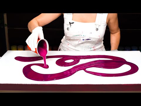
BURGANDY BEAUTY! Acrylic Swipe with Burgundy Negative space

Показать описание
Acrylic Pour Painting with a Burgundy Vibe. This colour palette I choose based on Burgundy as my main colour. With hints of neutral metallics and some soft pink and purple. I wanted some negative space. I accidently hit the bottom with my swipe while tilting and it stuck in the composition. I'm still happy with the way it turned out. Burgundy is one of my favourite colours!
Colours
The colours listed were used to make the colours for this painting. I just kept blending colours until I was satisfied with the tone.
Mont Marte Old Mauve
Arteza Pearl Deep Brown
Amsterdam:
Vandyke Brown
Persian Rose
Ultramarine Violet
Titanium Buff White
Gold Yellow (used a tiny bit in the pink)
Carmin
Liquitex Iridescent White
DecoArt Extreme Sheen:
Champagne Gold
Antique Bronze
Paint Mixing Video for Acrylic Pour Swipes.
AFFILIATE LINKS
==============
Pouring Mediums I use:
Paints I use:
Disclaimer: As an Amazon Associate I earn from qualifying purchases.
Thank you :)
Music:
Licensed with Audiio.
 0:14:50
BURGANDY BEAUTY! Acrylic Swipe with Burgundy Negative space
 0:15:34
(425) Swipe Technique with Sheleeart Pouring Medium! Tons of Cells and Beautiful Results!
 0:03:31
Burgundy Background Acrylic Swipe
 0:05:44
(557) Beautiful Pink and Burgundy Airbrush Acrylic Pour!
 0:00:41
Burgundy Ribbon Palette Knife Swipe | Acrylic Paint Pouring | Fluid Painting Art | Abstract #shorts
 0:22:10
#1097 Gorgeous Cells In This Red, Burgundy And Gold Acrylic Pour With Black Swipe
 0:13:12
BURGUNDY + GOLDEN Touch 😍3D Acrylic Pouring + NEXT Level TEXTURED Embellishment ~ Fluid Art Tutorial...
 0:14:26
WOW! Must see LACING on Exquisite Metallics - Best Acrylic Pour Swipe Yet!
 0:12:46
Lets Swipe Some Beautiful Colors Acrylic Swipe, Acrylic Pour Painting, Acrylic Painting
 0:01:00
Cloudy Swipe with Blowout and Spin
 0:04:11
Fluid Painting with Forks
 0:00:49
acrylic swipe painting, bloomstyle,
 0:11:05
Cosmic Aura 💥 Metallic Star Swipe - Acrylic Pouring Art
 0:02:24
Golden Tiger pour | Fluid art Painting only with Black, Gold and Water
 0:16:31
WOW! My Best LACING Yet - With Gorgeous METALLICS - Acrylic Pouring Swipe Technique
 0:16:46
#558 'Ghost' Pour Swipe In Burgundy, Pink And Decoart Metallic Gold
 0:29:08
Acrylic Pouring with Beautiful Gradient of Colors on a Dark Base ~ Special Collaboration!
 0:06:43
BEST Metallic CELLS EVER! 😍 GORGEOUS Straight Pour with Fluid Acrylics / Acrylic Pouring (90)
 0:24:20
The 4 Elements: Earth, Air, Fire, Water - Swipe with Australian Floetrol - Acrylic Pouring
 0:06:31
#106 Burgundy Flower pour / acrylic pouring / fluid art / scandinavian art
 0:00:59
Ring Pour Metallic Burgundy, Aqua, White - Fluid Art - Acrylic Pouring - Abstract Painting
 0:00:15
Beautiful Burgundy Flower Chain Pull! 🤩 #pourpainting #fluidart #acrylicpouring #abstract #artwork...
 0:00:16
Fluid Acrylic Pouring Paint Reaction
 0:16:33
Open Cup/ Swiping Amazing Palette Acrylic Pour Painting, Flow Art, Fluid Art Technique,
Комментарии