Small Business Website Redesign

preview_player
Показать описание

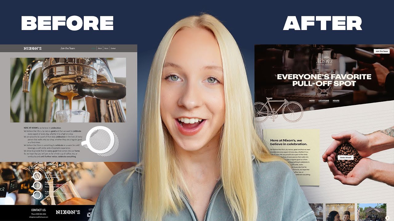
You can build your design portfolio and gain new clients by helping local businesses. Throughout this video, Maddy walks us through the steps she took to redesign the home page for a local coffee house in Colorado. Follow along as she works to make the site match the vibe of the physical location.

📽️ CHAPTERS

00:00 - Introducing the Design Challenge
00:44 - Redesign Skeleton
10:40 - Logo Design
13:30 - Content
17:57 - Final Result

📱 Check out Maddy’s channel & follow us on instagram:

How do you think she did? Let us know in the comments 👇🏼

#webdesign #freelancedesigner #figma #branding
Рекомендации по теме
Комментарии
Автор

I liked the result! It just felt weird that you were pretending to come up with those things on the spot when you would go and grab them from the finalized board you are right nearby. I guess being more transparent could be more helpful? Anyway, great work!

madeleineloup
Автор

Don't use rasterized images as hit targets (buttons). Rasterized images do not scale well unless you send very high DPI images. Picture this site on a 27" monitor. Vector images (SVGs) are much better choices. Also SVGs can animate and are much more responsive. Also rasterized images will not scale well for users who need to scale the size for any reason (disabilities, etc.). You'll have the same issues with the sticky note. If the text doubles in size, it will run off the sticky note and look weird.

alanthomasgramont
Автор

The client will like you but the developer won't 😅

njengathegeek
Автор

Wait so she was pretending to come up with this on the spot but it was actually on her screen on the side already, pretending to be thinking but really its already done

jordanislandwebdesign
Автор

18:18 _"Business owners don't respond well to cold emails that were clearly copy-pasted to dozens of other folks. This is the exact opposite approach. _*_Don't just tell them what you can do. Show them!_*_ "_

Great Advice right there.

VerdantJedi
Автор

To be honest the layout of the logo and the misplacement of the Navigation bar is definitely gonna confuse a whole lot of people, Especially the people who are using accessibility features. The hero section looks confusing on where should i actually look on . If the navigation menu has "about us" as the last piece of information, It is definitely gonna help maintain the flow of consistency. What does "Order Ahead" means? i emphasize that you have to visit the shop after ordering the menu ? I Felt like the Instagram images section really looks like the windows 98 era, If I were to design the section I would have make the section a lot bigger, as I feel there is wasted space below the carousel and maybe change the images that matches the color tone of the hero section. I really think that this design is mainly targeting the older audience .Why not use modern Serif fonts for the heading too to represent retro style? Finally I've really learned a lot from you .

chicpak
Автор

Sorry I don't get it. Are you taking stuff from a already made design and pasting it and calling it a new design?
Next time talk about readability how we approach a website, optical middle points color scheme and typographic

petropzqi
Автор

Maddy, your mindset changed the whole game!

sammiienyc
Автор

I would love to see how this site looks and performs on a cellphone or other small device.

globalfunseeker
Автор

It's a great exercise and very important one too.

The idea to do it from perspective of people on bikes is also very interesting and has great unexpected potential to unfold.


Everyone in the comment section are very kind and I don't want to be harsh. But if you really want to grow you probably wouldn't mind if I share my honest opinion - I probably wouldn't hire you based on this work.

First of all I would like it more if you show systemic approach. UI design is not a poster design. we need to take into consideration how the design is going to scale. And that part is really important. A 8px grid system is a great tool to help with that.

I whould like to see more work with the text. You were right to say that it wasn't very readable on the original website. But it has the same issue in your final version.

I am very interested to see you continue the work and make this design for bigger snd smaller screens. How would you handle those hands? and the background?

I would like to see more subtle work with the hands photo - it looks too red to me. And the shadows are too dark on this light background. I would also probably add some shadow under it as the post it has some. Our brains register those type of inconsistencies very well even when we don't understand them on conscious level.

I really hope my comment would not upset you but instead you will find some constructive guidance in it. I really like the way you think. Good luck!

lika_cola
Автор

This isn't a website it's a poster with a couple buttons. I love when graphic designers throw UI / UX out the window. Also this is gonna look like dookie on mobile.

andrewbrown
Автор

I design on figma and webflow and use a lot of similar designs/layout/structure. It's fairly straight forward to create on webflow. No developer required. 👍😀

garethellison
Автор

No way! My aunt sells her kombucha at Nixon! (Springs Culture Kombucha) This is an awesome site redesign!

johnnymonroe
Автор

I like the design Maddy! Love watching your videos😄

roxanarodriguez
Автор

Way to go, Maddy! 👏🏼 love your videos

ivanska.design
Автор

This was a great video but very badly edited. You forgot to remove the support assets for the video which we weren't supposed to see before.

vd
Автор

Good vid.
Unfortunately the new coffee stop tag-line means other things too....

bobbysilver
Автор

she's the girl from skillshare. i literally just saved her course for future use only a few days back

sentiasatransformasi
Автор

Now Website will take 3 business days to load.

hardikpatel-od
Автор

Thanks, Great video! But what tool did you use to cut out the background of the hand holding coffee beans image? Is it a Figma plugin?

bayoparkgalleries