filmov
tv
Excel Magic Trick 1337: No X-Y Scatter Chart From PivotTable!?!? Use Power Query Instead!!!

Показать описание
Download Files:
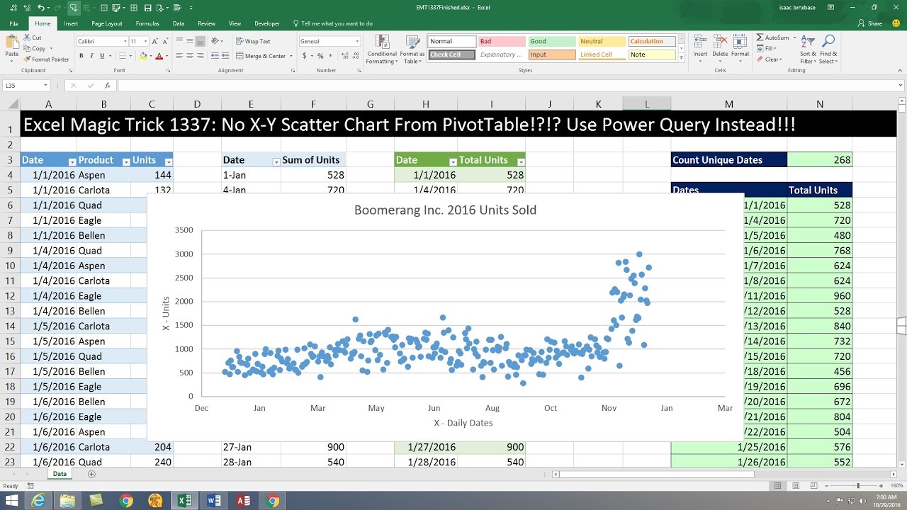
If you try to make X-Y Scatter Chart from PivotTable is will NOT work!!!!! See how to use Power Query to create the same output as a PivotTable in order to make an X-Y Scatter Chart:
1. (00:15) Introduction
2. (00:47) PivotTable to Adding Units by Day. But when we try to create an X Y Scatter Chart from PivotTable, we will get the error “You can’t create this chart type with data inside a PivotTable. Please select a different chart type, or copy the data outside the PivotTable”.
3. (02:35) Use Power Query to build PivotTable output, and then the X Y Scatter Chart will work perfectly!!
4. (05:30) Build X-Y Scatter Chart with Proper Labels.
5. (07:14) Summary
Excel Magic Trick 1337: No X-Y Scatter Chart From PivotTable!?!? Use Power Query Instead!!!
Excel Magic Trick 1333: Power Query (Get & Transform) Rounding: Banker's or Gaussian Roundi...
Excel Magic Trick 1380: Slicer Power Query Report To Show Incomplete Student Assignments
Excel Magic Trick 1358: Query Dependencies View in Power Query (Get & Transform)
Excel Magic Trick 1332: Power BI Desktop: Import Multiple Excel Files & Build Dashboard
Excel Magic Trick 1335: Power Query We Couldn’t Refresh The Connection Data Source Not Found Error
Excel Magic Trick 808: Copy Sheet and link Only Cells With Raw Data Go To Special Select Constants
Never torrent without vpn
Visualize your data with bubble chart in Excel.
Excel AI with Analyze Data Tool. PivotTable, Pivot Chart & X-Y Scatter Charts Excel Magic Trick ...
Add 2nd Set of Points to Excel X – Y Scatter Chart (Excel Magic Trick 1517)
Excel Magic Trick 807:Protect Sheet To Allow Data Enter Only In Cells With Raw Data
How to create Bubble Chart or Lollipop Chart in excel (step by step guide)
Excel Magic Trick 1338: Power Query: Unpivot 12 Cross Tabulated Tables into One Proper Data Set
How to Create Categorical Scatterplots in Excel
How to create a unique target chart in Excel
Excel 2013 Box and Whisker Plots
How to display Microsoft Excel sheet data on Google Earth
Bring unlimited data into Excel with PowerPivot
Nizovi i grafikoni u Excelu
Create Pivot Chart in MS Excel | Excel Pivot Chart with Slicer | Create Dynamic Chart
Excel Reference #2: Create a processed data table and a scatterplot
How to Move Column to End in Power Query Editor MS Excel 2016
X-Axis labels in excel graph are showing sequence of numbers instead of actual labels
Комментарии
 0:07:59
 0:10:31
 0:08:57
 0:01:34
 0:15:23
 0:01:43
 0:03:34
 0:00:20
 0:06:28
 0:04:35
 0:01:46
 0:03:02
 0:05:23
 0:24:00
 0:00:50
 0:03:36
 0:13:59
 0:02:30
 0:04:22
 0:26:12
 0:05:42
 0:04:51
 0:00:29
 0:02:38