filmov
tv
How to create a histogram with ggplot in RStudio - R for Data Science

Показать описание
ggplot is a powerful and flexible R package that can help us to get insights from our datasets through their visual examination.
In the video you'll see how to create univariate graphics such as a histogram using ggplot in RStudio.
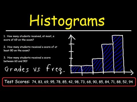
A histogram is a type of chart that we can use to understand the data distribution of a continuous variable.
The video shows the basic R code for producing a histogram chart in RStudio and how to interpret the result.
This video is part of the series on R for Data Science.
In the video you'll see how to create univariate graphics such as a histogram using ggplot in RStudio.
A histogram is a type of chart that we can use to understand the data distribution of a continuous variable.
The video shows the basic R code for producing a histogram chart in RStudio and how to interpret the result.
This video is part of the series on R for Data Science.
 0:07:21
 0:04:38
 0:04:00
 0:11:16
 0:03:31
 0:06:32
 0:02:36
 0:06:32
 0:01:00
 0:03:58
 0:06:08
 0:00:23
 0:07:16
 0:05:57
 0:03:40
 0:03:21
 0:01:29
 0:01:57
 0:02:36
 0:08:10
 0:08:11
 0:05:43
 0:01:46
 0:01:34