filmov
tv
Responsive Website Using HTML & CSS In Tamil | Media Query In CSS Tamil | CSS Animation Tamil |

Показать описание
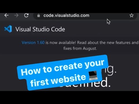
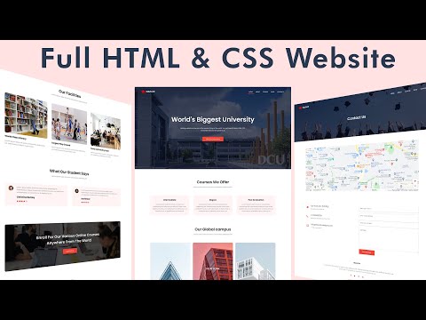
Welcome to our in-depth tutorial on creating a Responsive Website using HTML and CSS, presented in Tamil! In this video, we will guide you through the complete process of building a website that adapts seamlessly to different screen sizes and devices. Whether you're accessing the website from a mobile phone, tablet, or desktop computer, our responsive design techniques ensure that your site looks great and functions perfectly on any platform.
1. Introduction to Responsive Web Design
Responsive web design is an essential skill for modern web developers. In this section, we'll introduce the concept of responsive design and explain why it's critical for creating websites that cater to a wide range of devices and screen sizes.
Key Points:
What is Responsive Web Design? A brief overview of responsive web design, including its definition and importance in today's multi-device world.
The Evolution of Web Design: How web design has evolved from fixed layouts to responsive, adaptive designs that adjust to different screen sizes.
Benefits of Responsive Design: The advantages of building responsive websites, such as improved user experience, better SEO rankings, and reduced maintenance costs.
2. Introduction to Media Queries
Media queries are the cornerstone of responsive design, allowing you to apply different styles based on the characteristics of the user's device. In this section, we'll introduce you to media queries and explain how they work.
Key Points:
What are Media Queries? An explanation of media queries, including how they enable responsive design by applying different CSS rules based on device characteristics.
Syntax of Media Queries: Understanding the syntax of media queries, including how to target specific screen widths, orientations, and resolutions.
Common Media Query Breakpoints: Overview of common breakpoints used in responsive design, such as those for mobile devices, tablets, and desktops.
Using Media Queries in CSS: How to include media queries in your CSS file and apply styles that adapt to different screen sizes.
3. Implementing Media Queries for Responsiveness
With the basics of media queries covered, it's time to implement them in your project. This section will guide you through applying media queries to make your website responsive.
Key Points:
Setting Up Mobile-First Design: The benefits of adopting a mobile-first approach, where you design for the smallest screen sizes first and then enhance the design for larger screens.
Creating a Responsive Grid Layout: How to use media queries in combination with CSS Grid or Flexbox to create a responsive grid layout that adapts to different screen sizes.
Adjusting Typography for Different Devices: Using media queries to scale text sizes, line heights, and spacing based on the screen size, ensuring readability on all devices.
Making Images and Media Responsive: How to make images, videos, and other media elements responsive using media queries, including techniques like max-width: 100%.
Responsive Navigation Bar: Applying media queries to the navigation bar, transforming it from a horizontal layout on larger screens to a vertical or hamburger menu on smaller screens.
4. CSS Animations for a Dynamic User Experience
Animations can add a dynamic and engaging element to your website, enhancing the user experience. In this section, we will explore how to create smooth and responsive CSS animations.
Key Points:
Introduction to CSS Animations: Overview of CSS animations, including the difference between transitions and keyframe animations.
Creating Basic Animations: Step-by-step guide to creating basic animations, such as hover effects, fades, and slides, using CSS.
Using Keyframes for Advanced Animations: How to create more complex animations using CSS @keyframes, including animations that change multiple properties over time.
Animating with Flexbox and Grid: Examples of how to animate elements within a Flexbox or Grid layout, adding movement and interactivity to your design.
Responsive Animations: How to ensure your animations are responsive and perform well on different devices, including adjusting animation speed and effects based on screen size.
#responsivewebdesign #website #htmlcssjs #html #css #website #websitedesign #webdevelopment #webdesign #frontendforever #responsivewebsite #responsivelandingpages #javascript #javascripttutorial #javascripttamil #javascriptintamil #jstamil #javascripttutorial #javascriptprojects #jstutorial #jstutorialforbeginners #html #css #htmltamil #csstamil #cssanimationintamil
Website👇
Facebook Group👇
Telegram Group👇
Whatsapp Group👇
Instagram👇
LinkedIn👇
Stay Connected
Don't forget to like, share, and subscribe to our channel for more tutorials and updates
 0:09:39
 0:38:27
 0:21:17
 0:00:14
 0:04:18
 0:48:12
 2:02:22
 0:00:07
 0:15:29
 0:00:09
 0:00:30
 0:00:26
 0:00:10
 0:17:31
 0:00:23
 0:00:22
 0:00:11
 1:11:59
 0:00:24
 0:00:11
 0:25:27
 0:19:16
 0:00:17
 0:09:44