filmov
tv
Graffiti Tutorial: How to improve Letter Structure | Letter A

Показать описание
Hey everyone! In this video I go over the long requested tutorial- Letter Structure! This is a video that has been requested by a lot of viewers for a while now, and here it finally is! Letter Structure Tutorial
Video in a nutshell:
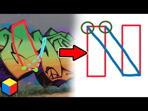
1) Practice the basic structure of letters (rectangles for bombs and rounded corners for throwies)
2)Once you got that down, begin to experiment with your letters along that same basic structure/flow enough to add some style but not deviate too far from the original letter
3) Once your comfortable forming letters passed the basic structure point and onto the semi-styled point (step 2), feel free and don't hesitate to really start letting your imagination run wild and start to create the craziest letters you can!
Thinking about doing the VR part of this video for every letter in the alphabet. What do you think? Comment below!
▼Check out my clothing brand:▼
▼Subscribe to my channel!▼
▼Follow Me!▼
#LetterStructure #Tutorial #VRGraffiti #TheWalkinGiant
Intro: (0:00)
Basic Letter Flow: (0:14)
Letter A: (2:36)
Letter A (Kingspray VR): (6:09)
Outro: (8:50)
Video in a nutshell:
1) Practice the basic structure of letters (rectangles for bombs and rounded corners for throwies)
2)Once you got that down, begin to experiment with your letters along that same basic structure/flow enough to add some style but not deviate too far from the original letter
3) Once your comfortable forming letters passed the basic structure point and onto the semi-styled point (step 2), feel free and don't hesitate to really start letting your imagination run wild and start to create the craziest letters you can!
Thinking about doing the VR part of this video for every letter in the alphabet. What do you think? Comment below!
▼Check out my clothing brand:▼
▼Subscribe to my channel!▼
▼Follow Me!▼
#LetterStructure #Tutorial #VRGraffiti #TheWalkinGiant
Intro: (0:00)
Basic Letter Flow: (0:14)
Letter A: (2:36)
Letter A (Kingspray VR): (6:09)
Outro: (8:50)
 0:00:28
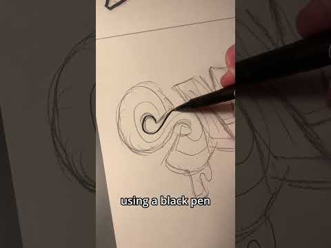
Graffiti Tutorial #shorts
 0:00:37
How to make your graffiti tags looks better - For beginners #graffiti #learn #shorts
 0:00:56
Reasons Why Your Graffiti Tags Don’t Look Good | As a Beginner #graffiti #youtube #tutorial #shorts...
 0:00:30
Simple ways to make your graffiti pieces look better #shorts #graff #graffiti
 0:09:08
Graffiti Tutorial: How to improve Letter Structure | Letter A
 0:00:21
Graffiti sketch tips! #howtodraw #sketchbook #drawingtutorial #graffiti
 0:12:12
12 Levels of Graffiti: Easy to Complex | WIRED
 0:00:23
Try these tips out on your next graffiti piece 🤩✌️
 0:54:09
34 Ataroa soutient la science - Cities: Skylines II patch 2.0 [FR]
 0:00:47
How to improve your graffiti straight letters #graffiti #shorts #youtube
 0:08:17
10 Graffiti Habits You Should Develop
 0:00:45
How to make your graffiti throwies look better | For beginners #graffiti #youtube #shorts
 0:00:16
Tutorial “T” #graffiti #graffitiartist #graffitibomb #graffitiletters #graffitistyle #graffitivideo...
 0:00:13
tutorial, of graffiti sticker hope u like it
 0:00:38
Use these tips to do your first graffiti throwie 🤩🫶 #graffiti #shorts
 0:08:49
Graffiti Handstyle Tutorial (Fundamentals Explained)
 0:07:06
5 TIPS FOR GREAT GRAFFITI SKETCHES
 0:00:59
How to make your graffiti throwups look better | For beginners #graffiti #graffititutorial #shorts
 0:00:23
How To Graffiti Letter A 😳
 0:03:23
🔥 This will improve your GRAFFITI OUTLINE skills!🔥
 0:12:36
1 Skill that will IMPROVE Your ART 100% (it works for ME!)
 0:05:37
🔥 This will improve your fading skills🔥 [Graffiti]
 0:10:17
How To Graffiti Pieces: Everything You Need To Know!
 0:00:16
HOW TO CREATE A TAG #tag #graffiti
Комментарии