CSS Flip Card Effect

preview_player
Показать описание
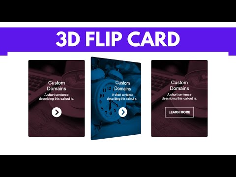
Create a flip card using just HTML and CSS3. The process requires just 5 essential blocks of CSS code. Flip cards are great space-savers for website content, and can greatly boost online user experiences. The code snippet for this tutorial is in the comments.
Рекомендации по теме
Комментарии
Автор

Here is the code snippet for this tutorial on CSS flip cards. Feel free to customise the code and content for your projects.

<!DOCTYPE html>
<html>
<head>
<meta charset="utf-8" name="viewport" content="width=device-width, initial-scale = 1">
<title>CSS Card Flip</title>
<style>
body{
background: #3C5377;
}

/* THE MAINCONTAINER HOLDS EVERYTHING */
.maincontainer{
position: absolute;
width: 250px;
height: 320px;
background: none;
top: 50%;
left: 50%;
transform: translate(-50%, -50%);

}

/* THE CARD HOLDS THE FRONT AND BACK FACES */
.thecard{
position: relative;
top: 0;
left: 0;
width: 100%;
height: 100%;
border-radius: 10px;
transform-style: preserve-3d;
transition: all 0.8s ease;
}

/* THE PSUEDO CLASS CONTROLS THE FLIP ON MOUSEOVER AND MOUSEOUT */
.thecard:hover{
transform: rotateY(180deg);
}

/* THE FRONT FACE OF THE CARD, WHICH SHOWS BY DEFAULT */
.thefront{
position: absolute;
top: 0;
left: 0;
width: 100%;
height: 100%;
border-radius: 10px;
backface-visibility: hidden;
overflow: hidden;
background: #ffc728;
color: #000;
}

/* THE BACK FACE OF THE CARD, WHICH SHOWS ON MOUSEOVER */
.theback{
position: absolute;
top: 0;
left: 0;
width: 100%;
height: 100%;
border-radius: 10px;
backface-visibility: hidden;
overflow: hidden;
background: #fafafa;
color: #333;
text-align: center;
transform: rotateY(180deg);
}


/*This block (starts here) is merely styling for the flip card, and is NOT an essential part of the flip code */
.thefront h1, .theback h1{
font-family: 'zilla slab', sans-serif;
padding: 30px;
font-weight: bold;
font-size: 24px;
text-align: center;
}

.thefront p, .theback p{
font-family: 'zilla slab', sans-serif;
padding: 30px;
font-weight: normal;
font-size: 12px;
text-align: center;
}
/*This block (ends here) is merely styling for the flip card, and is NOT an essential part of the flip code */
</style>
</head>

<body>
<div class="maincontainer">

<div class="thecard">

<div class="thefront"><h1>Front of Card</h1><p>This is the front of the card. It contains important information. Please see overleaf for more details.</p></div>

<div class="theback"><h1>Back of Card</h1><p>Your use of this site is subject to the terms and conditions governing this and all transactions.</p>
<button>Submit</button></div>

</div>
</div>

</body>
</html>

ArjunKhara
Автор

WTF. In 6 minutes everything explained. And then the sandwich example. Wow respect. Perfect explained.

TomTom-jvsv
Автор

that's called the way of explaining things perfectly, Respect you to provide the quality content

naushadansari
Автор

Finally! An easy-to-understand tutorial that gets straight to the point and it works

rileygriffin
Автор

This is a fantastic tutorial. After watching several tuts of flipping cards your explanation put it all together for me. I really appreciate it!

bretts
Автор

Had been banging my head onto every YT tutorial to create a flip card.... And this is the Best and Easiest so far .... LiferSaver Thanks Man for this .... Keep Going!!!

sayurikamble
Автор

This tutorial is gold. Not only it shows you how to achieve the desired effect in a straight to the point way, but it then takes the time to explain how everything works and why! Thank you for making this

gwija
Автор

Just subbed because your explanation was so on point! Thanks for not wasting time with fluff and explaining everything with great examples :)

DrHappybone
Автор

Thank you so much, your explanation about the css flip card was perfect!

arthurvinicius
Автор

great tutorial. really loved the sandwich example, it cleared the one doubt i had. Make more videos, please

Автор

great tutorial, after looking at lots of different resources I still felt a bit stumped, but after watching this video I understand how to get the desired flip effect, and also understand how I could create other unique 3d effects using this process

TheDanthelion
Автор

This is my wish for an instructive css tutorial come true!! thank you!!

bambubombon
Автор

Brilliant video! and thank you for taking your time to really explain step by step what each code means!

greene
Автор

Everything explained, understable. Great video!

aleksajovanovic
Автор

Thank you, Arjun. I have struggled to get this great feature to work for days... until I found your channel. Now I have a prettier website. Have a great day!

alexgochenour
Автор

this is what I need...
thanks for your clear and concise explanation :)

aaijalni
Автор

I know this is an older video - but thank you - this was a wonderful explanation

jaydenmoon
Автор

I have only admiration for your work, the way you explain and the way you show all posibilities of which would and wouldn't work, you are amazing and help loads building up own logic ! I wish you would have invested more time into this.

dariusarad
Автор

Thank you! Your tutorial is really clear and helpful!

wenchinyu
Автор

Thank you! Really good tutorial. Easy to follow and good explanation!

carinwood
visit shbcf.ru