filmov
tv
Bar Chart | Bar Graph | Stacked Bar Chart | Bar Graphs in Python Using Matplotlib|Stacked Bar Charts

Показать описание
Bar graphs/Bar charts/Column charts are the most common and basic technique used by analysts to plot or visualize the data and are very frequently used. If you are a beginner and want to learn how to start with visualization using Matplotlib and willing to use bar graphs, then just check this out.
In this video we have covered:
►00:00 - Introduction
► 01:16 - Creating a Basic Bar Graph or Chart
► 02:20 - Changing the Width of columns in a Bar Chart
► 02:44 - Changing the Color of columns in a Bar Chart
► 03:08 - Changing the Alignment of Columns to "Edge" or "Center" in a Bar Chart
► 04:36 - Stacking two columns in a Bar Chart
► 07:12 - Stacking multiple columns in a Bar Chart to make it a stacked Bar Graph
► 09:08 - Adding Legends to a Bar Graph
► 10:22 - Changing the location of Legends on a Bar Graph
Refer to the below link to get a full list of colors which can be used in matplotlib charts:
Contacts:
Download the excel files for practice data
#Python #Matplotlib #Python #Pythontutorial #Pythononlinetraining #Pythonforbeginners #PythonProgramming #PythonMatplotlib
 0:07:49
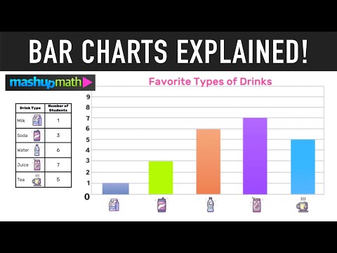
Bar Charts and Bar Graphs Explained
 0:04:11
Bar Graphs for Kids (Grade 1 and Grade 2) - Learn How to Read and Interpret Bar Graphs.
 0:05:23
Types of Bar Charts:Simple, Multiple and Component Bar Charts #barchart #bargraph #datavisualization
 0:04:00
Bar Graphs for 2nd Grade Kids - Create your own Bar Graph
 0:02:47
What is a Bar Chart?
 0:07:35
Bar Charts, Pie Charts, Histograms, Stemplots, Timeplots (1.2)
 0:01:00
Types of Bar Graphs #barchart #datarepresentation #datavisualization #bargraph #columncharts
 0:03:20
How to Make a Bar Graph in Excel
 0:52:42
ALL BANKING EXAM 2025 | RRB | IBPS | SBI | Bar Graph Part - 02 | D.I BASICS to ADVANCE | Bharat Sir
 0:00:16
How to reverse order in Excel Bar Chart #shorts
 0:03:20
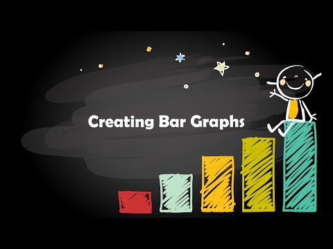
Creating Bar Graphs
 0:00:18
Draw a Multiple Bar Diagram in Excel
 0:02:28
Making a Bar Chart
 0:01:55
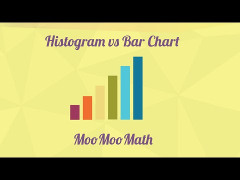
How a histogram is different than a bar chart?
 0:05:20
Drawing a bar graph from the given data - 4th grade math
 0:04:24
Bar graphs in Stata®
 0:02:59
Reading bar graphs | Applying mathematical reasoning | Pre-Algebra | Khan Academy
 0:06:36
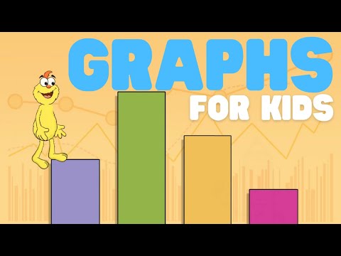
Graphs for Kids | Learn all about basic graphs
 0:08:04
Libreoffice Bar Chart Tutorial - Bar Graphs
 0:00:16
Draw Bar Graph | Easy drawing | #drawings #shorts
 0:00:44
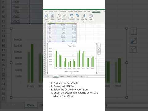
📊 How to create and design a Clustered Column Chart in Excel using Quick Styles
 0:02:54
Bar Graphs & Picture Graphs Song | 2nd Grade - 3rd Grade
 0:13:49
Bar chart with differences in Excel
 0:00:29
🔴Excel: How to Create Bar Graphs? @ZellEducation @Zell_Hindi
Комментарии