filmov
tv
How to Make Acrylic Paint Vibrant, Opaque & Brighter

Показать описание
How to make acrylic paints vibrant, opaque and bright. Let's go through a few problems with acrylic painting and how to fix them.
WATCH NEXT
MY ACRYLIC PAINTING SUPPLIES
• Nature Art Acrylic Colours (from Lidl)
• Crelando Acrylic Paints (from Lidl)
• cardboard primed with gesso / watercolor paper
• little pots to keep paint wet
• plastic paint palette
• round brushes
DISCLAIMER
Links marked with * are affiliate/referral links that let you support the channel at no extra cost to you.
********************************************************************
If you have issues with acrylics not being opaque enough or the colors not being vibrant and bright, you might be making some of these mistakes. (I don't really like calling them mistakes, though.) But you might find the quick acrylic painting tips for beginners in this video helpful to solve those issues.
1. The colors look different, when the painting is dry.
2. Your acrylics are not as opaque as you'd like. When you're painting a lighter color on top of a darker one, the darker color shows through. I didn't mention in the video why there are transparent and opaque acrylics. You can use transparent acrylics for glazing, where you paint transparent layers on top of a monochrome underpainting, for example.
3. Colors soak into the painting surface and lose vibrancy. This might happen if you're painting onto an unprimed surface, such as cardboard.
4. The colors you mix turn muddy or muted instead of bright and vibrant. I've had this issue with trying to mix a bright purple or orange, for example. I forgot to mention in the video that it's a good idea to use muted colors, too! If your painting has muted colors with a few bright spots, the bright colors will stand out more.
Have you had these or any other problems while painting with acrylics? Tell me in the comments.
********************************************************************
********************************************************************
YOUTUBE SET-UP
Microphone: Camera's microphone
Audio editing: Audacity
WHAT'S NEXT
SHOP
FOLLOW
MUSIC
 0:00:59
Homemade Acrylic Paint Colour | How To Make Acrylic Colour At Home
 0:00:30
Diy acrylic paints at home😲🤩#diy #trending #shorts
 0:01:09
How to Make Acrylic Paint Thicker
 0:00:16
diy varnish for acrylic paint 😱 at home #shorts #viral #diy #craft #homemade
 0:00:59
How to Turn 'DOMS Sketch Pen' into Acrylic color || How To Make Acrylic Color At Home #Sho...
 0:03:34
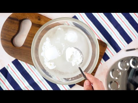
How to make acrylic paint at home | Homemade acrylic paint | Water colour paint making easy
 0:22:18
How I Make My Range of Acrylic Paint
 0:01:00
Everything You Wanted To Know About Acrylic Painting
 0:32:43
Colinsteedart. How to use acrylic to paint 'Broadway Tower'. The full demonstration.
 0:00:40
QUICK 🎨 TIP || Oil Vs Acrylic 💪 The Ultimate Showdown
 0:15:44
Making My Own Acrylic Paint With Powdered Pigments
 0:00:13
Get my supply sheet to make your own #shorts #painting #art
 0:00:20
Easy Acrylic Painting for Beginners | How to paint Flowers || Painting Tutorials #Satisfying
 0:08:06
Make your own POURING MEDIUM - Easy + Basics + Beginners ~ Acrylic Pouring
 0:05:53
How To Make Your Acrylic Paintings POP! (Bright and Saturated Colour)
 0:01:00
Trying Out Himi Acrylic Paint
 0:12:41
How to make acrylic paint at home | How to make paint at home|How to make colors at home| Diy paint
 0:00:43
Cotton Candy Clouds | Easy String Lights Acrylic Painting | Mini Canvas Painting Idea
 0:14:06
Acrylic Painting for Beginners: Techniques & Supplies
 0:00:35
How to use Acrylics like Watercolors!
 0:01:00
The Difference Between Gouache, Watercolor, and Acryla Gouache (With Special Appearance By Acrylics)
 0:00:28
Mixing Salt in Acrylic Paint to create sand like texture for beautiful green ocean #series
 0:00:59
EASY Acrylic Pouring Technique - Just PAINT and WATER #SHORTS
 0:03:16
How Luxury Paint Is Made | The Making Of
Комментарии