filmov
tv
How To Start Watercolor Painting (10 Starter Colors!)

Показать описание
The essentials set contains: Hansa Yellow, Dairylide Yellow, Phthalo Blue (green shade), French Ultramarine, Permanent Rose, Pyrrole Red, Yellow Ochre, Raw Umber, Burnt Sienna, Payne's Grey
0:00 Introduction and about Primary Colors
4:43 Hansa Yellow
5:29 Diarylide Yellow
7:18 Phthalo Blue (Green Shade)
8:19 French Ultramarine
10:38 Permanent Rose
11:58 Pyrrole Red
12:48 Yellow Ochre
14:22 Raw Umber15:18 Burnt Sienna
16:32 Payne's Grey
EXTRA RESOURCES:
GRAB Your Free PDF downloads:
SHOW NOTES AND LINKS:
The video I mentioned about Pink is here:
Disclaimer: Some of the product links above may be affiliate links which pay this channel a small commission (at no extra cost to the buyer) which enables me to make more free videos for you to enjoy. Thanks for your support!
 0:14:46
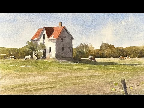
How & Where to Start with Watercolor Painting for Beginners
 0:16:14
The Very FIRST Watercolor Lesson for Beginners | Watercolor Painting for Beginners - Lesson 1
 0:08:25
How to Start Your Watercolor Painting (Four Steps)
 0:08:39
9 Minute Watercolor Tutorial for Absolute Beginners - Start Painting Today!
 0:05:25
Learn to Paint Watercolor in 5 Minutes - Easy Beginner Watercolor Lesson
 0:06:17
Watercolor Lessons for Beginners
 0:06:38
Watercolour Painting: Absolutely what You need to Know to get Started - PART 1
 0:24:28
The ultimate WATERCOLOUR TUTORIAL | For beginners | Drawlikeasir
 0:21:48
How To Start A Watercolour Painting
 0:11:50
Biggest mistake I see beginner watercolor artists make, and how to fix it
 0:20:29
Beginner Watercolour Techniques YOU NEED TO KNOW! Episode 1
 0:11:23
Watercolor Supplies For Beginners | What You Need To Get Started!
 0:14:38
A Crash Course on How to Watercolor
 0:09:44
How to Start a Watercolor
 0:13:56
How to START Watercolor Painting (from Zero Knowledge!)
 0:15:48
Easy Watercolor Painting for Beginners (step by step)
 0:18:41
How To Start Watercolor Painting (10 Starter Colors!)
 0:19:50
Beginners, This Skill Is A GAME CHANGER!
 0:06:40
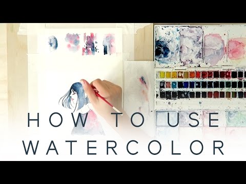
HOW TO USE WATERCOLOR - Introduction Tutorial
 0:07:03
How to Start Your Watercolor Painting - (Preparing your supplies and space)
 1:51:50
The Complete Beginner's Guide to Watercolor
 0:14:40
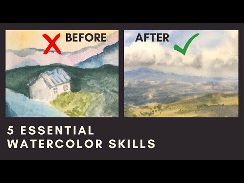
The 5 Essential Watercolor Skills (that completely changed my paintings)
 0:08:53
If I Started Over as a Watercolor Beginner, I’d Buy These Supplies First
 0:25:19
Getting STARTED With Watercolour - Everything you need to know as a beginner
Комментарии