filmov
tv
Responsive Design In Figma - Complete Guide In 7 Minutes

Показать описание
Welcome to Responsive Design in Figma: Crash Course 2024 in UI3! 🎨 Whether you're new to Figma or looking to level up your design skills, this video is your ultimate guide to mastering responsive design.
In this crash course, I’ll walk you through:
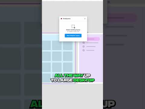
✅ Setting up responsive layouts.
✅ Using constraints effectively.
✅ Adapting designs for desktop, tablet, and mobile views.
By the end, you'll be equipped with the skills to create flexible and visually stunning designs for any screen size. Don't forget to like, comment, and subscribe for more UX/UI design tips and tutorials! 🚀
0:00 Introduction to Responsive Design
0:30 Setting Up Your Design
1:15 Responsive Navigation Bar
2:00 Adjusting the Background
3:15 Working with Images and Illustrations
4:00 Creating a Tablet View
5:00 Designing for Mobile
 0:13:46
Create Responsive Website Designs | Figma Tutorial
 0:19:46
Figma RESPONSIVE DESIGN using Variables, Layout grids and Auto Layout | Figma 2024
 0:20:47
Responsive Design in Figma: Crash Course 2023
 0:06:05
Responsive Design in Figma: Master Auto Layout!
 0:03:54
Responsive Web Design Has Never Been This Easy | Figma Breakpoints
 0:00:25
Figma Plugin For Responsive designs
 0:15:22
Figma Responsive Design for Development (Box Model + Auto Layout)
 0:26:30
Responsive Website In Figma
 1:52:28
Live Figma Design Exercise Part 1 - Setting Up The Design System
 0:06:10
Responsive Design in Figma The ONE Tip You Need ⚡️
 0:00:27
Creating responsive designs in figma
 0:00:35
Settings Device Breakpoint Variables in Figma!📱💻🖥️#figma #uiux #figmadesign #figmadesign#shortsfeed...
 0:19:20
Responsive Design Beginner's Tutorial for Figma
 0:07:07
Responsive Design In Figma - Complete Guide In 7 Minutes
 0:18:36
Responsive Design In Figma | Figma Tutorial 2025 | Responsive Design Using Figma | Simplilearn
 0:10:18
How To Make ANY Design Responsive in Figma
 0:13:27
Responsive design in Figma using Auto Layout and Local Variables
 0:00:38
How to use Figma Auto Layout wrap tutorial 2023 #figma #figmatips #figmatutorial #figmadesign #ui
 0:10:25
Fully responsive website design in figma ( From beginner to advanced )
 0:16:59
Figma UI3 Auto-Layout & Responsive Modes
 0:14:18
Responsive Web Design in 12mins | Figma Tutorial
 0:05:17
Responsive Design sur Figma | Tutoriel Complet
 0:10:55
Make an Entire Layout Responsive in Figma - In 10 Minutes
 0:00:37
Responsive Figma designs with Breakpoints 🤯
Комментарии