filmov
tv
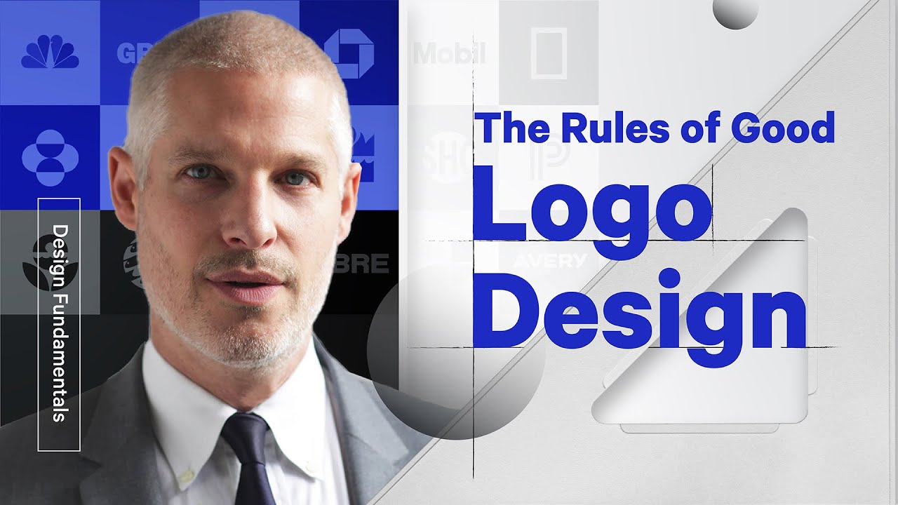
The 3 Rules of Good Logo Design

Показать описание
How do you design a good logo? What makes a logo great? How do you create a good logo? What are the rules and design principles behind logo design?
In this video, Sagi Haviv tells us his 3 tips for what makes a good logo:
1. Appropriate – logos should be appropriate in it's feeling.
2. Distinctive & Memorable – It has to be unusual enough to persist in our mind. It should pass the "doodle test."
3. Simple – It needs to be able to be produced in every pixel size.
When you strike the balance of these 3 things, you have a good logo.
Check out our full interview with Sagi here:
Chermayeff & Geismar & Haviv is the brand design firm behind many of the world’s most recognizable trademarks. Since 1957, the firm has pioneered the modern movement of idea-driven graphic design across every discipline, specializing in brand identities, exhibitions, print and motion graphics, and art in architecture.
#logo #sagihaviv #createlogo
--
Want a deeper dive? Typography, Lettering, Sales & Marketing, Social Media and The Business of Design courses available here:
—
Love the content? Become a sustaining member for $5/mo today.
Our BOOKLIST:
Kits & Proposals:
Visit our website:
FREE resources:
Mandarin (Chinese) Subtitles on UiiUii
—
We love getting your letters. Send it here:
The Futur
c/o Chris Do
1702 Olympic Blvd.
Santa Monica, CA 90404
USA
—
AFFILIATE LINKS*
🙏 Support The Futur but purchasing through our affiliate links:
✍️ Sharpen your skills by taking a course, using our affiliate links:
🎧 Do you like the music? Check out the music libraries we use in our affiliate links below:
*By making a purchase through any of our affiliate links, we receive a very small commission at no extra cost to you. This helps us on our mission to provide quality education to you. Thank you.
—
Futur Podcast on iTunes: 🎙
Spotify: 🎙
—
Host– Chris Do
Cinematography– Aaron Szekely, Mark Contreras, Ricky Lucas
Live Editor– Jona Garcia
Editor– Stewart Schuster, Mark Contreras, Aaron Szekely, Ricky Lucas, Jona Garcia
Social Team: Elle Money, Alex Burlui
Typefaces: Futura, DIN, Helvetica Neue, Calibre
Futur theme song— Adam Sanborne
Комментарии
 0:02:05
 0:03:40
 0:00:11
 0:25:56
 0:05:23
 0:04:03
 0:13:22
 0:11:44
 1:03:27
 0:00:21
 0:00:24
 0:00:20
 0:00:16
 0:03:08
 0:02:02
 0:00:30
 0:00:25
 0:05:51
 0:00:20
 0:00:10
 0:02:00
 0:00:09
 0:00:16
 0:02:08