filmov
tv
20th Century Fox/TSG Entertainment/CE (2017)

Показать описание
"The Greatest Showman" (2017).
An old-fashioned 20th Century Fox logo with its Trademark Fanfare is seen for a few seconds. It was from a 4K digital scan of the 1958 film "The Long, Hot Summer".
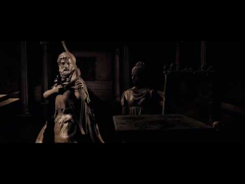
Then we see the modern version of the logo, along with TSG Entertainment and Chernin Entertainment. They are shown in sepia tone and music from the movie plays during the logos.
Preatty neat and applicable variation, don't you think?
(First time seeing this film, it already became one of my favorites)
20th Century Fox/TSG Entertainment/CE (2017)
20th Century Fox / TSG Entertainment / Chernin Entertainment (The Greatest Showman)
20th Century Fox/20th Century Fox/TSG Entertainment/Chernin Entertainment
20th Century Fox/TSG Entertainment/Chernin Entertainment (2017)
20th Century Fox/TSG Entertainment/Scott Free Productions (2017)
20th Century Fox / TSG Entertainment / Chernin Entertainment (2018)
Netflix/20th Century Fox/TSG Entertainment/Chernin Entertainment (2013/2017)
20th Century Fox/20th Century Fox/TSG Entertainment/Chernin Entertainment (2017)
Disney+ Original/20th Century Fox/TSG Entertainment/Chernin Entertainment (2019/2017)
20th Century Fox/TSG Entertainment/Chernin Entertainment (2017)
20th Century Fox/TSG Entertainment/Samuel Goldwyn Films
TSG Entertainment
20th Century Fox / TSG Entertainment / Chernin Entertainment (2017)
20th Television (2017) / Modified Screen / 20th Century Fox (x2) / TSG Entertainment / CE (2017)
20th Century Fox / TSG Entertainment / Chernin Entertainment (War of the Planet of the Apes variant)
20th Century Fox (2x, 1953/2017) / TSG Entertainment / CE (2017)
20th Century Fox / TSG Entertainment / Chernin Entertainment (Dawn of the Planet of the Apes)
20th Century Fox (x2)/TSG Entertainment/Chernin Entertainment (2017)
20th century fox tsg Cce pictures 2017
20th Century Fox (blue but looks gray)/TSG Entertainment/Scott Free (2017)
20th Century Fox and CE (2017)
20th Century Fox / TSG Entertainment / CE (Warp Speed) (2014)
20th Century Fox / TSG Entertainment / Scott Free (2017)
20th Century Fox / TSG Entertainment / Marvel (2017) with TV-MA LSV Rating
Комментарии
 0:00:39
 0:00:42
 0:00:36
 0:00:53
 0:00:49
 0:00:54
 0:01:04
 0:00:37
 0:01:06
 0:00:51
 0:00:43
 0:00:11
 0:01:01
 0:00:46
 0:00:49
 0:00:35
 0:00:44
 0:00:41
 0:00:52
 0:00:48
 0:00:39
 0:00:36
 0:00:52
 0:00:45