filmov
tv
How to Make a Responsive Design in Adobe XD | Adobe Creative Cloud

Показать описание
Scale your app design for optimal display across different screen sizes.
Preview without Responsive Resize:
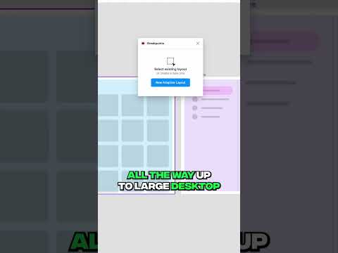
2. Duplicate the start artboard: Click the artboard name, press Control+D (Windows) or Command+D (macOS).
3. Select the second artboard. Double-click the artboard name and rename it.
4. Note that Responsive Resize is turned off in the Property Inspector.
5. Drag the right center handle to resize the artboard. Notice the artboard resizes, but none of the other design elements do. Use Control+Z or Command+Z to undo and reset the artboard size.
Enable Responsive Resize:
1. Toggle the Responsive Resize setting so it is turned on.
2. Select the artboard again and use the right center handle to resize the artboard.
3. Notice the featured images, navigation, and headline do not resize correctly. Undo to reset the artboard.
Note: Responsive resize speeds up your design workflow, but you will still need to make manual adjustments.
Override Auto settings:
1. Shift+click to select both featured images.
2. Tap Manual in the Responsive Resize section of the Property Inspector.
3. Deselect Fixed Width and resize the artboard again.
4. Shift+click to select both featured images, hold Alt or Option as you drag the middle right handle to make the images wider and decrease the padding between the images and the edges of the artboard.
5. Shift+click to select the Gallery label, gallery images, and the Featured label. Hold Shift as you drag to move these to the left of the artboard.
Tip: Holding shift as you drag to the right constrains the movement horizontally.
6. Expand the Gallery layer in the Layers panel.
7. Click to select the Repeat Grid.
8. Extend the right handle to reveal three photos.
9. Expand the title layer under Gallery in the Layers panel.
10. Select the dots layer and hold Shift as you drag the three dots to the right margin.
Make manual adjustments:
1. Expand the Hero layer, then expand the Main layer.
2. Select the title group.
3. Hold Shift as you drag a corner handle to resize proportionally.
4. Drag to move the title group into position using the guides to center.
That's it!
To watch with Subtitles/closed captions, click the CC icon in the lower-right corner.
About Adobe Creative Cloud:
Adobe Creative Cloud gives you the world's best creative apps so you can turn your brightest ideas into your greatest work across your desktop and mobile devices.
Connect with Adobe Creative Cloud:
#AdobeXD
How to Make a Responsive Design in Adobe XD | Adobe Creative Cloud
Preview without Responsive Resize:
2. Duplicate the start artboard: Click the artboard name, press Control+D (Windows) or Command+D (macOS).
3. Select the second artboard. Double-click the artboard name and rename it.
4. Note that Responsive Resize is turned off in the Property Inspector.
5. Drag the right center handle to resize the artboard. Notice the artboard resizes, but none of the other design elements do. Use Control+Z or Command+Z to undo and reset the artboard size.
Enable Responsive Resize:
1. Toggle the Responsive Resize setting so it is turned on.
2. Select the artboard again and use the right center handle to resize the artboard.
3. Notice the featured images, navigation, and headline do not resize correctly. Undo to reset the artboard.
Note: Responsive resize speeds up your design workflow, but you will still need to make manual adjustments.
Override Auto settings:
1. Shift+click to select both featured images.
2. Tap Manual in the Responsive Resize section of the Property Inspector.
3. Deselect Fixed Width and resize the artboard again.
4. Shift+click to select both featured images, hold Alt or Option as you drag the middle right handle to make the images wider and decrease the padding between the images and the edges of the artboard.
5. Shift+click to select the Gallery label, gallery images, and the Featured label. Hold Shift as you drag to move these to the left of the artboard.
Tip: Holding shift as you drag to the right constrains the movement horizontally.
6. Expand the Gallery layer in the Layers panel.
7. Click to select the Repeat Grid.
8. Extend the right handle to reveal three photos.
9. Expand the title layer under Gallery in the Layers panel.
10. Select the dots layer and hold Shift as you drag the three dots to the right margin.
Make manual adjustments:
1. Expand the Hero layer, then expand the Main layer.
2. Select the title group.
3. Hold Shift as you drag a corner handle to resize proportionally.
4. Drag to move the title group into position using the guides to center.
That's it!
To watch with Subtitles/closed captions, click the CC icon in the lower-right corner.
About Adobe Creative Cloud:
Adobe Creative Cloud gives you the world's best creative apps so you can turn your brightest ideas into your greatest work across your desktop and mobile devices.
Connect with Adobe Creative Cloud:
#AdobeXD
How to Make a Responsive Design in Adobe XD | Adobe Creative Cloud
 0:15:54
5 simple tips to making responsive layouts the easy way
 0:23:13
A practical guide to responsive web design
 0:21:17
17: How to Make a Website Responsive | Learn HTML and CSS | Full Course For Beginners
 0:08:18
How To Make Website Responsive Using CSS Media Queries | Responsive Web Design Tutorial
 0:00:16
Critical Responsive Layout Tips
 0:09:44
Master Media Queries And Responsive CSS Web Design Like a Chameleon!
 0:15:16
How to Make a Responsive Website
 0:19:16
How To Make Responsive Website Design Using HTML And CSS Step By Step
 0:01:39
How to Create Responsive Movies Website Design Using Html CSS and JavaScript | @TechnoWhiteFang
 0:15:21
How to create a Responsive Navigation Bar (for beginners)
 0:00:58
5 Responsive Layouts in 60 seconds
 0:00:38
The fastest way to make a webflow design responsive
 0:00:25
Figma Plugin For Responsive designs
 0:00:25
Responsive Templates in FlutterFlow 😎
 0:20:19
24 | MAKE A WEBSITE RESPONSIVE FOR ALL DEVICES | 2023 | Learn HTML and CSS Full Course for Beginners
 1:25:35
🌐 Responsive Web Development: Building Websites for All Devices! 📱💻🖥️
 0:08:00
How to Create Responsive Navigation Bar using HTML and CSS
 0:06:14
Create Responsive CSS Grid Layouts with GRID WRAPPING
 0:27:19
How to create a responsive HTML table
 0:11:04
How to create RESPONSIVE Layouts with CSS GRID
 0:00:44
Turning a Responsive Yoyo Unresponsive
 0:01:00
Responsive design in 59 seconds #shorts
 0:15:13
How To Create a Responsive Navbar Using HTML & CSS | Step By Step Tutorial
 0:04:14
Practical Guide to Responsive Design
Комментарии