filmov
tv
Making Your Sites Tablet and Mobile Friendly With Elementor

Показать описание
Join Ziv Geurts, Designer & Elementor’s Lead Educator, for a step-by-step walkthrough on how to use Elementor’s responsive settings to make sure your sites look great on tablet and mobile devices. The demo site is built with Elementor Pro, but the webinar will cover many topics relevant to all users.
6 Takeaways:
✓ Optimize and style navbar hamburger menus for tablet and mobile [PRO]
✓ Use Elementor’s responsive settings to create device specific designs
✓ Control column width and alignment per device
✓ Use relative units that scale better on devices, such as EM and %
✓ Optimize your Global Fonts for different viewports
✓ Manage Motion Effects for tablet and mobile devices [PRO]
Links mentioned in the Webinar:
Don’t forget to subscribe to our channel!
TIMESTAMPS:
00:00 Introduction
01:52 Site overview on tablet & mobile devices
03:30 Optimize & style the navbar hamburger menu for tablet and mobile
06:51 Tweak the header for mobile, device icons & alignment
09:30 Create device specific layouts using column width & responsive visibility
12:50 Optimize your global fonts for different viewports, understand default behavior & use EM to save time
18:28 Build a simple 2 column, text and image design & apply motion effects with mobile in mind
24:28 Tweak your buttons per device & understand the impact of changing values with settings that don’t have device icons
26:04 PX vs. % use relative units that scale better on devices
27:37 Applying Elementor’s responsive settings to create a custom footer layout for tablet and mobile
 0:36:00
Making Your Sites Tablet and Mobile Friendly With Elementor
 0:13:16
How To Make Your Website Mobile Friendly Using Elementor
 0:17:49
Custom Header Menus for Mobile & Tablet - Different Headers for Different Devices
 0:10:05
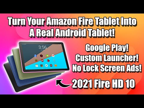
Easily Turn Your Fire Tablet Into A Real Android Tablet! HD10 HD7 HD8
 0:00:42
How to make your Android Tablet aesthetic (clean girl aesthetic) #aesthetic #android #app
 0:00:41
Simple DIY Tablet & Phone Stand / Holder in 1 minute with A4 Sheet Paper Folding
 0:00:28
How to find the perfect tablet area for osu! (?)
 0:00:14
quick sketch in iBisPaint using android phone w/ pen tablet
 0:00:10
Customize 🌹your homescreen Aesthetic | pastel red theme ❤️| BTS theme | Android tablet 🔥|
 0:00:18
MS Word digital note taking feat. pen tablet
 0:00:26
Turn your old Fire tablet into an Echo Show #shorts
 0:00:59
Design smoothly across tablet and desktop using Shapr3D
 0:00:10
Samsung tablet hack I wish I knew sooner🤯 digital notes | samsung galaxy tab tips
 0:06:29
How To Make Your Tablet A Laptop
 0:04:21
How to Make your Tablet a Phone - Works with Any Tablet - Thomas mesen
 0:00:16
3 Fold Bluetooth touchpad keyboard for Tablet/Phone #shorts
 0:00:30
The First Tablet with Android 12L: Lenovo Tab P12 Pro | #shorts #tech #android
 0:08:28
☁️ how to make your tablet aesthetic | samsung tab s6 | Aesthetic | Android
 0:05:06
Make your Amazon Fire Tablet FASTER and BETTER
 0:06:47
How to Make an Old Android Smartphone or Tablet Fast Again
 0:00:27
How to screen record on an Samsung Tablet🖥📱
 0:00:42
Custom templates for reMarkable tablet - Templates vs PDF
 0:03:48
How To Speed Up Your Android Tablet (& Phone!)
 0:01:00
This Android Tablet is on Another Level!
Комментарии