filmov
tv
Psychology of Computing: Crash Course Computer Science #38

Показать описание
We’ve spent most of this series talking about computers. Which makes sense - this is Crash Course COMPUTER SCIENCE after all. But at their core computers are tools employed by humans and humans are pretty complicated. So today, we’re going to discuss some psychological considerations in building computers like how to make them easier for humans to use, the uncanny valley problem when humanoid robots gets more and more humanlike, and strategies to make our devices work better with us by incorporating our emotions and even altering our gaze. Oh, and we'll talk about Carrie Anne's all time favorite user interface design principle - knurling.
Want to know more about Carrie Anne?
Want to find Crash Course elsewhere on the internet?
Want to know more about Carrie Anne?
Want to find Crash Course elsewhere on the internet?
Psychology of Computing: Crash Course Computer Science #38
The Singularity, Skynet, and the Future of Computing: Crash Course Computer Science #40
What Elon musk Said about Computer Science Degree
Complete PBS Crash Course on Computing
pov: you worked harder for gcses than alevels. #shorts #student
Machine Learning & Artificial Intelligence: Crash Course Computer Science #34
The Internet and Computing: Crash Course History of Science #43
Hackers & Cyber Attacks: Crash Course Computer Science #32
Elon Musk on Studying Physics
Alan Turing: Crash Course Computer Science #15
Computer Vision: Crash Course Computer Science #35
How much does ZOOLOGY pay?
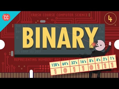
Representing Numbers and Letters with Binary: Crash Course Computer Science #4
my tummy looks like this 🫠👀 #ashortaday
BEST DEFENCE ACADEMY IN DEHRADUN | NDA FOUNDATION COURSE AFTER 10TH | NDA COACHING #shorts #nda #ssb
How much a UX Designer makes
Cybersecurity: Crash Course Computer Science #31
Natural Language Processing: Crash Course Computer Science #36
How much does a UI/UX DESIGNER make?
👀 Asking GCSE Students (Hamdi) How Much They Physics They Know - Part 1 #Shorts
Memory & Storage: Crash Course Computer Science #19
Educational Technology: Crash Course Computer Science #39
#pov : my gcse results vs what i predicted #gcse #gcseresults #gcse2022 #results #shortsvideo
The Computer and Turing: Crash Course History of Science #36
Комментарии
 0:12:39
 0:12:30
 0:00:49
 7:16:52
 0:00:10
 0:11:51
 0:12:28
 0:11:53
 0:01:00
 0:13:04
 0:11:10
 0:00:26
 0:10:46
 0:00:14
 0:00:15
 0:00:47
 0:12:30
 0:11:50
 0:00:33
 0:00:37
 0:12:17
 0:11:52
 0:00:16
 0:11:54