filmov
tv
Interior Design — Luxury Coastal Lake House Cottage
Показать описание
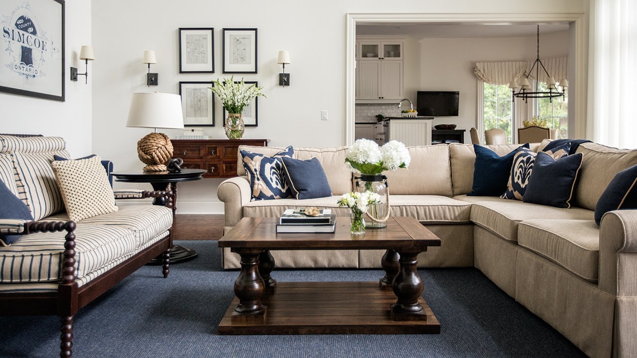
Step inside a stunning, nautical retreat by designer Jessica Waks. See how she mixed classic chic Hamptons style with a country aesthetic to create a space that’s perfect for hosting family and friends.
Jessica used a palette of sand, indigo, cream and black throughout. The foyer hints at what’s to come with a breathtaking lake view and natural accents, including a sisal carpet and a round walnut pedestal table. Tall ceilings in the great room offer a grand feel, while a cozy sectional, slipcovered chairs and a settee with barley-twist arms maximize seating. The family loves to entertain, so a kitchen with a large island and a breakfast nook was essential. Paisley-print wallpaper warms up the dining room, where a long table provides ample seating. With a grand master bedroom, a global-inspired guest bedroom and a third-floor bedroom designed for sleepovers, this lake house is ideal for weekend guests.
----------
MORE DESIGN INSPIRATION
----------
CONNECT WITH HOUSE & HOME!
Interior Design — Luxury Coastal Lake House Cottage
Inside a fully renovated modern home on the Gold Coast, Australia with luxurious coastal interiors
Vantage: An Aussie Coastal Home That Speaks Luxury Resort | House Tour
The Most Luxurious Mediterranean House Design in Australia | House Tour
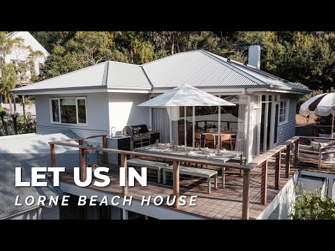
Home Tour! Our Luxury Beach House. Full Walkthrough w Interior Designer. House Tour
Ultimate Minimalist Homes: Concrete Luxury Meets Coastal Vintage Dream House
Our Top 10 COASTAL STYLE Design Tips & Tricks | What is Coastal Style?
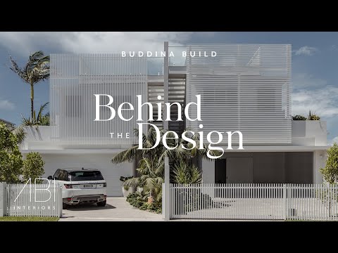
Sundream: A Luxury Modern Coastal Home Unifying Indoor and Outdoor Living | Behind the Design
Dream Luxury Home #shortsfeed #shorts #trending #youtubeshorts #viralvideo #home #house
Luxury Bedroom Interior Design 🤩 #shorts
Inside Dee & Tommy Hilfiger's Mediterranean-Style Home | Open Door | Architectural Digest
A Look Inside a Luxurious Modern Coastal Home on the Sunshine Coast | Behind the Design (House Tour)
A coastal home that speaks luxury resort - explore more on our channel! #coastalhometour
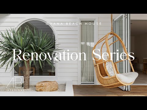
Unveiling the Modern Coastal Ohana Beach House + Exclusive Walkthrough | Renovation Series
Tour an Interior Designer's Malibu Dream Home | At Home With Kelly Wearstler | Harper's BA...
A Remote and Hidden Home with a Breathtaking View and Interior Design (House Tour)
Immaculate Mansion in the SKY with Private Pool | LUXURY HOME TOUR
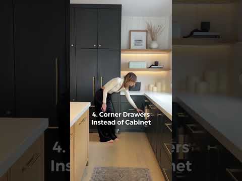
Our 5 favourite essential design features in our kitchen!
Inside ultra luxury Penthouse in Dubai Marina !
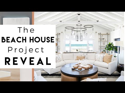
The Beach House Reveal | Interior Design
luxury bathroom
Classic Hamptons Style | Step-By-Step Guide For A Luxury Bedroom Interior Design (EP 1)
Portonovi – Montenegro’s seaside luxury lifestyle resort
HOW TO Decorate MEDITERRANEAN-INSPIRED Interiors | Our Top 10 Insider Design Tips
Комментарии
 0:04:17
 0:12:11
 0:06:42
 0:04:57
 0:19:42
 0:40:38
 0:06:50
 0:04:11
 0:00:58
 0:00:15
 0:12:36
 0:03:21
 0:00:23
 0:06:27
 0:10:44
 0:08:04
 0:29:32
 0:00:29
 0:00:13
 0:24:18
 0:00:06
 0:08:29
 0:00:15
 0:24:53