Swatch with Me: All the Schmincke! | Schmincke Horadam 140-Color Dot Card
preview_player
Показать описание
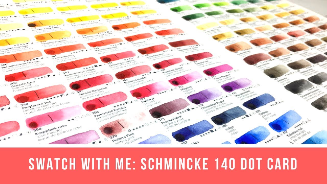
Hello! Today we are doing another Swatch with Me video, this time for the massive 140 Dot Card from Schmincke! I know we just had one of these, but I was pressed for time available for editing and the amazing Oto Kano sent me this beauty in the mail, so I thought why not! I'm so excited to finally see all the Schmincke colors in person to help me better to decide which colors to invest in when the time comes, and I hope it can be a similar reference for you as well!

This video wont be for everyone as we spend two hours rambling on about paint colors and pigment numbers. If you'd like a more concise review, please check out the following videos:

New Jackson's Affiliate Links:

I have created watercolor palettes in collaboration with Da Vinci Paint Co. Your purchase of these palettes and other purchases made with the affiliate links below helps to support two small businesses and this channel:

As an Amazon Associate, I earn from qualifying purchases.

Jackson's Art links are also affiliate links in which a small percentage of the sale supports this channel without costing you more. Thank you for your support!

*** Support & Shop ***

*** Follow***

*** Music ***
Intro and Outro Music by:
"Lights" by Ikson
Рекомендации по теме
Комментарии
Автор

No! I LOVE your commentary; it is how I learn. And, I prefer no music; I want to easily concentrate on what you say. I can play my own favorite music softly in background if want to. Thanks so much for this slow, informative video! I believe I saw a much more recent one with music. But, I did want to put in my vote.:))

josephcollins
Автор

Wonderful video, thank you so, so much! Now I must buy some schmincke, goddamnit. I just need to make two remarks. The short one: there are many combos for convenience mixes like Hooker's, Payne's, neutral tint, sepia etc. In the case of the latter three, the usage of black is actually traditional, with the primary differentiator being them being the colour towards which the mix leans. Of course, another variant is the method of neutralisation (violet+yellow, blue+orange etc), which is traditional too (thus, I find it very strange when people call it Jane's grey when it lacks black, since the combo of sienna/umber + blue has been a version of the Paynes’ way before Jane called it her combo). But even then, neutral tint remains the purple leaning neutral and is not totally neutral. Just like how Payne's grey is not totally grey but leans to blue and sepia leans to warm tones.
Now, for the second comment...

It's art history time!
So, burnt sienna, a ferric oxide pigment, is probably the most ancient pigment, used by ancient civilisations but also by prehistoric men on cave walls. The pigment was called Sienna because of the Italian city of Sienna which offered a stable source for it, and was one of the popular pigments of the Italian master painters we all know and ADORE. Now, somewhat 30+ years ago, the mines in Italy were closed, for environmental reasons and along with them the industry lost its primary source for this colour. And this is when something very strange happened. You see, in Europe, companies started using a synthetic - probably indistinguishable - alternative to the original pigment. The code of the original pigment (which was the only sienna till the 70-80s) was PR102 and the synthetic, nigh-identitical substitute was PR101.
USA brands, on the other hand, decided to use something completely different, you guessed it, PBr7; a pigment traditionally used to produce the colour identified as (burnt) umber. So, technically, you should be mad at the American brands for mislabeling their product, because PBr7 colours labelled as Sienna should in fact, be labelled as (burnt) Umber Sienna-ish, at best. After all, there was no PBr7 in the mines of the city of Sienna.
I believe that handprint (a pseudo-scientific but rather prejudiced and flawed - in the technical aspect of the methods followed- source) also makes the same mistake. You can look further for umber and sienna in the pages of Wikipedia and especially in the printed material provided in the footnotes.

DrPhilologist
Автор

German here. If you’re confused by them calling certain colors “transparent” when they aren’t really, that’s because the translation is occasionally a bit wonky. “Lasur” means glaze in German, but they tend to translate it as transparent. Similarly the olive green is green olive (grünoliv).

.
Автор

This was really interesting -- in this 2 hours, I probably learned more about watercolor paints and mixtures than from any class or book. It's so nice to hear from someone who has actually done the research and is not just basing their info on personal preference. Thank you for taking the time to do these beautiful paints justice.

barbhayes
Автор

Gasp! Oto! Such an enabler. Denise will never get over her swatch addiction at this rate! -- I joke! Please never stop. These swatching videos are wonderful and I'm forever amazed by the amount of time and work you put in for us so we can see all the pretty colours. 💜

LeySketch
Автор

This mammoth Schmincke colour exercise is most valuable to me. I was exhausted just watching and taking notes. Thank you for the information, I have saved it to my Art playlist refer to it often.

bobjuniel
Автор

I put the cobalt green turquoise back last time I was at the art store and was like, "no Natalie you have enough paint", (which of course is a lie🤣), but when I saw the swatch I just had to go out today and grab a tube to try.

Its so lovely 😍

nataliedubious
Автор

I actually love hearing your narration. A big part of these swatch videos is seeing what an artist has to say when they look at these paints. It provides me with good information.

alejandromorales
Автор

i don't know if i'll make it to the end before i go to sleep so i gotta say two things before i forget!! 1. i like that there's no background music in these videos, it's like bob ross, just chillin with the paints :) i personally like hearing you "drone on"! 2. your videos are the reason i even know about pigment numbers and it's definitely super helpful!!! for example i could justify buying a second watercolor set because most of the pigments were different, haha.

Pixiewithpens
Автор

I'm back to watercolors after about a 6 year hiatus. I went through my watercolor tubes and found my crumpled up, empty "real" Quin Gold!!! (I thought of you, Denise!) I had NO idea that real Quin Gold was gone until you popped up on my YouTube feed! It was so sad and kind of funny, too. Art imitates life. Love all of your videos. SO informative. Thanks

carolyn_r
Автор

This is keeping me alive while I’m sick.

Edit: I really enjoy the fact that you DON’T have music in the background. Like having music makes my brain expect more of a video and so I get bored more easily. Without the music, it’s just hanging out, listening to you chatter on about pigments, which I love. That’s just my two cents though. You should do whatever you want!

legoduckie
Автор

As I follow along, Denise, I feel like I'm a judge at a dog show. I give each one points, and make notes about every color, and then slip it into my bag so that whenever I am next in an art store, I have my "shopping list" ;)

AlphaGeekgirl
Автор

I love the unique, smooth vibe Schminke watercolors give off. I can't explain it, but theres's something so unique and pure about them. The fun of watching this particular dot card video was in how unexpected each color was :)

FuriedHearts
Автор

I fell asleep watching this last night, in a good way!
Your voice is so soothing, and watching you swatching the paint was so relaxing to watch!

KyleTheFabulous
Автор

I can’t speak to portraits, but I put a pan of Green Earth in a set and used it. Up faster than I’ve ever used any before. On it’s own it is pretty if a bit pale, but it totally improves ANY color you mix it with. I plan to add it to my main palette just for mixing.

annettet
Автор

I always use a very light green underpainting as the first layer in my watercolor portraits. It's a technique that's commonly called "verdaccio" and originally comes from fresco painting. It does tone the flesh tones down but it also gives the skin so much more dimension, luminosity, and an overall far more realistic look. I currently still mix the green myself but I'm planning on buying some version of Green Earth for convenience because I do paint quite a lot of portraits.

StrawberryLegacy
Автор

I don’t even do art but these videos are seriously the best💯

brennawhitley
Автор

I'm not entirely sure why you apologize for rambling/stumbling over words, etc. We ALL do that--it's called being human. I LOVE these videos. I learn so bloody much from them, and I appreciate that you take the time to do them!!! Also, please don't add music to them. PLEASE. Cheers :)

redforrori
Автор

Hehe, I'm one of those who bought 3 PG7 when I started painting "for real" because they all had fancy names XD
I need to get my hands on that dot card, I love all the colors ♥

EveBolt
Автор

Thank you so much for taking the time to do this :) I've been on the lookout for a good non-granulating brown and this swatch chart helped! :D Love your channel and keep putting out great content! :)

WaterColorMisfit