filmov
tv
Session 25 - Plotting using Seaborn | DSMP 2022-23

Показать описание
Session 25 - Plotting using Seaborn | DSMP 2022-23 | Data Science Mentorship Program (DSMP) 2022-23
-------------------------------------------------------------------------------------------------------------------------------------------------------
Notebook Links
--------------------------
-------------------------------------------------------------------------------------------------------------------------------------------------------
-----------------------
| Time stamp |
-----------------------
0:00 Start
2:50 Session Start
6:09 Why #seaborn ?
8:43 Seaborn Roadmap
9:07 Types of Functions -- Figure Level and Axis Level
13:11 Main Classification Plotting
13:34 Relational Plot - #scatterplot, #lineplot
14:19 Distribution Plot - #histogram, #kedplot, ruggplot
15:13 Categorical Plot - #barchart, #violinplot
16:19 Regression Plot
15:51 Matrix Plot -#heatmap , #Clusterplot
17:32 Multiplots - #joinplot
19:54 Doubts
23:24 Importing libraries and data loading
1. Relational Plots
25:04 scatterplot - axis level
27:15 scatter plot using relplot - figure level
28:38 Which one to use scatterplot or relplot?
30:15 Using different parameters in seaborn - hue, size, style
34:24 #lineplot
38:37 Lineplot using relplot
46:14 Facet plot
51:58 col wrap
54:43 Doubt
57:08 2. Distribution Plots
59:51 histplot
1:02:32 Ploting univariate histogram
1:03:31 histogram using Distplot - figure level function
1:04:11 Using different parameter - bins
1:05:13 Plotting histogram on categorical column
1:06:43 hue and element parameter
1:10:52 facet plot with distplot
1:11:51 #kdeplot - Kernal Density Plot
1:10:48 Rugplot
1:20:16 Bi-Variate histogram
1:22:50 Bi-Variate kdeplot
1:24:30 Doubts
3. Matrix Plot
1:26:13 Heatmap
1:31:52 Customization with heatmap - annotation, line width, colour map
1:35:10 Clustermap
1:39:52 Doubts
1:43:33 How to change size in figure level plot
#ploting #seaborn #visualization
-------------------------------------------------------------------------------------------------------------------------------------------------------
Notebook Links
--------------------------
-------------------------------------------------------------------------------------------------------------------------------------------------------
-----------------------
| Time stamp |
-----------------------
0:00 Start
2:50 Session Start
6:09 Why #seaborn ?
8:43 Seaborn Roadmap
9:07 Types of Functions -- Figure Level and Axis Level
13:11 Main Classification Plotting
13:34 Relational Plot - #scatterplot, #lineplot
14:19 Distribution Plot - #histogram, #kedplot, ruggplot
15:13 Categorical Plot - #barchart, #violinplot
16:19 Regression Plot
15:51 Matrix Plot -#heatmap , #Clusterplot
17:32 Multiplots - #joinplot
19:54 Doubts
23:24 Importing libraries and data loading
1. Relational Plots
25:04 scatterplot - axis level
27:15 scatter plot using relplot - figure level
28:38 Which one to use scatterplot or relplot?
30:15 Using different parameters in seaborn - hue, size, style
34:24 #lineplot
38:37 Lineplot using relplot
46:14 Facet plot
51:58 col wrap
54:43 Doubt
57:08 2. Distribution Plots
59:51 histplot
1:02:32 Ploting univariate histogram
1:03:31 histogram using Distplot - figure level function
1:04:11 Using different parameter - bins
1:05:13 Plotting histogram on categorical column
1:06:43 hue and element parameter
1:10:52 facet plot with distplot
1:11:51 #kdeplot - Kernal Density Plot
1:10:48 Rugplot
1:20:16 Bi-Variate histogram
1:22:50 Bi-Variate kdeplot
1:24:30 Doubts
3. Matrix Plot
1:26:13 Heatmap
1:31:52 Customization with heatmap - annotation, line width, colour map
1:35:10 Clustermap
1:39:52 Doubts
1:43:33 How to change size in figure level plot
#ploting #seaborn #visualization
 1:50:09
Session 25 - Plotting using Seaborn | DSMP 2022-23
 0:12:30
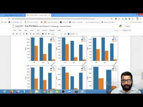
How to plot multiple sub-plots using Matplotlib and Seaborn | Session With Sumit
 2:06:30
Session 23 - Plotting using Matplotlib | DSMP 2022-23
 1:41:04
Session 26 - Plotting using Seaborn Part 2 | DSMP 2022-23
 0:09:24
Lollipop Plot Data Visualization using R , plotting performance data
 0:56:21
How to Build a D&D Plot Web (Step by Step Tutorial) | DM Academy
 0:06:25
Box Plot and Skew
 0:22:29
BAR GRAPH - Live writing session - Band 8.0+ sample answer!
 0:46:23
LIVE #XAUUSD TRADING | New York AM Session using ICT concepts | 25July2024
 0:00:37
📐matplotlib | 📈 😮😮Plot graph using python 📊 |Plotting graph 📉 in data science |#python #short...
 0:01:02
How to Find the Median with a Stem and Leaf Plot
 0:04:58
IB MYP Plotting of graph on Assessprep | Monit Sir | Eduxcite Classes
 0:29:18
3/25/21 - Math - lesson 26, session 1 - measuring length & plotting data on line plots - pgs 551...
 0:14:40
25 Plot Shape
 0:01:29
ASPLOS'24 - Lightning Talks - Session 3D - MAGIS: Memory Optimization via Coordinated Graph Tra...
 0:25:20
Upload Large Files To OneDrive Using Microsoft Graph API In Python
 0:33:21
Managing with Microsoft Graph (and PowerShell)
 0:00:07
Villa size plots available for sale near Mahindra world city| Call us -7734846612 #shorts
 0:04:51
Scatter Plots, Association and Correlation
 0:00:58
#Shorts Should you plot with pandas, matplotlib, or seaborn?
 0:08:31
Basic Tutorial On How To Plot a Survey Plan on AutoCAD For Beginners.
 0:07:50
Stem and Leaf Plot, Range, Mean, Median and Mode - Free Statistics
 0:49:25
Capture Live: Plots special
 0:19:43
Line Graph | Companies Turn-Over | DI | Reasoning | Part - 25 | Bharath Kumar
Комментарии