filmov
tv
The most important Figma Update!

Показать описание
Figma announced a bunch of updates recently but there is one in particular that I believe is super important for us precision freaks!
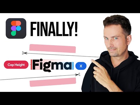
For years now in most UI designs - both as visuals and coded, there was a problem of slightly misaligned labels in buttons (and some other UI elements).
It was always a point or two off either up or down. That is because of how the bounding box of a typeface is rendered to accommodate some special characters and symbols.
Now, with this Figma update you can actually use Auto-Layout with perfect alignment - something that was preventing me to use the feature as I couldn't unsee those 1p misalignments.
Great work Figma, and I wish this becomes the standard in other apps soon!
#figma #ui #ux
☝️ Watch next and be awesome!
🏆 Master design with me
My Twitter:
My Instagram:
👨🏻💻 About me
I'm a designer, entrepreneur and startup founder. I started back in the late 90's and currently my main goal is to share my knowledge, both paid and free. This channel is one of the places where I share my tips on design, user experience, growth, marketing, and getting your first UX Design job.
Subscribe to stay in touch and have a beautiful day! ❤️
 0:02:16
The most important Figma Update!
 0:09:54
Figma Config 2025 Highlights: All New Features in 10 Minutes ✅
 0:06:30
Top 5 Game-Changing Updates from Figma Config 2025!
 0:09:35
🚀 Figma April 2025 Update: Fun & Useful Features You Need to Know! 🎨
 0:04:23
Figma's Most Important Update Ever! — Interactive Components, New Logo & More!
 0:07:30
Figma’s 5 Most Useful New Features (from a hybrid designer/developer's perspective)
 0:04:52
10 Must-Have Figma Plugins for UI/UX Designers (2025)
 0:15:37
The most important Figma feature
 0:08:19
Google's Stitch AI UI Designer - How to Use FULL TUTORIAL | Figma Killer?
 0:23:00
A Guide to Auto Layout: Best Practices, Tips & Tricks | Figma
 0:13:29
🤩 Figma Config 2025: Detailed Updates & Highlights in 13min!
 0:09:18
Amazing Figma Update: Widgets!
 0:16:09
10 Advanced Figma Hacks in 2024
 0:06:00
Most Exciting Figma Update Yet! — Design News
 0:01:01
New Figma Update Is Amazing! - All The New Features #shorts
 0:00:42
BEST FIGMA AI TOOLS for UI/UX Designers 2024⚡️| Saptarshi Prakash #shorts
 0:00:36
#Code for #Animation in #Figma!
 0:00:13
website design from the future #figma
 0:09:28
MASTER Figma Components in 10 Minutes (Everything You Need To Know)
 0:12:06
New Figma Update - Config2025: Grid Style & Freeform Layouts Explained! #config2025
 0:12:10
How to Master Figma and Design 10X FASTER!
 0:00:17
Make a Professional Website UI Design in Figma | Figma Tutorial | Figma Tutorial For Beginners
 0:05:57
10 Game-Changing Figma Tips & Tricks Every Designer Needs to Know
 0:05:34
CRITICAL UX Skills To Master ASAP, No “Learn Figma” BS (from a Google Sr UXD) How to Get a Job 2025...
Комментарии