filmov
tv
Seaborn FacetGrid | How to make Small Multiples with Python Seaborn | Titles, Hue, Legend
Показать описание
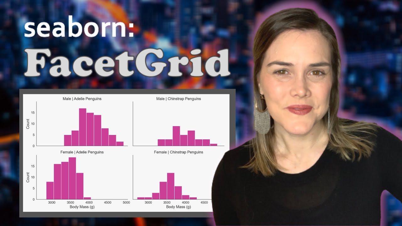
This Seaborn FacetGrid tutorial shows you how to make and style a FacetGrid using Python Seaborn. I first introduce you to the concept of small multiples and making Seaborn small multiples with the facet grid. We walk through the row and col options, and I then show you how to use the Seaborn FacetGrid map and map_dataframe methods to add plots to the FacetGrid. I demonstrate how to make a seaborn FacetGrid histogram as well as scatter plots. I then teach you how to style the facet grid using methods and attributes including updating the Seaborn FacetGrid title through title templates and adding axes labels. I also show you how to use sharey and ylim within the facet grid. We next talk about displaying additional categorical data through the Seaborn FacetGrid hue, and I also show you how to add a hue legend. I show you code for updating the palette and how to style a Seaborn FacetGrid KDEplot. Finally, I demo a custom Python function that you can use to customize the facet grid however you like!
0:00 Introduction
0:21 Intro to Small Multiples
1:03 FacetGrid Code Basics
5:49 FacetGrid Methods & Attributes (axes labels, titles, sharey, ylim)
10:16 Hue & Custom Functions
15:18 Conclusion
Github Code:
Related Videos:
#seaborn #dataviz
0:00 Introduction
0:21 Intro to Small Multiples
1:03 FacetGrid Code Basics
5:49 FacetGrid Methods & Attributes (axes labels, titles, sharey, ylim)
10:16 Hue & Custom Functions
15:18 Conclusion
Github Code:
Related Videos:
#seaborn #dataviz
 0:15:46
Seaborn FacetGrid | How to make Small Multiples with Python Seaborn | Titles, Hue, Legend
 0:11:29
Seaborn FacetGrid | How to make Small Multiples with Python Seaborn | Titles, Hue, Legend
 0:13:35
Creating Multiple Subplots the Easy Way - Seaborn FacetGrid Introduction
 0:08:10
Facetgrid - Seaborn
 0:10:33
Seaborn FacetGrid Part 1
 0:12:24
Seaborn FacetGrid Part 2
 0:16:01
Python Seaborn - 22|What is a FacetGrid Plot and How to Create this Using Seaborn in Python
 0:07:36
Como fazer MÚLTIPLOS PLOTS no Seaborn (FacetGrid)
 0:10:49
How to work with Facetgrid in seaborn | Seaborn video tutorial
 0:01:11
PYTHON : How can I change the font size using seaborn FacetGrid?
 0:12:23
Build Matrix Visuals with Seaborn Facet Grid
 0:04:41
python data analysis tips facetgrid in seaborn apply histplot violinplot hue
 0:01:21
PYTHON : How to set some xlim and ylim in Seaborn lmplot facetgrid
 0:06:14
Python Seaborn FacetGrid
 0:01:01
PYTHON : how to set readable xticks in seaborn's facetgrid?
 0:04:46
python data analysis tips seaborn catplot control facetgrid
 0:12:24
118 Seaborn FacetGrid Part 2
 0:07:29
Python Data Analysis Tips StripPointPlot in Seaborn FacetGrid pointplot stripplot different scales
 0:10:34
117 Seaborn FacetGrid Part 1
 0:18:00
Facet Grids in Seaborn | Seaborn Tutorial Python
 0:08:39
python data analysis tips ridgeplot seaborn use facetgrid and kdeplot together
 0:01:02
PYTHON : How can I change the font size using seaborn FacetGrid?
 0:03:53
Seaborn | 11. FacetGrid and PairGrid
 0:08:35
GGPlot Lessons 3.2: Facet Grid
Комментарии