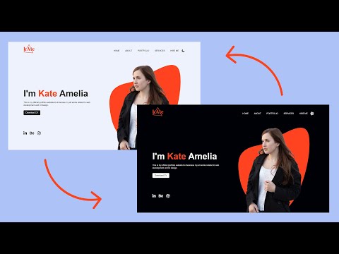
Creating 'Enable Dark Mode' Button Using useState Hook | Complete React Course in Hindi #10

preview_player
Показать описание
In this react course, we will see how to learn react using projects.
This is going to be a project-based course full of real-world react projects. In this video, we will create an about component and will learn to enable dark mode in our react app

Best Hindi Videos For Learning Programming:

►C Language Complete Course In Hindi -

►JavaScript Complete Course In Hindi -

►Django Complete Course In Hindi -

Follow Me On Social Media
Comment "#HarryBhai" if you read this 😉😉
Рекомендации по теме
Комментарии
Автор

Best react course I have ever seen because I tried an udemy course of react js too but can't get content like that. Truly premium content in free of cost by Harry Bhai

suryaprakashchaudhary
Автор

First video of ReactJS :- 70K Views
This Video :- 2K views

Only Some People Stay Consistent Throughout The Series and..

CONGRATULATIONS YOU ARE ONE OF

Shourya_
Автор

Beginner in React. Enjoying the course, it is so addictive. Thank you very much. I learned HTML and CSS with your videos .

JinalKShah
Автор

Alternative of dark and light mode is :
let dark={
color:"white",
backgroundColor:"black",
border:"1px solid white"
}
let light={
color:"black",
backgroundColor:"white",


}


const [myStyle, setStyle] = useState(
{
color:"black",
backgroundColor:"white",

}
);
let toggleHandledark =()=>{
setStyle(dark);

}
let toggleHandlelight=()=>{
setStyle(light);
}
harry bhai Op!

intekhabalam
Автор

Best thing about harry vai is he makes the video on spot so he makes the silly mistakes that we also do.. Which makes us feel that It's normal to have mistakes ❤

showrin
Автор

Harry bhai I am a big fan of yours I did masters in arts history and now learning to code with yours videos I have watched all ur html CSS and java script playlist and now learning react from this I have started learning in first week may from different channel there i have completed full html and css and I remembered when I was scrolling in youtube that time I saw ur playlist and started from starting.
Harry bhai you have helped me alot.
thankyou Brother :)

bushrasayed
Автор

For the algorithem. Altho i bought a course on udemy before this course started but i know harry bhai's the best. So im liking and commenting on every video for the algo.

shi-nee
Автор

Thank you so much Harry for this React Course ❤️

sakshamjoshi
Автор

Thanks a lot for these React tutorials. The toggle button gave me the idea to make a single button for uppercase and lowercase text and changes the button className as well using useState.

InfoWebme
Автор

@CodeWithHarry...I have switched my career into web development last year.I have been following you since 9 months and 3 days prior I started this course. After 10th lecture I feel confident in react and I know that am gonna crack interview of react after watching this video. I am soo happy because i need to watch your video only once and sab dimag mai fit ho raha hai. The way you teach is just outstanding. I am definitely gonna donate you 1000 bucks once i get a job into react for sure as a goodwill gesture to you:)Love u harry bhai

rahulchilap
Автор

bhai kaha the yr tum ab tak... I mean itna motivation kabhi aya he nh React learn krne k ly jitna tumhari video ko dekh kr aa rh h.. Thanks Harry bhai...

shankargairy
Автор

I added the dark mode with the use of button (useState)
Here is the code
const [button, setbutton] = useState('Enable Dark Mode');

const [style, setstyle] = useState({
color:'black',
backgroundColor:'white'
})

const handlemode = (event) => {
if (button === 'Enable Dark Mode') {
setbutton('Enable light Mode');
setstyle({
color:'white',
backgroundColor:'black'
})
}
else {
setbutton('Enable Dark Mode');
setstyle({
color:'black',
backgroundColor:'white'
})
}
}

Hope everyone like it

vikasgond
Автор

I have checked a lot tutorials but switched to this tutorial and this tutorial is love

codesengine
Автор

This video cleared my many doubts like where where we can use useState variable
~Thank You Harry

anuragsuryawanshi
Автор

I must say teacher like u harry bhaiya make complex things fun and easier best videos ek bache ko bhi smjh aajey aisa content banana hats off harry bhaiya

prekshasoni-nz
Автор

Hi harry from Pakistan...Love your way of teaching...

dreamerboy
Автор

Looking at your speed of development. I really need too much practice to resonate it. You are inspiration to everyone. Thanks Harry

gauravarora
Автор

Hi, we can modify handleOnChange event as below to correct count of word in case simply there is no any text entered in textbox.
const handleOnChange = (event) => {
setText(event.target.value);

let inputText =
let inputTextLength = '';
if(inputText !== '')
{
inputTextLength = inputText.split(" ").length;
}
else
{
inputTextLength = 0;
}

}

Kidzworlddotcom
Автор

you can also do something like this for enabling dark mode

import React, { useState } from 'react'

export default function About() {
const handleDarkMode = () => {
setBgColor(!bgColor);
}
const handleBtnToggle = () => {
setBtnName(!btnName);
}
const [bgColor, setBgColor] = useState(false);
const [btnName, setBtnName] = useState(false);
// let myStyle = {
// backgroundColor: bgColor ? "black" : "white",
// color: bgColor ? "white" : "black"}
// }
return (
<div className='container' style={{ backgroundColor: bgColor ? "black" : "white", color: bgColor ? "white" : "black", border: bgColor ? "1px solid white" : "none"}}>
<h1 className='my-3'>About Us</h1>
<div className="accordion" id="accordionExample">
<div className="accordion-item">
<h2
<button className="accordion-button" style={{ backgroundColor: bgColor ? "black" : "white", color: bgColor ? "white" : "black", border: bgColor ? "1px solid white" : "none"}} type="button" data-bs-toggle="collapse" data-bs-target="#collapseOne" aria-expanded="true" aria-controls="collapseOne">
Accordion Item #1
</button>
</h2>
<div id="collapseOne" className="accordion-collapse collapse show"
<div className="accordion-body" style={{ backgroundColor: bgColor ? "black" : "white", color: bgColor ? "white" : "black", border: bgColor ? "1px solid white" : "none"}}>
<strong>This is the first item's accordion body.</strong> It is shown by default, until the collapse plugin adds the appropriate classes that we use to style each element. These classes control the overall appearance, as well as the showing and hiding via CSS transitions. You can modify any of this with custom CSS or overriding our default variables. It's also worth noting that just about any HTML can go within the <code>.accordion-body</code>, though the transition does limit overflow.
</div>
</div>
</div>
<div className="accordion-item">
<h2
<button className="accordion-button collapsed" style={{ backgroundColor: bgColor ? "black" : "white", color: bgColor ? "white" : "black", border: bgColor ? "1px solid white" : "none"}} type="button" data-bs-toggle="collapse" data-bs-target="#collapseTwo" aria-expanded="false" aria-controls="collapseTwo">
Accordion Item #2
</button>
</h2>
<div id="collapseTwo" className="accordion-collapse collapse"
<div className="accordion-body" style={{ backgroundColor: bgColor ? "black" : "white", color: bgColor ? "white" : "black", border: bgColor ? "1px solid white" : "none"}}>
<strong>This is the second item's accordion body.</strong> It is hidden by default, until the collapse plugin adds the appropriate classes that we use to style each element. These classes control the overall appearance, as well as the showing and hiding via CSS transitions. You can modify any of this with custom CSS or overriding our default variables. It's also worth noting that just about any HTML can go within the <code>.accordion-body</code>, though the transition does limit overflow.
</div>
</div>
</div>
<div className="accordion-item">
<h2
<button className="accordion-button collapsed" style={{ backgroundColor: bgColor ? "black" : "white", color: bgColor ? "white" : "black", border: bgColor ? "1px solid white" : "none"}} type="button" data-bs-toggle="collapse" aria-expanded="false"
Accordion Item #3
</button>
</h2>
<div id="collapseThree" className="accordion-collapse collapse"
<div className="accordion-body" style={{ backgroundColor: bgColor ? "black" : "white", color: bgColor ? "white" : "black", border: bgColor ? "1px solid white" : "none"}}>
<strong>This is the third item's accordion body.</strong> It is hidden by default, until the collapse plugin adds the appropriate classes that we use to style each element. These classes control the overall appearance, as well as the showing and hiding via CSS transitions. You can modify any of this with custom CSS or overriding our default variables. It's also worth noting that just about any HTML can go within the <code>.accordion-body</code>, though the transition does limit overflow.
</div>
</div>
</div>
</div>
<div className='container my-3'>
<button type="button" className="btn btn-primary" onClick={() => {handleDarkMode(); handleBtnToggle();}}>{btnName ? "Disable Dark Mode" : "Enable Dark Mode"}</button>
</div>
<br />
</div>
)
}

pranav_arya
Автор

Just exactly when I needed this course. Thanks a million...

shivanshgoel