filmov
tv
4. Best Fonts

Показать описание
You probably don’t use a lot of words in your presentation slides, but the few words you do use should be readable.
Use the best, most readable fonts.
Let’s start here. The two main font families are the Serif fonts and the Sans-Serif fonts.
Serifs are the extra strokes on the ends of letterforms. They’re useful for keeping the reader’s eyes on a line of text. Therefore, serif fonts are best for printed copy, like books and articles.
Sans-Serif or without-serif fonts are generally best for media presentations and digital display, since they’re cleaner and more modern. Plus, they’re easier to read on small screens . . . like smart phones.
For consistency, stick to one type face in your presentation slides.
For variety, mix things up a little.
How do you do that?
Stay tuned. Subscribe.
 0:01:04
4. Best Fonts
 0:00:16
The best fonts for your Presentations 🤫 #powerpoint #fonts #typography #graphicdesign
 0:01:00
My 4 favorite body fonts (all available on Google fonts!) 🎨 #font #graphicdesign #graphicdesigner
 0:00:33
Top 5 Fonts For Your Resume
 0:04:32
Best Fonts for Email Perfection: Enhance Readability and Style
 0:05:05
Best Free Fonts for Designers - 5 Quality Fonts
 0:06:01
3 Tools to Help You Choose Fonts for Your Projects
 0:06:18
TOP 5 Best Fonts for any Graphic Design Project ✔
 0:04:02
Best Fonts for Youtube Thumbnail and Photo Editing | Best Font for Editing | Best font for thumbnail
 0:04:10
40+ Most Popular Sans Serif Fonts for Designers
 0:07:19
The Psychology of Fonts | Fonts That Evoke Emotion
 0:08:10
Designers Only Need These 6 Fonts. Trash the Rest.
 0:00:21
Best PREMIUM Fonts For Free #shorts #font
 0:10:56
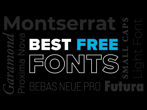
BEST FREE FONTS for Commercial Use 2025
 0:06:31
Top 10 Best Microsoft Word Fonts 2022 | Top 10 Best Fonts for Resume Writing 2022 | Best Font to Use
 0:07:26
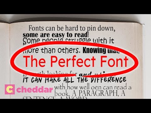
The Font That Makes Everyone Read Faster - Cheddar Explains
 0:04:36
How to Pick the Best Fonts for Your Designs
 0:02:24
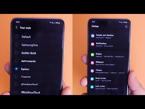
How To Install New Fonts For FREE In Any Samsung Device - 100% Working
 0:25:43
30+ Best Fonts for T-Shirts. How to choose the right font for your shirt design & get more sales...
 0:07:46
10 Best Fonts for Mobile Application 2023
 0:00:15
5 of my favourite FREE fonts to use for your Photos & Videos
 0:00:16
𝓗𝓸𝔀 𝓽𝓸 𝓰𝓮𝓽 𝓹𝓻𝓮𝓹𝓹𝔂 𝓯𝓸𝓷𝓽𝓼!
 0:11:50
Top 7 BEST Websites for FREE T-Shirt FONTS!
 0:00:06
12 Best Canva Cursive Fonts for Scroll-stopping Designs |
Комментарии