filmov
tv
How make a dot plot in excel.

Показать описание
How make a dot plot in excel.
Chapter
0:00 Introduction.
0:23 Going over a dot plot
1:30 =COUNTIF(range, criteria)
2:16 "Let's do one together"
4:10 Outro, extras :)
Notes:
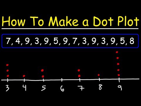
A dot plot is a simple, visual representation of data in which individual data points (dots) are plotted along a number line or a categorical axis. Each dot represents one unit or a single data point, and dots are stacked vertically if multiple data points share the same value.
Key Characteristics of a Dot Plot:
(1) Data Representation: Each dot represents a single data point or observation.
(2) Simplicity: It provides an easy-to-understand visualization, especially for small datasets.
(3) Axis: The data points are plotted on a number line (for continuous data) or along categorical axes (for categorical data).
(4) Stacking: If there are repeated values, dots can stack on top of each other, showing frequency or distribution at that value.
(5) Distribution Insight: Dot plots are useful for showing the distribution and identifying patterns like clusters, gaps, and outliers.
Example:
If we have a dataset like this:
1, 5, 4, 2, 4, 1, 1, 1, 5, 7, 2
A dot plot would look like:
1: * * * *
2: * *
3:
4: * *
5: * *
6:
7: *
When to Use a Dot Plot:
(1) When you want to show the frequency of individual data points.
(2) For small to medium-sized datasets.
(3) To easily identify outliers, clusters, or gaps in data.
Generally, dot plots are particularly effective in visualizing the distribution and patterns within a dataset without the need for more complex graphs.
Additional Sources used:
¯\_(ツ)_/¯
Chapter
0:00 Introduction.
0:23 Going over a dot plot
1:30 =COUNTIF(range, criteria)
2:16 "Let's do one together"
4:10 Outro, extras :)
Notes:
A dot plot is a simple, visual representation of data in which individual data points (dots) are plotted along a number line or a categorical axis. Each dot represents one unit or a single data point, and dots are stacked vertically if multiple data points share the same value.
Key Characteristics of a Dot Plot:
(1) Data Representation: Each dot represents a single data point or observation.
(2) Simplicity: It provides an easy-to-understand visualization, especially for small datasets.
(3) Axis: The data points are plotted on a number line (for continuous data) or along categorical axes (for categorical data).
(4) Stacking: If there are repeated values, dots can stack on top of each other, showing frequency or distribution at that value.
(5) Distribution Insight: Dot plots are useful for showing the distribution and identifying patterns like clusters, gaps, and outliers.
Example:
If we have a dataset like this:
1, 5, 4, 2, 4, 1, 1, 1, 5, 7, 2
A dot plot would look like:
1: * * * *
2: * *
3:
4: * *
5: * *
6:
7: *
When to Use a Dot Plot:
(1) When you want to show the frequency of individual data points.
(2) For small to medium-sized datasets.
(3) To easily identify outliers, clusters, or gaps in data.
Generally, dot plots are particularly effective in visualizing the distribution and patterns within a dataset without the need for more complex graphs.
Additional Sources used:
¯\_(ツ)_/¯
 0:05:54
 0:05:35
 0:02:42
 0:01:56
 0:01:25
 0:06:37
 0:04:31
 0:03:24
 0:02:24
 0:05:07
 0:04:08
 0:02:29
 0:02:09
 0:02:42
 0:01:31
 0:03:43
 0:02:00
 0:09:52
 0:05:09
 0:01:51
 0:00:47
 0:00:37
 0:01:01
 0:04:47