filmov
tv
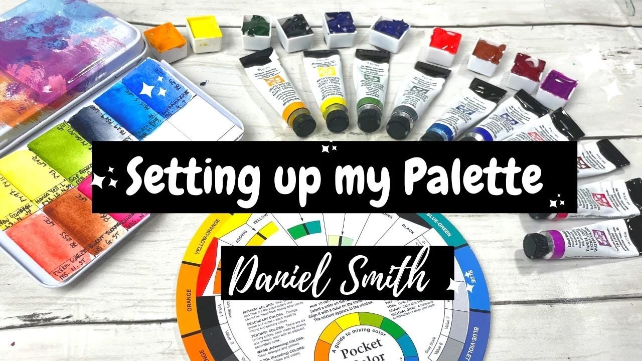
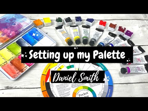
How to create a watercolour palette | Daniel Smith watercolors & swatches
Показать описание
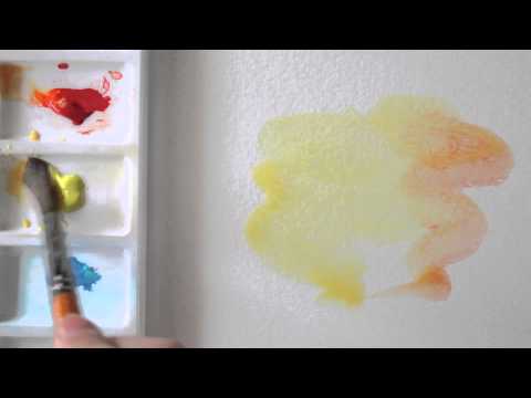
Hey in this video I talk through how to set up a watercolour palette as I FINALLY set up my Daniel Smith palette.
Watercolour tin palette:
Colours included:
🎨 New gamboge
🎨 Hansa yellow light
🎨 Sap green
🎨 Phthalo blue
🎨 Ultramarine
🎨 Quinacridone rose
🎨 Pyroll scarlet
🎨 Payne's grey
Colour I didn't like: Cobalt violet
_________________________________________________________________________________
GET IN TOUCH:
🎨Instagrams:
@Maks_Paper
__________________________________________________________________________________
__________________________________________________________________________________
Affiliate Links (That help out the channel):
DISCLAIMER: Links included in this description may be affiliate links. If you buy a product or service with the links that I provide I may receive a small commission - at no additional charge to you at all! It is a free way to support the channel. Thank you for supporting me and my art journey so I can continue to create art videos each week!
 0:05:36
HOW TO set up your watercolour work-space 🎨 GET ORGANIZED!
 0:24:28
The ultimate WATERCOLOUR TUTORIAL | For beginners | Drawlikeasir
 0:14:40
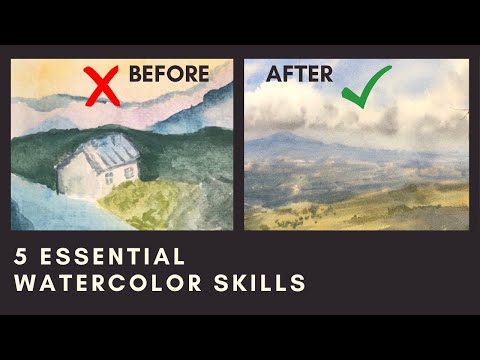
The 5 Essential Watercolor Skills (that completely changed my paintings)
 0:04:39
How to Create a Watercolor Painting Effect in Photoshop
 0:01:00
60 Second Watercolour Lesson. A Summer Tree
 0:14:26
The Biggest Mistake Beginners Make In Watercolour
 0:19:25
Watercolour Texture Techniques You Have to Try!
 0:08:54
How to NOT OVERWORK Your Watercolors
 0:12:02
WATERCOLOR TUTORIAL // How to Paint Waves
 0:00:32
Unbelievable: How To Create Masterpieces With Watercolour In Under 3 Minutes!
 0:04:42
How to paint a SIMPLE watercolour galaxy! // EASY beginners tutorial!
 0:06:30
How I Create Fog Effects In Watercolour
 0:26:21
How to Paint Shadows in Watercolour using Local Colours
 0:29:09
How To Create A Stunning Watercolour Window Box With Flowers
 0:16:11
How to create a watercolour palette | Daniel Smith watercolors & swatches
 0:55:27
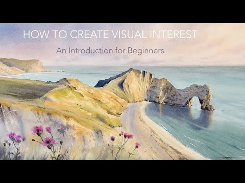
6. Creating Visual Interest with Watercolour - An Introduction for Beginners
 0:06:03
EASY watercolour painting for beginners (10 minute tutorial)
 0:10:02
Create Special Effects With These Watercolor Techniques!
 0:05:58
How to create watercolour drops and blotches
 0:01:47
Making a watercolour Background wash
 0:16:38
Make your own Watercolour Journal/Sketchbook, Part 1
 0:05:31
How to create highlights in Watercolour by Paul Clark
 0:32:30
3. Watercolour Washes - An Introduction for Beginners
 0:22:16
How to Make Any Skin Tone With Watercolour
Комментарии