filmov
tv
5 Golden Rules of Game Cards Graphic Design You MUST OBEY

Показать описание
Five golden rules to design the perfect card. Improve your board game design through graphic design. Tips and tricks and the best practices for designing your cards layout. Graphic design tips for beginners for the best card layout for tabletop and collectable card games.
In this video, we're going to discuss the 5 golden rules of game card graphic design. These rules will help you create beautiful and professional game cards.
If you're interested in bumping up your games graphic design, then you need to watch this video! We'll discuss the basic concepts of game card graphic design, and give you some tips on how to create beautiful and professional game cards. By following these 5 golden rules, you'll be on your way to becoming a professional card designer!
Connect with fellow enthusiasts, access invaluable resources, and foster your passion for tabletop game creation by joining us on the Tabletop Craft Discord!
This video could save you literal months of tedious work on your next game.
00:00 Intro
00:49 Dextrous
01:50 Never obscure vital elements
04:23 Follow Visual Hierarchy
07:30 If it can be said in fewer words, say it in fewer words
09:00 If it’s said repeatedly, say it in symbols
10:53 Art is paramount
 0:11:27
5 Golden Rules of Game Cards Graphic Design You MUST OBEY
 0:18:21
5 Golden Rules Of Gambling
 0:05:01
5 GOLDEN RULES In 5 MINUTES - Rainbow Six Siege
 0:31:03
The Golden Rule of Game Promotion: No One Cares About Your Game
 0:10:13
5 Golden Rules For Beginner Tennis Players
 0:12:49
The Five Golden Rules of Tennis
 0:08:04
5 GOLDEN RULES That Took My Trading to The NEXT Level
 0:07:01
5 laws of design layout & composition *golden rules*
 0:13:30
How to survive in Tarkov - The 5 Golden Rules - Tarkov: Getting Started Episode 4
 0:00:16
Golden Pokemon Cards #Pokemon #cards #pikachu
 0:09:50
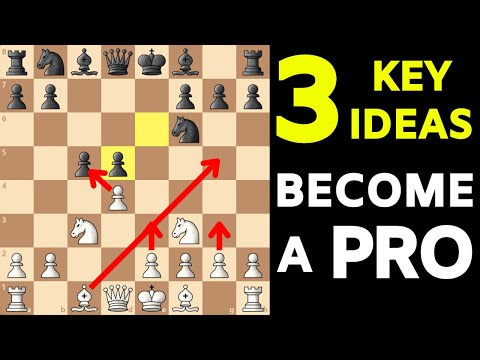
3 Rules That Will Change YOUR Chess Forever! [Expert SECRETS & TIPS]
 0:14:04
FOOD: Rule #1 of Doggy Dan's 5 Golden Rules - Why You Need To Control Your Dog's Food
 0:04:22
5 Golden Rules for Successful Trading Strategies
 0:10:38
Warren Buffett: You Only Need To Know These 7 Rules
 0:05:15
5 Golden Rules For Kayaking
 0:19:14
Day 99 - Golden rules of Gambling | Golden rules of betting | Play professionally
 0:04:56
The 5 Golden Rules Of Tennis
 0:13:18
5 golden rules for starting your day perfectly | Daniel Hoffmann | TEDxFHNW
 0:00:15
What If Earth Was Shaped Like a Donut? #Shorts
 0:00:24
7 Signs You Have A Strong Mindset🗿 #sigmarules #menquote
 0:12:31
5 Golden Rules of Decision Making
 0:01:14
How to play Sudoku
 0:00:42
Pinkod2's Chess Tricks | Traxler Counterattack
 0:00:22
The GOLDEN RULE for Positioning | ROCKET LEAGUE
Комментарии