filmov
tv
K means clustering using python

Показать описание
The scikit learn library for python is a powerful machine learning tool.
K means clustering, which is easily implemented in python, uses geometric distance to create centroids around which our data can fit as clusters.
In the example attached to this article, I view 99 hypothetical patients that are prompted to sync their smart watch healthcare app data with a research team. The data is recorded continuously, but to comply with healthcare regulations, they have to actively synchronize the data. This example works equally well is we consider 99 hypothetical customers responding to a marketing campaign.
In order to prompt them, several reminder campaigns are run each year. In total there are 32 campaigns. Each campaign consists only of one of the following reminders: e-mail, short-message-service, online message, telephone call, pamphlet, or a letter. A record is kept of when they sync their data, as a marker of response to the campaign.
Our goal is to cluster the patients so that we can learn which campaign type they respond to. This can be used to tailor their reminders for the next year.
In the attached video, I show you just how easy this is to accomplish in python. I use the python kernel in a Jupyter notebook. There will also a mention of dimensionality reduction using principal component separation, also done using scikit learn. This is done so that we can view the data as a scatter plot using the plotly library.
 0:19:20
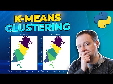
K-Means Clustering Algorithm with Python Tutorial
 0:25:15
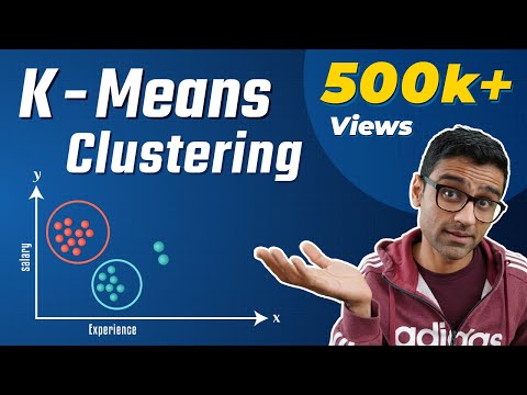
Machine Learning Tutorial Python - 13: K Means Clustering Algorithm
 0:39:05
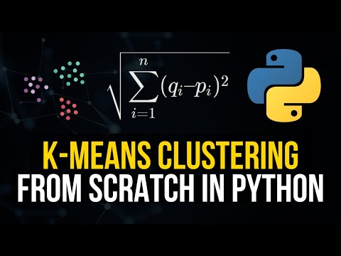
K-means Clustering From Scratch In Python [Machine Learning Tutorial]
 0:33:10
K-Means Clustering From Scratch in Python (Mathematical)
 0:17:23
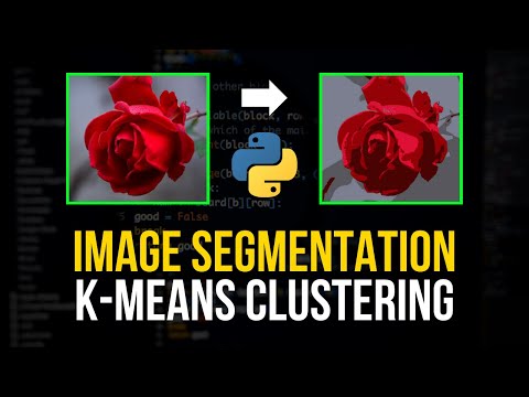
Image Segmentation with K-Means Clustering in Python
 0:12:59
Python Machine Learning Tutorial #6 - K-Means Clustering
 0:10:13
K-Means Clustering Algorithm in Python | Practical Example | Student Clustering Example | sklearn
 0:27:05
K Means Clustering Algorithm | K Means Example in Python | Machine Learning Algorithms | Edureka
 0:21:50
10 thuật toán học máy phổ biến (Top 10 Machine Learning Algorithms)
 0:50:17
K Means Clustering Algorithm | K Means In Python | Machine Learning Algorithms |Simplilearn
 0:11:21
K means clustering using python
 0:12:41
K-Means Clustering - Methods using Scikit-learn in Python - Tutorial 23 in Jupyter Notebook
 0:37:34
K Means Clustering Algorithm Example in Python - V1
 0:49:47
Project 13. Customer Segmentation using K-Means Clustering with Python | Machine Learning Projects
 0:08:31
StatQuest: K-means clustering
 0:16:56
Customer Segmentation Using K-Means Clustering | Machine Learning | GeeksforGeeks
 0:18:11
How to Perform K Means Clustering in Python( Step by Step)
 0:07:20
KMeans Clustering Algorithm Practical Implementation
 0:11:21
K-Means Clustering using Python
 0:50:23
K Means Clustering Algorithm | K Means Example in Python | Machine Learning Algorithms | Simplilearn
 0:21:35
K Means Clustering Python
 0:29:28
K-Means Clustering in Python - Machine Learning From Scratch 12 - Python Tutorial
 0:34:23
K-Means Clustering in Python - Clients Segmentation with Unsupervised Learning
 0:46:42
Customer Segmentation Tutorial | Python Projects | K-Means Algorithm | Python Training | Edureka
Комментарии