filmov
tv
DeviantArt Eclipse inbox - A closer look

Показать описание
Hello there!
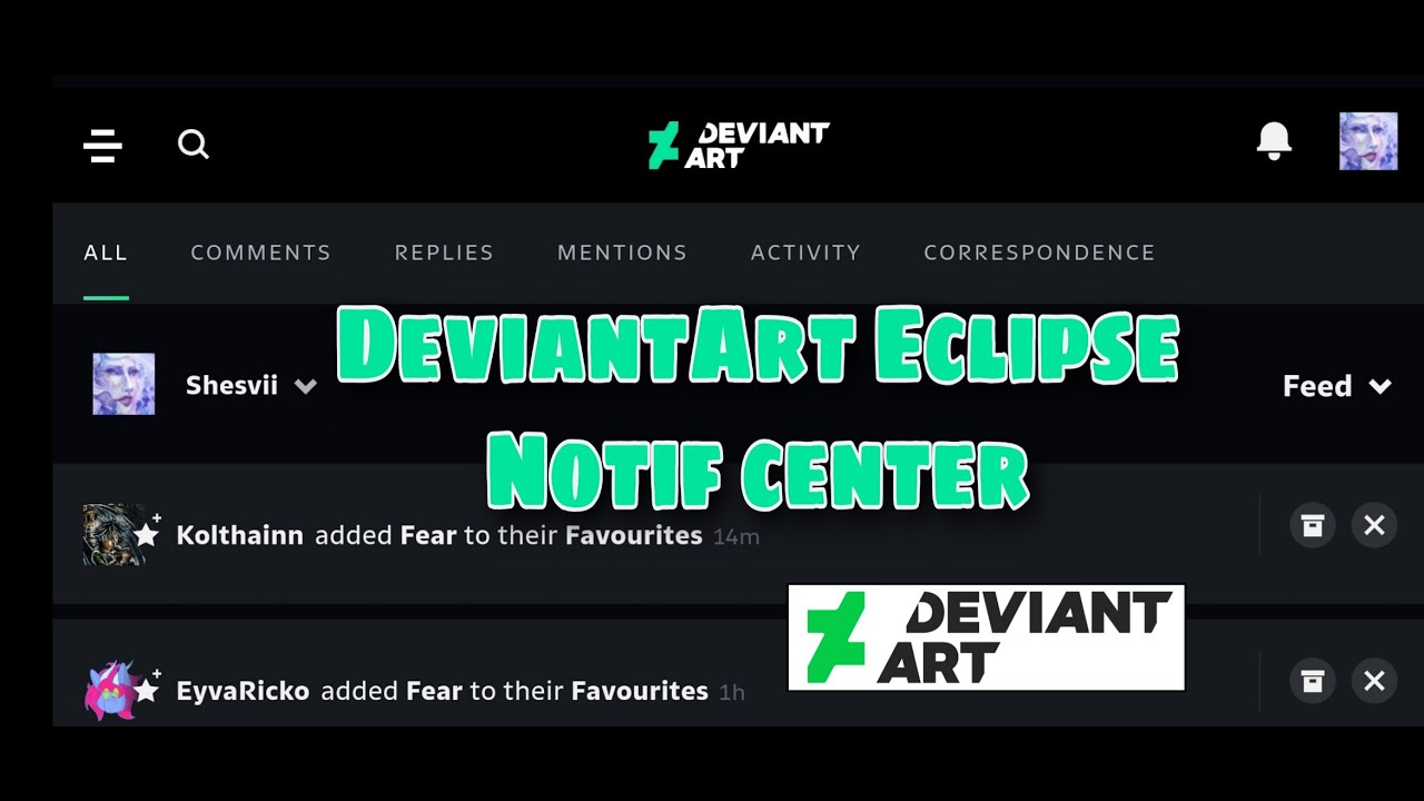
This is just me screenrecording on Google Chrome DeviantArt mobile site how the new Eclipse layout inbox looks like.
Very quick and short video to show how everything is well put into groups.
I don't understand why people say it's messy! It's extremely organized.
You don't need to endlessly scroll down now to find the different notification categories. No need to click on a right bar menu and wait for it to pop, then select the category (activity, mentions etc). That's how ut worked on old site.
On DeviantArt Eclipse you just hover over the top bar and easily scroll without extra clicks to find the category you want.
The feedback notifications are now separated from the art from your watcher feed which makes it less confusing.
•••••••••••••••••••••••••••••••••••••••••••••••••••••••••••••••••
Social stuff:
•••••••••••••••••••••••••••••••••••••••••••••••••••••••••••••••••
Thanks for watching! \(○v○)/
 0:01:14
 0:13:26
 0:01:42
 0:15:36
 0:00:50
 0:23:26
 0:00:03
 0:00:20
 0:44:51
 0:00:33
 0:02:01
 0:08:06
 0:01:26
 0:04:49
 0:03:00
 0:02:04
 0:05:06
![[PMV] Holding Hooves](https://i.ytimg.com/vi/JI7RvaVSChw/hqdefault.jpg) 0:02:53
0:02:53
 0:03:11
 0:14:35
 1:00:24
 0:14:08
 0:14:12
 0:16:04