filmov
tv
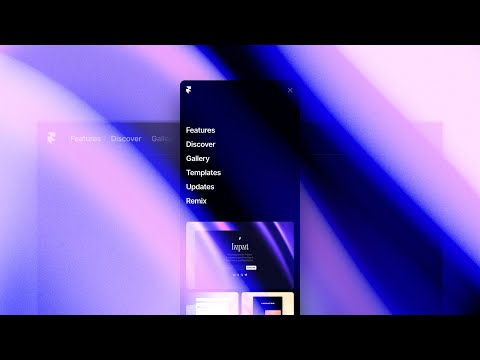
Build a Mobile Hamburger Menu with HTML, CSS, and JavaScript

Показать описание
HTML: 0:43
CSS: 3:40
JavaScript: 6:55
The devices people use to browse the web vary in size. We often want a website to look different on small devices (i.e., mobile phones) than on larger ones (i.e., computers). We see this concept illustrated by the frequent use of hamburger menus.
This beginner-friendly hamburger menu tutorial includes
♥ CSS Media Queries
♥ CSS Transitions
♥ JavaScript Toggle Function
♥ JavaScript Button
♥ JavaScript If statement
♥ JavaScript Event Listener
♥ CSS border-box
♥ HTML page set up
♥ Much more!
Music:
Title: Lost World
 0:03:47
Build a Hamburger Menu with HTML, CSS, and JavaScript | Treehouse Tips
 0:09:18
Build a Mobile Hamburger Menu with HTML, CSS, and JavaScript
 0:27:45
SIMPLE & MODERN mobile hamburger menu with HTML, CSS & JavaScript
 0:19:12
CF 1.0 - How To Build A Mobile Menu w/Hamburger Bun Icon in ClickFunnels Using HTML
 0:12:28
How To Make a Mobile Friendly Burger Menu Nav Bar in Webflow
 0:11:26
JavaScript - How to Create a Responsive Hamburger Menu with HTML, CSS, & JavaScript
 0:00:54
When NOT to use a Hamburger Menu 🍔 #uiux
 0:15:28
Create a Functional HAMBURGER MENU NAVIGATION in Figma (Tutorial)
 0:00:19
Simple hamburger menu in just 2 mins... #shorts #codewithharry
 0:24:05
How To Build An Animated Hamburger Menu With Only CSS
 0:06:28
Navigations: Mobile Menus
 0:10:33
Creating a Hamburger Menu in Readymag
 0:15:21
How to create a Responsive Navigation Bar (for beginners)
 0:00:12
Create a hamburger menu bar using html and css
 0:09:21
Responsive Navigation Bar with mobile menu Using HTML & CSS
 0:13:59
Create a Responsive Hamburger Menu using only HTML and CSS | Responsive Navigation Menu
 0:00:20
Should you use a hamburger menu?
 0:15:43
Create Better Mobile Menus With Elementor Popups
 0:26:30
How to make a Responsive Hamburger Menu with JavaScript
 0:10:47
How to Make Hamburger Menu With ONLY CSS & HTML | Mobile Menu CSS (CLICK)
 0:09:53
Creating our mobile header for our Framer template
 0:01:00
Create a hamburger menu transition in Figma #shorts
 0:40:06
Responsive navbar with mobile hamburger menu | HTML, CSS, JS
 0:16:27
Build a Slide out Hamburger Menu with HTML, CSS & JavaScript
Комментарии