filmov
tv
Did Nickelodeon Just Bring Back The Splat Logo?

Показать описание
Nickelodeon's golden era of animation included Nicktoons like SpongeBob SquarePants, The Fairly OddParents, Danny Phantom, Rugrats, Invader Zim, Hey Arnold, and more. This era was represented by the iconic orange splat logo, which became pretty minimalistic in 2009. Now, it looks like the classic Nickelodeon splat is coming back!
Welcome to Vailskibum!
Cartoon News ✧ Reviews ✧ Discussions
✭ SOCIAL MEDIA ✭
My videos are produced with the editor Camtasia Studio 2022 and I use a Blue Yeti Microphone to record. All scripts are written by me. Any footage used is from various TV shows, movies, and games to illustrate my personal thoughts on these pieces of media. All stock photos and images are either created by me or are sourced from publicly viewable image websites. This criticism, comment, or news reporting falls under Fair Use (The Copyright Act of 1976, Section 107). If you are interested in viewing full cartoon episodes/movies or playing entire video games, please buy the DVDs and games from the media companies providing them. Also, the intro song featured in my videos is Finding Hope - Wonder.
Vailskibum videos may contain swearing, violence, references to drug use, or other mature themes. This video should not be viewed by anyone under 13 years old at any time.
 0:02:31
Did Nickelodeon Just Bring Back The Splat Logo?
 0:05:48
Responding to the drama
 0:00:42
JoJo Siwa said she wasn't invited to Nickelodeon's annual Kids Choice Awards …
 0:08:07
Nick DiGiovanni Answers The Web's Most Searched Questions | WIRED
 3:58:20
PAW Patrol Marshall's BEST Fire Truck Rescues! #3 🚒 4 HOURS | Nick Jr.
 0:03:38
Every iCarly & Victorious Crossover Moment | Nickelodeon UK
 0:01:00
Steve RETURNS To Blue's Clues 💙 | Nickelodeon #Shorts
 0:00:34
Tori to Beck: Hi Baby! 😍Jade to Tori: 🤬| Nickelodeon UK
 0:00:27
'Good Burger' is BACK on the Menu! 🍔 | Official Announcement! | Nickelodeon
 0:00:20
SpongeBob isn't just another cartoon character!
 0:04:15
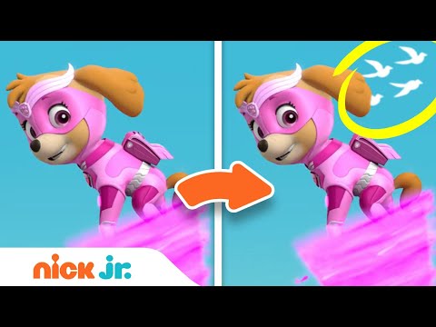
Spot the Difference Game #2 w/ the Paw Patrol Mighty Pups! | Nick Jr.
 0:06:27
JoJo Siwa Through the Years! 🎀 2005-2020 | Nickelodeon
 0:02:57
Love Potion Fails 💘 | Not So Valentine's Special | Nick
 0:02:23
Henry Danger | Brain Warp | Nickelodeon UK
 0:01:40
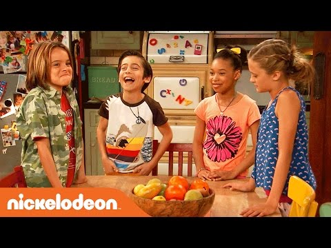
Nicky, Ricky, Dicky & Dawn | Behind the Scenes Blooper Reel | Nick
 0:29:05
PAW Patrol Moto Pups & More! 30 MINUTE MARATHON | Nick Jr.
 0:10:30
Henry Danger was the dumbest Nickelodeon show
 0:02:06
Victorious | It's not Christmas without You | Nickelodeon France
 7:09:19
🔴LIVE! - NEW GODZILLA BOSS UPDATE COUNTDOWN in FORTNITE!
 0:00:56
How I Got a Job at NICKELODEON from GOOGLE Pt. 1
 0:02:03
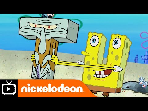
SpongeBob SquarePants | Trash Life | Nickelodeon UK
 0:02:16
The Loud House | Dress up | Nickelodeon UK
 0:02:16
Butterbean's Café | The Legend of the Shadow Bean! | Nick Jr. UK
 0:02:02
Meet Rex: A NEW PAW Patrol Pup! | Nick Jr.
Комментарии