filmov
tv
Python Seaborn - 3 |BAR PLOTS in Python Using Seaborn Library with MEAN, MEDIAN, SUM, COUNT agg

Показать описание
Python Seaborn - 3 | Creating BAR PLOTS in Python Using Seaborn Library with MEAN, MEDIAN, SUM or COUNT aggregation | Change the Aggregation Function in Seaborn BAR PLOT
In this video we have covered:
00:00 - Introduction
01:56 - Importing all the required libraries
03:05 - Get the list of dataframes provided with seaborn library
03:31 - Load dataframe from seaborn library | Import dataframe from seaborn library
05:93 - Creating a basic BAR PLot based on one categorical and one numerical variable
05:45 - Adjusting the size/dimension of plot
07:08 - Creating BAR PLOT using two categorical and one numerica variable with the help of HUE parameter
08:35 - Change the orientation of BAR PLOT | Creat a HORIZONTAL BAR PLOT
09:29 - Change the order of columns or bars in a BAR PLOT
11:03 - Change the order of Hue variable elements in a BAR PLOT
11:33 - Adding caps on the error bar in a BAR PLOT
12:21 - Removing error bars from a BAR PLOT | Removing liens showing at the top of each column/bar in a BAR PLOT
12:46 - Change the COLOR of columns or bars in a BAR PLOT
13:25 - Changing the color palettes using palette attribute | get the list of accepatable color palettes in SEABORN PLOTS
14:40 - Changing the COLOR SATURATION of bars or columns in a BAR PLOT
15:42 - Using different statistical aggregation function in BAR PLOT other than MEAN from the Numpy Library
You can download the excel files used in this video using:
You can download the script created in this video using:
Seaborn Official website for Bar plot:
#python #pythonforbeginners #VisualizationInPython #seaborn #visualizationUsingSeaborn #BarPlotUsingSeaborn
 0:17:23
Python Seaborn - 3 |BAR PLOTS in Python Using Seaborn Library with MEAN, MEDIAN, SUM, COUNT agg
 0:04:32
How to create a high quality bar chart with Python using Seaborn?
 0:10:00
Seaborn Bar Plot Tutorial | How to make and style a barplot with Seaborn Python
 0:07:00
Seaborn Bar Plots Part 2 | Python Seaborn Tutorials 3
 0:00:09
The Power of Seaborn Python Library to Create Data Visualizations!
 0:00:15
Python seaborn barplot #shorts
 0:07:50
Creating a simple bar plot using Seaborn in Python
 0:09:04
Seaborn countplot | What is the countplot? | Seaborn countplot vs barplot
 0:28:23
Introduction to Python Libraries for Data Science | Seaborn | AIML End-to-End Session 53
 0:12:30
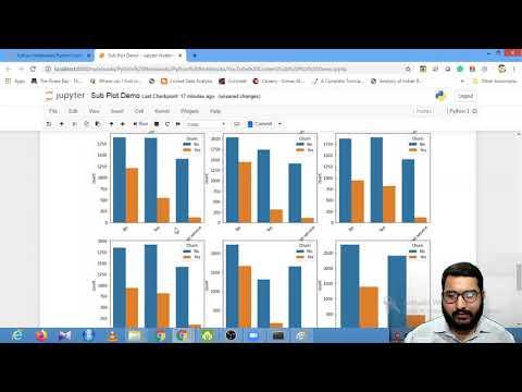
How to plot multiple sub-plots using Matplotlib and Seaborn | Session With Sumit
 0:22:39
Seaborn Is The Easier Matplotlib
 0:02:24
Creating BARPLOT using SEABORN in PYTHON
 0:01:00
How to draw scatter plots with 3 variables? | Python, Seaborn
 0:12:09
Seaborn Bar Plots Part 1 | Python Seaborn Tutorials 2
 0:16:57
High quality figures in Python with matplotlib and seaborn - bar plots
 0:00:14
Easy way to increase your Python chart size
 0:13:20
Bar Chart | Bar Graph using python | Bar chart tutorial
 0:05:50
Seaborn Barplot | Python
 0:00:44
Box plot using Python Seaborn #pythondatascience #seaborn #datascience
 0:27:43
Seaborn BarPlot Method in Python for Beginners - Complete Guide
 0:00:59
Menampilkan Nilai diatas bar untuk seaborn barchart Python #shorts #short
 0:59:34
Seaborn Tutorial : Seaborn Full Course
 0:00:35
Seaborn with Matplotlib Library Python
 0:00:32
Quick Creat a Barchart on python | #matplotlib #design #barchart @learneverythingonline4u 📊📊📊...
Комментарии