filmov
tv
Want YOUR Logo To STAND OUT? Watch This Now

Показать описание
Ever wonder why some logos just work while others fall flat? In this discussion, Chris Do breaks down what really makes a logo effective - and it's not just about looking pretty. Using Under Armour as a case study, he reveals why even billion-dollar companies can get it wrong, and why AI isn't the answer to great logo design.
What You'll Learn:
🎯 Why aesthetics alone don't make a great logo
💡 The difference between trends and timeless design
🔍 How to evaluate a logo beyond just its looks
⚡ The real reason companies pay thousands for logos
🤖 Why AI can't replace professional logo design
Whether you're a designer, business owner, or just curious about branding, this discussion offers valuable insights into what makes logos truly work - and why getting it right matters more than you think.
#logodesign #logodesigner #brandidentity #designprinciples #creativestrategy #graphicdesign
🚀 Futur Accelerator
The step-by-step blueprint and coaching program designed to get your creative business off the ground:
🥇 Futur Pro
The professional creative community designed to grow your personal brand, your business, and your network:
✍️ Other Courses, Templates, and Tools:
🎙 The Futur Podcast:
Recommended books, tools, music, resources, typefaces & more:
Music by Epidemic Sound:
Shorts Playlist:
We love getting your letters. Send them here:
The Futur c/o Chris Do
556 S. Fair Oaks Ave. #34
Pasadena CA 91105
*By making a purchase through any of our affiliate links, we receive a very small commission at no extra cost to you. This helps us on our mission to provide quality education to you. Thank you.
Host: Chris Do (Bald Asian Guy Talks About Business)
Cinematographers/Editors: @RichCardona @RodrigoTasca
logo design, logo designer, good vs bad design, brand identity, design principles, graphic design, graphics designer, professional design, design critique, Under Armour logo, logo trends, design aesthetics, brand development, AI design limitations, design process, brand strategy, logo evaluation, visual identity, design fundamentals, corporate branding, design research, brand recognition, design application, logo mockups, brand equity, design feedback, logo evolution, brand guidelines
 0:11:18
Giving Every NFL Team A New Name And Logo To EXPOSE Who They Really Are
 0:00:15
You got it, dude #shorts
 0:00:40
Would Your Doll Do This…? 💁♀️
 0:00:47
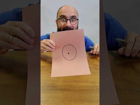
the circle dot trick
 0:00:14
Create a Brand Logo in Excel Using Just a Formula – This Will Blow Your Mind! #excel #office #tricks...
 0:00:51
This cube LIGHTS up! 💡
 0:00:37
Most powerful body language hacks #selfhelp #confidence #bodylanguage #growth #personaldevelopment
 0:01:00
Why hasn't Apple invented this yet?!
 0:00:58
Implantat vs. 2,5 Tonnen: Hält das Silikon stand?
 0:00:35
If You Stand Like This #shorts
 0:00:25
Melania singing to Barron -  you stand so tall just like your dad #melaniatrump #barrontrump
 0:00:13
Better than a bench mount receiver hitch?? Vise Stand for your workbench. New tool. The Tool Swing
 0:00:20
How To Make Your Funko Pops Stand!
 0:00:59
CRAZY DIY FRIENDS PRANK || Funny Situations You Must To Try With On Friends by 123 GO! Kevin #shorts
 0:00:43
Realistic Perspective Text - Photoshop Tutorial
 0:00:30
How To Turn One Pendant Into 5!! #Shorts
 0:01:00
Your brand is your power. Let’s design it to stand out, speak loud, and sell smart. DM to start!
 0:06:03
Netanyahu tells people of Iran: 'This is your opportunity to stand up'
 0:00:16
The Easiest Shuriken Technique #shorts #tutorial #naruto #anime #shuriken #ninja
 0:00:41
the 'he's flying' song IRL 🌈 | SpongeBob #shorts
 0:00:55
Disney World Has A Secret 😨
 0:00:19
Infinite cube glitch? 🤔
 0:00:19
Learn How to Spring the Cards like a PRO😮 #shorts #tutorial
 0:00:55
Mockup design in Photoshop
Комментарии