filmov
tv
Lorenz Curve and Gini Index in Excel

Показать описание
What is Lorenz Curve?
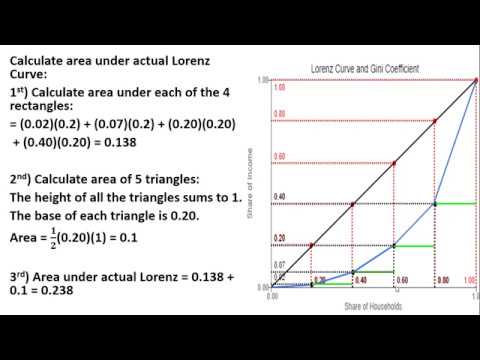
In economics, the Lorenz curve is a graphical representation of the distribution of income or of wealth. It was developed by Max O. Lorenz in 1905 for representing the inequality of wealth distribution.
The curve is a graph showing the proportion of overall income or wealth assumed by the bottom x% of the people, although this is not rigorously true for a finite population (see below). It is often used to represent income distribution, showing the bottom x% of households and the percentage (y%) of the total income they have. The percentage of households is plotted on the x-axis, the percentage of income on the y-axis. It can also be used to show the distribution of assets. In such use, many economists consider it to be a measure of social inequality.
What is the Gini Coefficient?
Gini Coefficient, also known as the Gini index, is the statistical measure used to measure the distribution of the income among the country's population, i.e., it helps measure the income inequality of the country’s population. t is a value between 0 and 1. A higher number indicates a greater degree of income inequality. A value of 1 indicates the highest degree of income inequality where a single individual earns the country's entire income. A value of 0 indicates that all individuals have the same income. Thus, a value of 0 indicates perfect income equality. One of the limitations of the Gini index is that its use requires that no one has negative net wealth.
For further study:
**************************************************************************************************
Workshop Alert on An Integrated MCDM approach for Drought Vulnerability Assessment in ArcGIS
**************************************************************************************************
Enrollment link
*******************************************************************************************************
UDEMY Course
Rainfall Indices for MCDM models in ArcGIS: how and Why?
Preparation of 10 important rainfall indices for MCDM models and time series analysis using Excel, ArcGIS and QGIS
Click this link only Rs. 390 or 12.99 USD
*******************************************************************************************************
Advances in Geographical Research
Learn research methodology online with courses of Advanced Geospatial technologies, statistical methods, and Machine Learning algorithms.
*******************************************************************************************************
WhatsApp Group for subscribers:
Group 1
Group 2
***************************************************************************************
Playlist
1. Basics Remote sensing
2. MCDM and ML
3. Arc GIS
4. Free online data download
5. Advanced Excel
SUBSCRIBE to the YouTube channel Dr. Jayanta Das, to get notification about our recent lecture uploads on Advances in Geographical Research.
ALL RIGHTS RESERVED.
#DrJayantaDas
 0:08:15
Gini Coefficient and Lorenz Curve
 0:07:58
Lorenz Curve and Gini Coefficient - Measures of Income Inequality
 0:03:28
Measuring income inequality: The Lorenz curve and Gini coefficient
 0:05:15
Understanding the Gini Coefficient
 0:09:33
Gini Index and Lorenz Curve in Excel
 0:04:50
Lorenz Curve and Gini Coefficient
 0:13:14
Lorenz Curve and Gini Index in Excel
 0:06:08
Lorenz Curve & Gini Coefficient | A Level and IB Economics
 0:07:35
GINI Index and Lorenz Curves
 0:05:55
How to Calculate the Gini Coefficient
 0:07:06
Calculating the Gini Coefficient
 0:07:40
Excel: Lorenz Curve and Gini Coefficient - Full Tutorial
 0:03:18
Lorenz Curve with Gini Coefficient
 0:04:10
The Lorenz curve and Gini coefficient
 0:08:13
Income Inequality: The Lorenz Curve and Gini Coefficient
 0:02:54
Gini Coefficient & Lorenz Curve in R
 0:12:07
Gini Coefficient | Lorenz curve | Values of Gini Coefficient | Harpreet Kaur | Ecoholics
 0:11:50
Ch5-Lorenz Curves and Gini Coefficients
 0:06:28
Lorenz Curve and Gini Coefficient
 0:04:19
Inequality (Part 1): Lorenz Curve and GINI
 0:29:06
How to Measure Income Inequality: Gini & Lorenz
 0:04:54
Lorenz Curve and Gini Coefficient Calculation
 0:03:24
Ongelijkheid meten: de Lorenz-curve en de Gini-coëfficiënt
 0:09:40
Lorenz Curve | Interpretation | Lorenz Criterion | Can Lorenz curves cross | 26 |
Комментарии