filmov
tv
Why Your Awwwards Website Sucks

Показать описание
I talk about why some Awwwards websites annoy me as a web designer, and as a user.
All but one of the websites shown in this video are all found on Awwwards. Most of them are businesses that ideally want inbound inquiries from their site. I speak about some reasons why they make it hard for users to do just that.
All but one of the websites shown in this video are all found on Awwwards. Most of them are businesses that ideally want inbound inquiries from their site. I speak about some reasons why they make it hard for users to do just that.
 0:05:18
Why Your Awwwards Website Sucks
 0:01:00
What is Awwwards and why do you need them for your website
 0:03:56
Should You Use Awwwards for Website Inspiration?
 0:00:30
Why Your Website Sucks
 0:08:00
The Scientific Reason Simple Websites Are Better
 0:05:27
Why Your Website Probably Sucks
 0:05:42
The ONLY resources you need to design award winning websites
 0:07:55
I tried to design and code an awwwards-inspired portfolio website. Here's the process
 0:16:21
This Is Why Most 3D Websites Suck
 0:08:34
Developer Reacts to the Horrible websites design
 0:09:51
5 Design Traits Of An Award Winning Website
 0:09:11
Recreating AWWWARDS Winning Websites is Easier Than I Thought!
 0:00:35
Awwwards: Watch, Learn, Play
 0:00:59
5 best for landing page inspiration #shorts #awwwards #wordpress #website #websiteinspiration
 0:18:29
Why Your Website Sucks & How to Fix It
 0:23:05
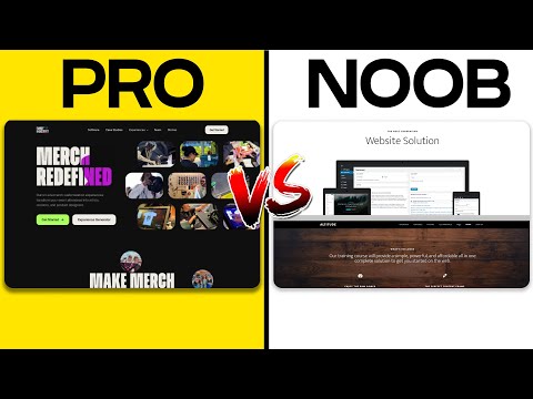
PRO Vs AMATEUR Website Layouts (With Examples)
 0:00:17
Looking for '𝗖𝗢𝗡𝗧𝗔𝗖𝗧 𝗙𝗢𝗥𝗠' design inspiration? #shorts
 0:00:31
𝗗𝗶𝗴𝗶𝘁𝗮𝗹 𝗧𝗵𝗶𝗻𝗸𝗲𝗿𝘀 𝗖𝗼𝗻𝗳𝗲𝗿𝗲𝗻𝗰𝗲𝘀 𝗔𝗥𝗘 𝗕𝗔𝗖𝗞!💥 #Shorts...
 0:13:39
Warum war ich in Amsterdam? Adobe XD News & Awwwards! 👍 [VLOG]
 0:18:55
Rendering SEO: Why Your Fancy Expensive Website Sucks and Doesn't Rank!
 0:05:48
Critiquing Bad Websites - ZARA
 0:00:23
Is Overstimulation Too Much as a Web Design Trend 2023
 0:17:40
Awwwards Winning Websites | Best Websites in the Wold | The Best of Navigations | North Nine
 0:07:49
Are Sliders And Carousels Good Or Bad In Web Design?
Комментарии