filmov
tv
CSS Tutorial — Relative Sizes, Percentage % (7/13)

Показать описание
CSS Tutorial — Relative Sizes, Percentage % (7/13)
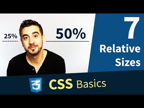
Relative size is huge. The first one I wanna show you is percentage. AAAAAA this is a good one. You can say width: 50%. That’s legit CSS. But wait, 50% of what? Good question...
Say we have P tag. I’ll give it a red background so we can see where it starts and where it ends. You should do that too. P tags by default are block level elements, I explain more here. so they take up the whole row. Their width is 100% of their parent. So by default it’s kinda like the P tag has an invisible rule on it that says width: 100%.
They kinda just adjust to their containing parent element. Now what if I change the width to 50%; What if I add that to my CSS? BOOM. Look at that. Now it’s half the size. Wait, again, half the size of what?
In this case the containing parent of our P tag is the body, I’ll add a green border to body so you can see. when I resize the window the body is getting smaller & bigger, but the width value that we gave our P tag stays 50%, relative to the body. Because it’s its parent. So when I resize the window, my P tag will automatically resize itself to be 50% whatever the body is.
This is a technique used in responsive web design. It’s extremely useful. It’s not the end all be all, there are times where you don’t want a relative value, but if I used absolute values for width and height, my element might look great on one screen, but be completely unusable in a smaller device.
So it’s safe to say relative values are mostly used to support different screen sizes. I don’t want you to worry about responsive web yet, it’s a whole course in and of itself, and I promise we’ll get there.
There are other very important relative units I wanna show you, EM and REM, they are absolutely essential in sizing your text, something I brought up already. And that’s coming up next. Let’s go get it.
 0:02:35
CSS Tutorial — Relative Sizes, Percentage % (7/13)
 0:05:15
CSS Tutorial — EM & REM, Relative Sizes (8/13)
 0:02:15
The 'rem' unit in CSS - relative font sizes
 0:02:52
How to resize text effectively with EM/REM units
 0:08:48
Learn CSS Units In 8 Minutes
 0:06:54
Learn CSS height and width in 6 minutes! 📏
 0:03:55
CSS Absolute vs Relative Position EXPLAINED!
 0:09:28
CSS Tutorial - Sizes, Absolute and Relative DEMO (9/13)
 1:08:15
How to Create Responsive Portfolio Website with HTML & CSS: Step-by-Step Tutorial with Code
 0:09:26
Learn CSS Position In 9 Minutes
 0:08:32
Learn CSS Positioning Quickly With A Real World Example
 0:15:13
A CSS Unit Deep Dive - Learn CSS Units & When To Use Them
 0:08:00
CSS Tutorial For Beginners 27 - Font Size
 0:08:16
Learn Flexbox CSS in 8 minutes
 0:02:09
CSS Tutorial — Absolute Sizes, px, pt (6/13)
 0:02:21
Relative Sizing
 0:12:04
CSS Units of Measurement [rem, em, vw, vh, px, %]
 0:14:42
CSS Tutorial: Position absolute, relative, fixed and sticky in CSS | Web Development Tutorials #25
 0:12:19
CSS Typography, Part 5: Relative Font Sizes
 0:21:25
CSS Units & Sizes Tutorial for Beginners
 0:17:20
CSS Units (CSS Lengths: rems, ems, pixels, percents, and more)
 0:01:00
Stop Using Pixels/Rems/Percentages To Define Widths In CSS
 0:09:44
Master Media Queries And Responsive CSS Web Design Like a Chameleon!
 0:20:08
CSS Tutorial: em, rem, vh and vw units + Responsive design Explained | Web Development Tutorials #29
Комментарии