filmov
tv
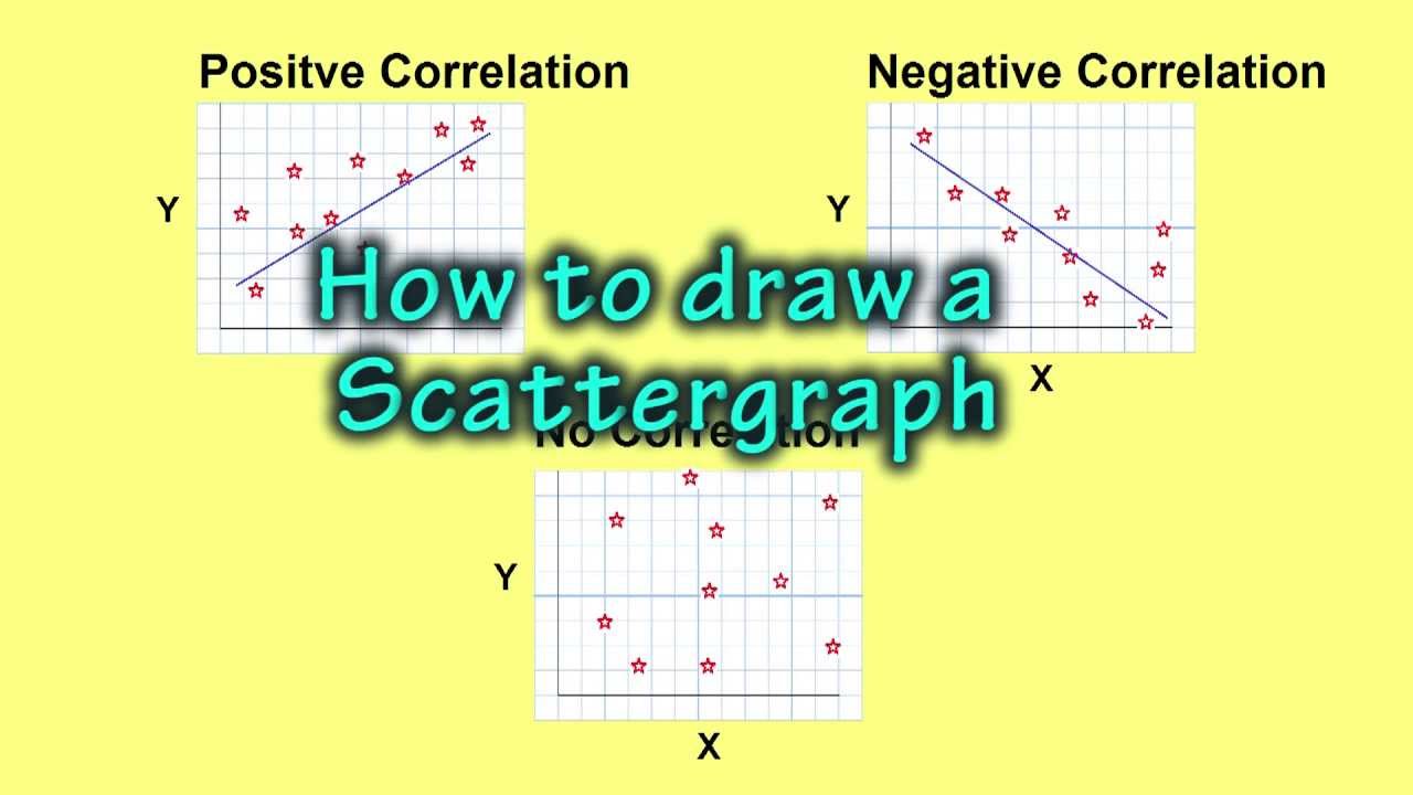
How to make a Scatter Graph
Показать описание
Scatter graphs show the relationships between two sets of variables. They are also known as scatter plots, scatter grams and scatter diagrams. In this video I explain how to make a scatter graph and interpret the different relationships that exist between data sets. In Geography they are often used when teaching about why some countries or regions are more developed than others. For example, a scatter graph can be used to show the relationship between GDP per capita and Life Expectancy.
 0:04:42
How to Make a Scatter Plot in Excel
 0:06:03
Statistics - Making a scatter plot
 0:12:03
Making Scatter Plots/Trendlines in Excel
 0:04:39
Creating a Scatter Plot in Excel 2016
 0:04:51
Scatter Plots, Association and Correlation
 0:07:23
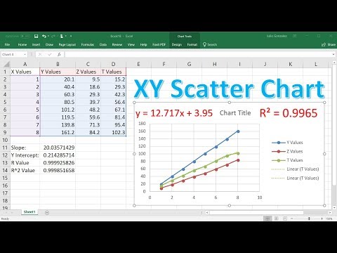
Create an XY Scatter Chart in Excel
 0:12:09
Tutorial - How to make a scatter plot in Google Sheets
 0:06:07
Creating an XY Scatter Plot in Excel
 0:00:32
MyPlots.Ai Graphing Assistant Introduction
 0:02:52
Scatter Graphs: What are they and how to plot them
 0:03:44
How to build Scatter plot in Tableau | Tableau Charts
 0:07:33
Scatter Plot in Excel / Scatter Diagram Interpretation and Creation by ExcelDestination
 0:25:17
How To Make SCATTER TERRAIN With TRASH
 0:02:09
How to Create a Quick and Easy SCATTER PLOT Diagram in EXCEL Like a Pro | Lean Six Sigma
 0:02:31
Excel scatter plot with group colouring
 0:07:09
How to Make and Interpret a Scatter Plot in Excel
 0:13:23
How To Make a X Y Scatter Chart in Excel With Slope, Y Intercept & R Value
 0:00:54
How to Make a Scatter Plot in Excel
 0:06:46
How to Make a Scatter Graph/Plot in Microsoft Excel (Scatter Graph Tutorial)
 0:07:07
Making a scatter plot and a line of best fit + prediction.
 0:04:36
Using Scatter Plot Trend Lines to Make Predictions
 0:06:49
Scatter Plot in Power BI | When to use the Scatter Plot | Animated Scatter Plot in Power BI | #16
 0:16:33
Crafting Miniature Forest Scatter Terrain for Wargaming
 0:04:16
How to Make a Scatter Plot in Google Sheets
Комментарии