filmov
tv
Sprite Analysis | Chrono Trigger Character Portraits

Показать описание
In this video we’ll look at the character portraits of Chrono Trigger, and consider the translation of illustrated artwork into a pixel design!
————
0:00 Intro
0:20 Pixel Art from Illustration
2:30 Sprite / Portrait Palette Comparison
4:12 Outro
4:22 VID OVER
————
Check out my art here:
————
Title sequence theme music by Failpositive:
Background chiptune music by mcguy215:
————
Portions of the materials used are trademarks and/or copyrighted works of Square. All rights reserved by Square. This material is not official and is not endorsed by Square.
————
0:00 Intro
0:20 Pixel Art from Illustration
2:30 Sprite / Portrait Palette Comparison
4:12 Outro
4:22 VID OVER
————
Check out my art here:
————
Title sequence theme music by Failpositive:
Background chiptune music by mcguy215:
————
Portions of the materials used are trademarks and/or copyrighted works of Square. All rights reserved by Square. This material is not official and is not endorsed by Square.
 0:04:35
Sprite Analysis | Chrono Trigger Character Portraits
 0:00:41
Pixel Análisis #1 - Chrono Trigger
 0:04:31
How to start with Pixel Art?
 0:13:32
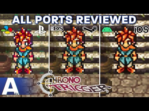
Which Version of Chrono Trigger Should You Play? - All Ports Reviewed & Compared!
 0:05:25
Chrono Trigger (Magus) - Pixel Art Character Timelapse
 0:00:10
Where did she hide it?
 0:00:15
Simple question 👀
 0:00:24
WTF Chrono Trigger Box Art #gaming
 0:00:04
Across Time #3dart #art #fanart #loop #snes #pixelart #chronotrigger #nds
 0:00:48
The Rarest Form of Spekkio in Chrono Trigger #shorts
![[Chrono Trigger] What](https://i.ytimg.com/vi/r628Hw5mpy4/hqdefault.jpg) 0:00:28
0:00:28
[Chrono Trigger] What happens when nature learns to fake wrestle
 0:00:15
Chrono Trigger Pixel Art
 0:00:49
The SnowBall Fight Part 1 — Chrono Trigger Sprite Animation
 0:05:55
Sprite Analysis | Ryu (Breath of Fire I-IV)
 0:00:57
Why a Smash Bros. / Street Fighter Crossover Would Never Work
 0:00:17
The Chrono Trigger PC Port is TRASH
 0:25:52
Chrono Trigger - Review and Analysis
 0:00:04
Cloaked in Flames #art #3dart #fanart #loop #pixelart #3d #snes #chronotrigger
 0:05:18
Want to create some geeky deco stuff? DIY Custom Chrono Trigger Pixel art! SNES sprite style
 0:04:11
Pixel Art - Slash (Chrono Trigger)
 0:03:30
Pixel Art Character Timelapse (CHRONO TRIGGER)
 0:22:32
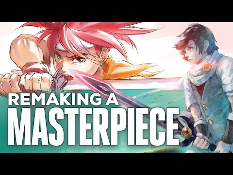
Chrono Trigger vs. Lost Sphear | Remaking a Masterpiece
 0:26:02
PowPodPlus- Sprite Analysis with Brandon James Greer
 0:07:45
Chrono Trigger - Ein zeitloses Meisterwerk?
Комментарии