Responsive layout practice for beginners

preview_player
Показать описание

🔗 Links

⌚ Timestamps
00:00 - Introduction
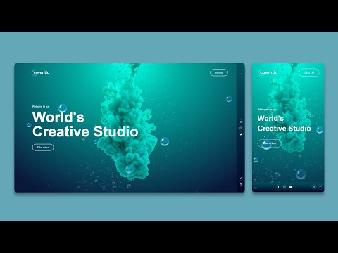
00:25 - What we’re going to be working on
01:20 - Opening the project in VS Code
04:00 - Analyzing the layout
07:45 - Writing the HTML
20:10 - Getting the Google font
22:00 - Setting up the custom properties
29:30 - Base CSS styles
33:30 - Styling the wrapper
36:10 - Styling the header
38:56 - Creating the three columns
42:05 - Using locally scoped custom properties
48:10 - Styling the individual cards
1:00:13 - Fixing the header font sizes and weights
1:01:36 - The card image position
1:05:27 - Fixing the layout for mobile
1:07:32 - Removing my columns and using grid-template-areas

#css

--

Come hang out with other dev's in my Discord Community

Keep up to date with everything I'm up to

Come hang out with me live every Monday on Twitch!

---

Help support my channel

---

---

I'm on some other places on the internet too!

If you'd like a behind the scenes and previews of what's coming up on my YouTube channel, make sure to follow me on Instagram and Twitter.

---

And whatever you do, don't forget to keep on making your corner of the internet just a little bit more awesome!
Рекомендации по теме
Комментарии
Автор

Videos hardly go in depth like this, maybe for other reasons of course but i would really love to see more detailed videos like this. I definitely recommend this channel for real learning.

nove
Автор

We need more of these project videos Kevin. Your methods to tackle common web dev problems is really amazing and helpful for other devs. It'd be great if you could do more of these videos

nemeziz_prime
Автор

I've learnt more in this video than in my 3 years of web development in high school. Thx Kevin!

Rubi-fnuu
Автор

At 1:09:44, you have to assign the grid-area in the media query, or it will break on smaller screens. You put them below the .card which puts them in areas that don't exist. Another option is to add: 
grid-template-areas: 
'one'
'two'
'three'
'four';
to .layout-grid.

AlphaPlus
Автор

So many pieces of gold throughout this video for anyone newer to css. Thank you for not editing out the part where you had to change the design and go a different direction!

iChrisBirch
Автор

Thank you for this awesome video. I recently completed the Responsive Layout Course and I just want to THANK YOUUU. The course has changed the way I tackle building responsive layout designs. Enjoyed it and learnt so much from it. I’m excited and a lot more confident in building my first portfolio project. Would 100% recommend to anyone who hasn’t taken it by now

earthangel
Автор

My love for CSS is growing solely because of you. Lovely videos

chukwuebukaokonta
Автор

i love when developers on youtube go super in depth explaining everything, especially to do with the responsiveness of webpages

ManWhoLostTheWar
Автор

Love your break down, please continue with this series every week.

nasimajosefi
Автор

Thank you, Kevin. I’ve been in a bit of a programming rut and I’m starting to get back into it and I’ve been wanting to improve with CSS. These videos are really helpful for folks like me. I hope you had a wonderful Christmas weekend. And thank you for everything.

Avarn
Автор

man's a god-tier teacher of html css.

faheem
Автор

Reaching the end I definitely like the grid solution more than flex. Following what I've heard you say in other videos, grid is better when you want the parent to exercise control of its children. So, in this example, you can have more control just adding properties to the `.layout-grid` rather than having to also worry about the `.card` for layout positioning. `.card` just becomes concerned with styling.

jacobwwarner
Автор

Love your work mahn, I'm an intern web developer and I must say you have helped me a lot and appreciate what you do for the programming community.

noiamnotsomebodyelse
Автор

Very useful video. Thank you! For the <h1> “problem” there is actually an element for that:

<hgroup>
<h1>…</h1>
<p>…</p>
</hgroup>

Note that the <p> is not part of the <h1>. So your solution might be better in the case in the video.

erikjansson
Автор

Great video with superb detailing thanks Kevin.just one thing i have noted you haven't put
.card:nth-child(1) {
grid-area: one;
}
.card:nth-child(2) {
grid-area: two;
}

.card:nth-child(3) {
grid-area: three;
}

.card:nth-child(4) {
grid-area: four;
}

it should be inside media query

nandu
Автор

I hope you continue doing more of this. I've learned a lot by watching your videos. If I may be so bold and suggest that maybe a next one can be the workit landing page from frontendmentor. I feel like there's a lot of positioning stuff in there albeit being tagged with a difficulty of newbie. Anyhow, thank you for these videos! I always come back to your videos whenever I need a refresh and/or continue learning!

iMickoymouse
Автор

Kevin, I can’t thank you enough for this walkthrough! I am a digital designer who is just starting to learn to code. I’m not very far along in my HTML/CSS training yet but seeing someone work on a real project and talk through considerations along the way was incredibly valuable in my learning. It also helped get my psyched up to keep learning even though it’s a daunting skill to tackle. Thanks very much!!

Kj-grfv
Автор

Kevin is such a nice, entertaining and funny guy! I love your videos. I can follow along with how you explain and lay out stuff so easily. In the future I will buy some courses when I need them. Thank you so much for your efforts!

MrOliver
Автор

The simplest way how I fixed the problem of border-top color is this :
.col:nth-child(1) > .card{
border-top: solid 0.25rem var(--clr-supervisor);
}
.col:nth-child(2) > .card:nth-child(1){
border-top: solid 0.25rem var(--clr-teambuilder);
}
.col:nth-child(2) > .card:nth-child(2){
border-top: solid 0.25rem var(--clr-karma);
}
.col:nth-child(3) > .card{
border-top: solid 0.25rem var(--clr-calculator);
} . I could've done just border-color on each one, but i decided to do on this way .
Your videos are amazing and helpful btw!

mustafeismajli
Автор

This was an awesome video ! I've been following you for years now and your content gets better and better. I love this long format when you go deep down in explaining the building process of a whole section. You should do more of that ! Thank you !

zoa_photo