filmov
tv
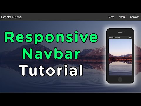
Responsive Navbar using HTML CSS and JavaScript

Показать описание
hey guys, in this tutorial we will learn how to make responsive navbar using html css and javascript.
It's one of the most popular project that used to display the links inside the navigation or you can say that top of the website.
That's very important for everyone website to nevigate the users. So, I'm going to teach with you how you can use HTML, CSS and also little bit of JavaScript to make hamburger menu html css javascript.
humburger menu means you can see the small screen three bars, when you will click on it to display the menus. It's called humburger menus. So, hope this tutorial is helpful and beneficial for you.
Once you watch the complete tutorial, hope you will get a lot of ideas from it and hope you will learn something new from it.
Download Source Code:
You May Also Like:
HTML and CSS Tutorial For Beginners From Scratch
Responsive Contact Us Form in HTML and CSS
Create a Responsive Pricing Table in HTML and CSS
Responsive Signup Form in HTML and CSS
How to Create Profile Card in HTML and CSS
OnlineITtuts Tutorials cover many topics such as Web Designing, Web Development, Programming, Databases. I was made many videos for different categories, and I will share another helpful tutorial for different topics. you can learn Basic to Advance Knowledge with practically.
Support Me on Patreon
Follow Us on Facebook
Follow Us on Twitter
Follow Us on Pinterest
 0:08:00
How to Create Responsive Navigation Bar using HTML and CSS
 0:16:52
How to Create Responsive Navbar using HTML & CSS
 0:15:13
How To Create a Responsive Navbar Using HTML & CSS | Step By Step Tutorial
 0:15:21
How to create a Responsive Navigation Bar (for beginners)
 0:12:03
Responsive Navbar HTML CSS, Responsive Navbar HTML CSS JavaScript
 0:49:25
Responsive navbar tutorial using HTML CSS & JS
 0:09:12
Responsive Navbar HTML CSS, Responsive Navbar HTML CSS JavaScript
 0:16:31
Responsive Navbar Using HTML CSS And JavaScript
 0:09:02
How to Create a Responsive Navigation Bar in HTML & CSS
 0:11:40
Animated Responsive Navbar with CSS - Plus Other Useful Tricks
 0:14:07
How To Make Responsive Navigation Bar Using Only HTML and CSS | Responsive Navbar Tutorial
 0:09:21
Responsive Navigation Bar with mobile menu Using HTML & CSS
 0:10:21
Responsive Navigation Menu Bar using HTML & CSS | CSS Media Query
 0:13:24
Responsive Navbar Using HTML & CSS | Step By Step Tutorial
 0:07:33
Responsive Navigation Bar in HTML & CSS
 0:14:56
Create a RESPONSIVE NAVBAR with sidebar animation (CSS ONLY)
 0:07:41
Responsive Navbar using HTML and CSS Only | Free Source Code
 0:09:24
Responsive Navigation Menu Bar using HTML CSS & JavaScript
 0:13:35
Responsive Navbar Tutorial
 0:09:50
Responsive Navbar using Html & Css | No Javascript
 0:29:00
Responsive Navbar using HTML CSS and JavaScript
 0:11:26
JavaScript - How to Create a Responsive Hamburger Menu with HTML, CSS, & JavaScript
 0:32:09
Responsive Navbar Using HTML CSS & JavaScript | With Search & Login
 0:15:30
Responsive Navigation Bar Using HTML & CSS | Responsive Navbar HTML CSS | HTML & CSS Tutoria...
Комментарии