filmov
tv
New 2011 vs. Old 2010 Xbox 360 Dashboard | Comparison
Показать описание
Hello,
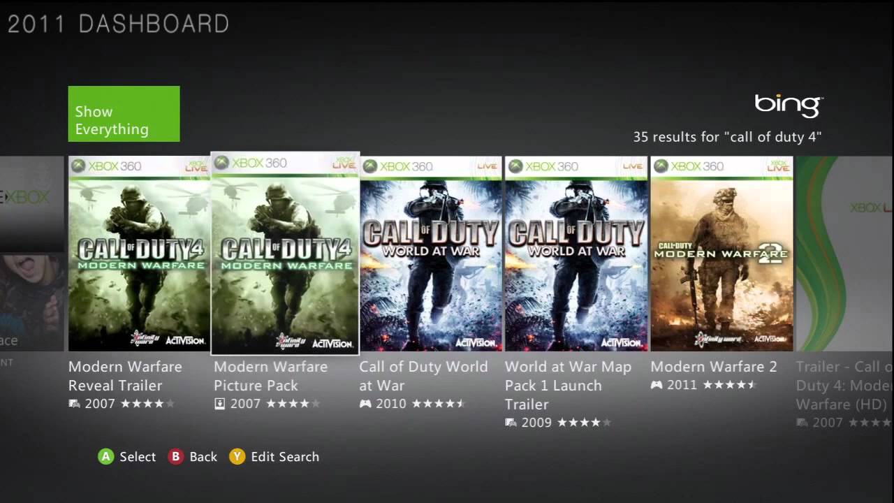
Today I am going to be showing you the difference between the newest Xbox 360 Dashboard (The metro-style one) and the dashboard before it. As you can see, this difference is quite tremendous between the two and I really do like the new one better. Probably why I like Windows 8 so much. The whole Metro-style thing really appeals to me because I come from a typographic background and the whole metro thing really fits into that. Just look at my room, it's very modern and boxy.
* Recorded on the Hauppauge HDPVR
Thank you,
chargerfun34
 0:04:55
New 2011 vs. Old 2010 Xbox 360 Dashboard | Comparison
 0:00:26
OLD VS NEW Fortnite Graphics 🤯
 0:00:22
Minecraft Nostalgia 2023 vs 2013 #shorts
 0:00:26
The ROBLOX avatar evolution (2006-2022)
 0:00:19
Roblox logo evolution from 2017 - 2080
 0:00:12
NEW vs OLD Minecraft... 🥺 (Nostalgia)
 0:00:50
10 YEARS✂️🥹🥳#tradition#cousins#newyear
 0:00:41
Justin Bieber vs Jaden smith through the years (2010~2025) #transformation
 0:00:25
Evolution of Roblox
 0:00:17
Old Roblox on Samsung Galaxy S3 mini
 0:00:55
The History of Roblox's Default Avatars
 0:00:18
Roblox in 1988 (fan animation by @SquirrelMonkeyCom )
 0:00:16
Old Nokia 3310 vs New 3310 #shorts
 0:00:20
Rating the last 20 years of mustangs 🏎💨 Dio you agree with list? What’s your rank?
 0:00:25
Evolution of Honda Civic (1972~2022) #shorts
 0:00:33
El Clasico fight moments
 0:00:16
Indian Old Pattern Notes: ₹1000, ₹500, ₹100, ₹50, ₹20, ₹10, ₹5 | Old Indian Currency #shorts #viral...
 0:00:27
Remember When All The 2010s Songs Sounded Like This? #shorts #2010s #nostalgia
 0:00:22
FREE FIRE Evolution 2017 to 2030#shorts
 0:00:11
Early 2000s vs 2022 fashion 🌼 #shorts #short #trending #viral
 0:00:56
IShowSpeed’s EVOLUTION: From Zero to Streaming Legend 🎥💰 (2005-2025) #evolution #shorts #ishowspeed...
 0:00:18
Good vs Great vs Legendary Versions Of Neymar😎🤙 (+1M)
 0:00:16
R.I.P Builderman 😭🪦
 0:00:14
Honda City old vs New #hondacar #hondacity #drift
Комментарии