filmov
tv
SWITCH between PERCENTAGE and ABSOLUTE VALUES in one visual I Calculation Groups in Power BI

Показать описание
In this video I show you how to create buttons to switch between % and absolute values.
Learn more about calculation groups in Power Bi.
--------------------------------
📊 TRAININGS 📊
---------------------------------
---------------------------------
⏱️ TIMESTAMPS ⏱️
---------------------------------
0:00 Intro
0:27 Getting Ready: Visual and Tabular Editor
1:43 Adding a calculation group with calculation items
4:20 Applying the calculation group
5:38 Formatting expressions in calculation groups
6:57 Show slicer with buttons
8:06 End
---------------------------------
😍 JOIN 😍
----------------------------------
---------------------------------
👇 CHECK THIS OUT! 👇
---------------------------------
* Above are affiliate links, which means at no additional cost to you, if you make a purchase using these links we will receive a small commission. It supports us and helps us to continue making more How to Power BI videos!
Thanks for being a part of this channel and all your support! 💪 🙏
#HowToPowerBI #PowerBI #DataTraining
#powerbidesktop #powerbitraining #powerbideveloper #DAX
 0:08:20
SWITCH between PERCENTAGE and ABSOLUTE VALUES in one visual I Calculation Groups in Power BI
 0:08:30
MASTERING Stack Column Chart in Excel | SWITCH between PERCENTAGE % and ABSOLUTE VALUES with SLICER
 0:11:03
Absolute Change vs. Relative Change
 0:03:33
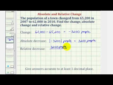
Ex: Change, Absolute Change, and Relative Change
 0:12:24
Excel - switch between relative, absolute, and mixed references
 0:07:06
Tableau Tutorial - Absolute and percentage changes in Tableau
 0:13:05
5.5.4 Absolute, Relative, and Percent Change
 0:11:53
Unit One Absolute and Percent Change
 0:29:43
Mastering Charts and Graphs: Excel for Beginners Part 06
 0:09:47
Switching between relative, absolute, and mixed references in Excel by Chris Menard
 0:00:42
Change Formula to relative or Absolute in one click !! See description
 0:04:25
Percent of Change | Percent Increase and Decrease | Math with Mr. J
 0:04:28
Calculate Percentage in Excel the Right Way (% Change & Amount after % increase)
 0:14:39
Percentages Absolute Relative Change
 0:09:34
Absolute Change and Relative Change
 0:05:52
MyOpenMath - Absolute Change and Relative Change
 0:06:11
Relative vs Absolute Cell Reference in Microsoft Excel - What's the difference?
 0:14:39
how to compute percent absolute relative change final initial beginning ending colmath 1dot2
 0:03:22
Excel Skills #22 - Calculating Percentages (Absolute and relative referencing)
 0:06:41
Absolute and Relative Change
 0:08:40
How to calculate Relative and Absolute changes (MATHorial)
 0:11:22
Quantitative Literacy - Absolute and Percent Change
 0:00:13
Learn How to Calculate the Absolute Difference between Two Numbers in Excel with ABS
 0:06:00
Measures vs. calculated columns in DAX and Power BI
Комментарии