filmov
tv
Kalyan Akkapantula - Advanced Visualization in Jupyter Notebooks | JupyterCon 2020

Показать описание
Brief Summary
Data visualization is a huge field. Now some of the key things to take away from this field without going, becoming an expert in data visualization are, it's a delicate skill, so you have to be careful not to exaggerate, even though you have so many tools at your disposal sometimes using less is more. In this talk we're going to look at some more advanced ways to visualize our data.
Outline
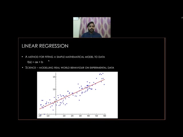
Advanced Data Visualization gives a new meaning on how pictures can simplify information needed to comprehend complex questions. Advanced Data Visualization displays data through interactive data visualization, multiple dimension views, animation, and auto focus. The road map of talk structure goes like this. First we're going to give an introduction to information dense visualizations, a way of basically showing multiple layers of data and different data within a single plot. Then we're going to look at how to visualize correlation, the similarity or Association of different variables. Following that we're going to show technique called linear regression to build a simple linear model describing the real-world behavior of our data. Lastly, when we expand our exploration of multiple variables, showing even more types of data, we're going to use a technique called correlation matrix, the quickly showed the correlation between all the different combinations of variables.
----
JupyterCon brings together data scientists, business analysts, researchers, educators, developers, core Project contributors, and tool creators for in-depth training, insightful keynotes, networking, and practical talks exploring the Project Jupyter ecosystem.
JupyterCon is possible thanks to the generous support of our sponsors, and the labor of many volunteer organizers.

JupyterCon2020
JupyterCon 2020

JupyterCon2020
JupyterCon 2020

JupyterCon2020
JupyterCon 2020
 0:12:30
 0:56:55
 0:02:29
 0:02:42
 0:22:00
 0:22:28
 0:11:16
 0:10:44
 0:32:21
 0:13:41
 0:13:18
 0:11:47
 0:24:54