filmov
tv
R Tutorial - Advanced Line Graphs with ggplot in RStudio - YOY!

Показать описание
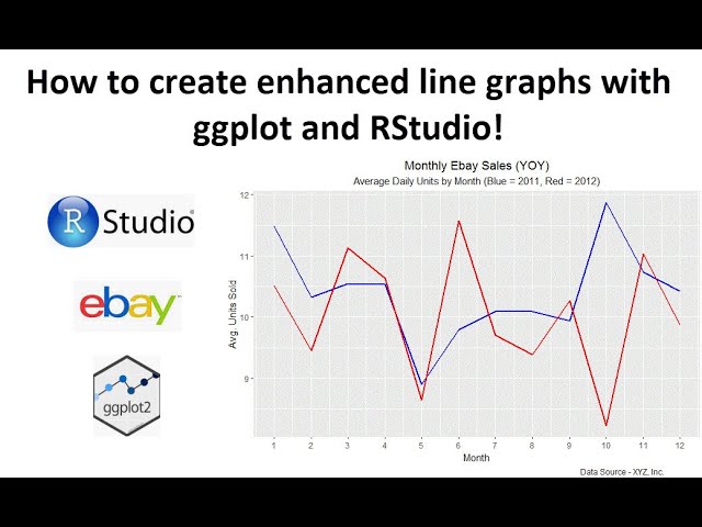
In this video tutorial we will show you exactly how to make enhanced and advanced line graphs that include a YOY (Year Over Year) graph. We will use the kableExtra library and kable function to make our data look better. We will then go step by step through line graphs and enhanced line graphs.
We will make two separate ggplot commands for graphing each years plot and then we will combine them into one. I will also show you some extras like aggregating the data by month from daily data. Daily data would be rather messy or unsightly in a YOY (Year over Year) graph, so we will aggregate it to monthly.
Then we will enhance the graph with a title, subtitle and caption. The graph will become overloaded in R with all our enhancements so it won't display a legend on top of everything we are doing. But that is fine. It will be a great looking graph you can be proud of and easily replicate to any time range. The best part is you can make a reusable process that will digest daily data, get it in the right format and then aggregate it and create YOY line graphs for you.
I hope you found this video on creating line charts in r interesting and helpful.
Please take a moment to subscribe, like and share. Be sure and click the bell so that you will be notified each time I publish a great video like this one.
Thanks again and God bless!
Комментарии
 0:14:28
 2:10:39
 1:26:19
 10:10:56
 0:15:49
 6:49:39
 0:34:11
 0:02:20
 0:26:55
 0:15:57
 6:51:20
 0:37:43
 3:16:53
 1:10:56
 1:11:35
 0:06:36
 0:49:45
 0:02:33
 0:06:12
 1:45:21
 1:33:00
 0:06:25
 0:06:49
 0:01:00